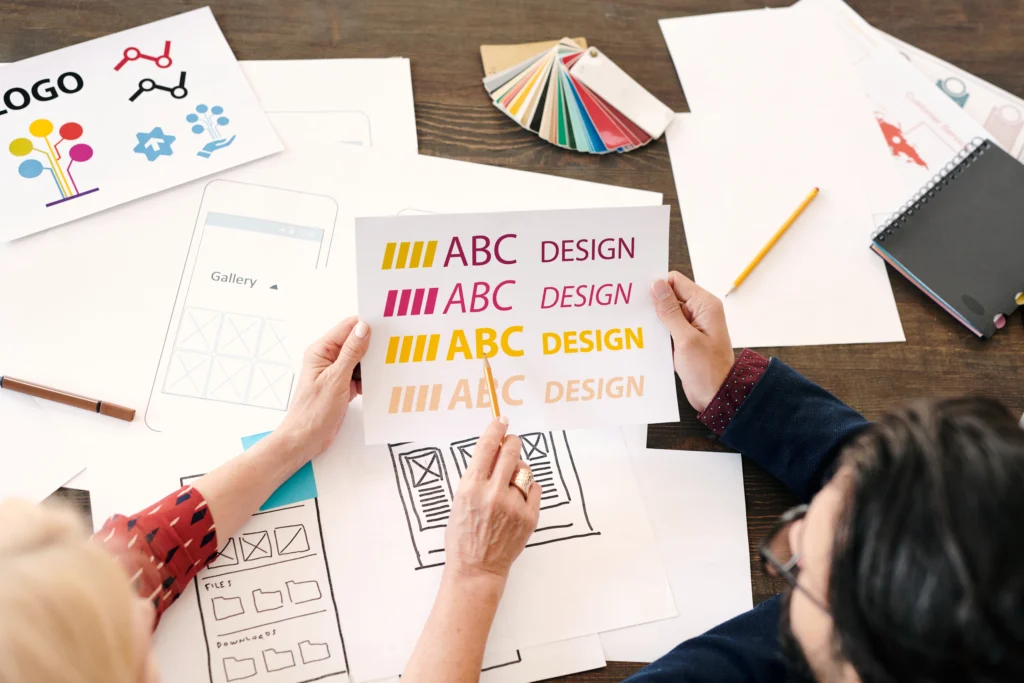
When choosing the best fonts for print and digital use, the typeface selection can significantly impact the design’s effectiveness and readability. Fonts play a pivotal role in shaping the visual identity of a brand and the user experience across various platforms. In this article, we will explore the best fonts for both print and digital mediums, highlighting the nuances that make certain fonts more suitable for specific uses. Whether you’re designing for print materials, websites, or mobile apps, the right font can elevate your design to new heights.
Font choice is an essential aspect of design that directly affects readability, perception, and the overall visual appeal of your project. In print, fonts need to perform well in physical formats, with consideration for paper type, size, and color. Meanwhile, digital fonts need to be legible across various devices and screen resolutions.
In print design, the primary concern is legibility, clarity, and the way the font interacts with the printed medium. Whether designing business cards, brochures, or advertisements, choosing the right font ensures that the message is communicated effectively and is visually appealing. Serif fonts, for example, are often preferred for print because their small lines at the ends of characters help guide the eye, making them easier to read in long blocks of text.
In digital design, fonts must be chosen for both their readability on screens and their adaptability across devices. Digital fonts need to be legible on smaller screens like smartphones and tablets, where pixel density varies. A font’s ability to remain clear across a range of screen sizes is critical. Sans-serif fonts are often preferred for digital platforms because their clean lines improve legibility on screens, especially at smaller sizes.
When selecting fonts for print design, factors such as the medium (brochure, magazine, poster, etc.) and the target audience must be considered. The following fonts are some of the best choices for print-based design projects:
One notable example of font choice affecting the perception of print marketing can be seen in the rebranding of a major fashion brand. The company switched from a serif font to a bold, modern sans-serif font across its brochures and advertisements. The change was a hit with a younger audience, giving the brand a more contemporary, accessible feel. This case demonstrates how font selection can influence consumer perception and brand identity.
When designing for digital platforms, readability and scalability are key. The following fonts are known for their effectiveness in digital media, offering clear legibility and a modern aesthetic:
A good example of font selection influencing digital design can be seen in a case study of a website redesign for an e-commerce platform. The website switched from a heavy serif font to a cleaner sans-serif font. The new design resulted in a noticeable improvement in user experience, as visitors found the site easier to navigate, especially on mobile devices. This shift in font choice was not only a visual update but also an improvement in accessibility and usability.
Font pairing is an art that requires an understanding of balance and contrast. When designing for both print and digital formats, pairing complementary fonts can create a cohesive and visually appealing design. Here are a few tips for effective font pairing:
Choosing the best fonts for print and digital mediums is essential to achieving effective design. While print design often calls for classic, legible serif fonts that can be read comfortably in print, digital design benefits from fonts that are optimized for screen use, often favoring sans-serif fonts for their clarity at small sizes. Whether you’re working on a print brochure or a website layout, the right font can enhance readability, boost user engagement, and help convey your brand’s message more effectively.
Ultimately, the key is to understand the unique needs of each medium and to choose fonts that best support those needs. By considering factors such as legibility, audience, and the tone of the design, you can select fonts that elevate your project and ensure a lasting impact.