


In today’s highly competitive market, the importance of having a memorable brand identity cannot be overstated. A brand’s font choice plays a vital role in conveying its personality, values, and message. Bold display fonts, with their eye-catching and strong visual presence, have emerged as a popular choice for brands aiming to make a statement. This article explores the significance of bold display fonts in branding, why they work, and how to effectively choose the right bold font to elevate your brand.
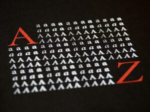
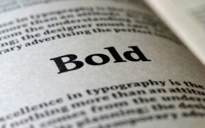
Bold display fonts are typefaces characterized by their large size, heavy weight, and strong visual impact. They are typically used for headlines, logos, and other prominent textual elements that require attention. Display fonts are designed to stand out and convey a sense of authority, creativity, or playfulness, depending on the brand’s identity.
These fonts differ from traditional body fonts, which are usually more subtle and easier to read in large blocks of text. Bold display fonts, on the other hand, are meant to grab the viewer’s attention immediately, making them ideal for branding, advertising, and promotional materials.
There are several reasons why bold display fonts have become a go-to choice for brands:
Many renowned brands have successfully leveraged bold display fonts in their branding. Some noteworthy examples include:
Selecting the right bold display font is critical to aligning with your brand’s message and values. Consider the following factors when choosing a bold font for your brand:
Your brand’s font should reflect its personality. Is your brand playful, authoritative, modern, or classic? For instance, a fun and playful brand might opt for a rounded, hand-drawn bold font, while a tech startup may choose a sleek, futuristic bold typeface.
While bold display fonts are designed to grab attention, they should still be legible across various platforms and sizes. Ensure that your font choice is clear and easy to read in different contexts, including digital screens, printed materials, and mobile devices.
Your bold display font should work well across all of your brand’s touchpoints, from your website to your social media channels, packaging, and advertisements. Consistency in font usage helps reinforce brand identity and fosters familiarity with your audience.
While bold fonts may be trendy, it’s important to choose one that will stand the test of time. Your font should be able to adapt to future trends without losing relevance. Opt for a font that can evolve with your brand as it grows.

Below are some popular bold display fonts that have been widely adopted by brands to create strong visual identities:

To make the most of bold display fonts in your branding, consider the following tips:
While bold fonts can make a statement, overusing them can lead to visual fatigue. It’s essential to balance bold text with more neutral fonts for body text, ensuring that your design doesn’t become overwhelming. Bold fonts should be reserved for key elements like headlines, logos, or calls to action.
Bold display fonts work best when paired with complementary fonts. For example, a sleek sans-serif bold font can be paired with a clean serif or a minimalist sans-serif for body text. This combination creates visual hierarchy and enhances readability.
Bold fonts are most effective when used with high-contrast colors. Dark bold fonts on light backgrounds (or vice versa) create a striking contrast that draws attention. This is particularly useful in logos, website headers, and billboards.
Many brands choose to customize or create their own bold fonts to achieve a truly unique look. Customizing a font allows you to tailor it specifically to your brand’s message, making your visual identity more distinct and memorable.
Bold display fonts are a powerful tool in modern branding, providing an immediate impact that helps brands stand out in crowded markets. By carefully choosing and using bold fonts that align with your brand’s identity, you can create a memorable and authoritative visual presence. Whether you’re launching a new brand or refreshing an existing one, bold fonts offer versatility and strength that can enhance your overall branding strategy.
As you explore bold fonts for your brand, keep in mind factors such as legibility, consistency, and longevity. Use bold fonts strategically, pairing them with complementary typefaces and colors to create a well-rounded and cohesive brand identity. With the right approach, bold display fonts can leave a lasting impression on your audience and elevate your brand to new heights.
