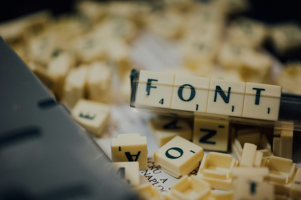
Typography is one of the cornerstones of design. It’s not just about choosing pretty letters but about using fonts that communicate ideas, establish tone, and guide the viewer’s eye through the content. Among all font types, bold fonts are the go-to choice for those who want to make a statement. They are powerful tools in design that attract attention, enhance readability, and emphasize key messages. The best part? Many of the bold fonts available today are free to download, offering endless possibilities for graphic designers, marketers, and creatives alike.
Why Bold Fonts Matter in Design
Bold fonts are more than just visually striking; they are a design element that carries a heavy weight in both form and function. From logos to web design, here’s why bold fonts are so important:
- Visual Impact: Bold fonts immediately draw attention. In a world full of distractions, grabbing a viewer’s attention is paramount. A bold font can be used to highlight a brand’s name, a headline, or an important message. It demands focus.
- Readability: Bold fonts are easier to read, especially in larger text blocks. The thicker strokes of bold fonts help ensure legibility, making them a great choice for headlines and text that need to stand out.
- Conveying Authority and Strength: Bold fonts can communicate a sense of strength and authority. They are often used in situations where a brand wants to portray confidence, reliability, or power.
- Emphasizing Key Information: Bold fonts are often used for important information, making it stand out from the rest of the content. Whether it’s a call-to-action button or a crucial piece of information, bold fonts help guide the viewer’s eye and provide clear visual hierarchy.
The Best Websites for Free Bold Font Downloads
Finding the right bold font is essential for any project. Fortunately, several websites offer high-quality fonts for free. These resources make it easy for designers to access and download fonts without breaking the bank. Below are some of the best platforms for downloading bold fonts:
- Google Fonts: Google Fonts is the largest collection of free, open-source fonts. It includes a wide range of bold fonts suitable for all types of design. Fonts like Roboto Bold, Open Sans Bold, and Montserrat are popular choices among designers for their clean and modern looks.
- DaFont: DaFont has a massive collection of fonts, including bold typefaces. The site allows you to search fonts by categories such as ‘Fancy,’ ‘Modern,’ or ‘Techno,’ helping you find a bold font that perfectly fits your design needs.
- Font Squirrel: Font Squirrel is known for offering high-quality fonts that are free for both personal and commercial use. Many of their bold fonts are well-designed and ready to be integrated into any project.
- Behance: Behance is not just a portfolio platform; it’s also a source for free fonts. Many designers showcase their work on Behance, offering downloadable fonts as part of their design portfolio. This is a great place to find unique, creative fonts.
- FontSpace: FontSpace is a user-friendly platform that offers thousands of free fonts. Their bold fonts come in various styles, from playful and handwritten to sleek and professional.
How to Choose the Right Bold Font for Your Project
Choosing the right bold font is crucial for any design project. Not all bold fonts are created equal, and each design has specific needs. Below are key factors to consider when selecting the perfect bold font:
1. Consider Your Brand’s Personality
The font you choose should align with the personality of your brand. A bold, modern font might be perfect for a tech startup, while a hand-lettered bold font could be ideal for a creative agency or artisan brand. Before downloading a bold font, ask yourself the following questions:
- Does the font reflect the style and tone of the brand?
- Is the font appropriate for the target audience?
- Does it communicate the brand’s message effectively?
2. Legibility and Readability
While bold fonts are designed to catch attention, they must still be legible. Poor readability can defeat the purpose of using a bold font in the first place. Always test your chosen font at different sizes and in different settings to ensure it remains clear and easy to read.
3. Design Context
Consider the overall design context. Bold fonts work well for headings, titles, and calls to action. However, using them excessively in body text may cause visual clutter. It’s often best to combine bold fonts with lighter fonts to create a harmonious visual balance.
Popular Bold Fonts You Can Download for Free
Here are some of the most popular bold fonts that are free to download. Each has its own unique style and can be used across different types of design projects:
- Impact: Impact is a strong, condensed bold font that’s often used for headlines and advertisements. Its thick letterforms make it perfect for catching attention in noisy or competitive spaces.
- Roboto Bold: Roboto is a versatile sans-serif font that offers a modern, geometric style. The bold version of Roboto is highly legible and works great for both digital and print designs.
- Montserrat: Montserrat is a contemporary sans-serif font inspired by urban typography. It’s perfect for web design, branding, and marketing materials. The bold weight of Montserrat gives your design a sophisticated and confident look.
- Oswald: Oswald is a condensed, sans-serif font that is perfect for headlines and posters. Its bold weight is impactful without being overpowering, making it ideal for many design contexts.
- Bebas Neue: Bebas Neue is one of the most popular bold fonts in the design world. Known for its clean lines and all-caps style, it’s commonly used in advertising, posters, and branding projects.
Tips for Using Bold Fonts Effectively
Using bold fonts effectively is an art. While bold fonts are meant to stand out, they must be used in moderation to avoid overpowering your design. Below are some tips for using bold fonts to their fullest potential:
- Use Sparingly: Avoid using bold fonts for every element in your design. If everything is bold, nothing stands out. Use bold fonts for headlines, keywords, and other important elements.
- Pair with Lighter Fonts: Pair a bold font with a lighter, regular weight font to create contrast and visual interest. This helps maintain a balanced, professional look.
- Check for Readability: Always check the contrast between the bold text and the background to ensure legibility. High contrast is important, especially for users with visual impairments.
- Be Mindful of Size: When using a bold font, experiment with different font sizes. Bold fonts often look better at larger sizes, so avoid using them for small text, which could become hard to read.
Conclusion
Bold fonts are an indispensable tool for designers. They are versatile, easy to read, and incredibly effective at making a statement. Whether you’re designing a website, a logo, or marketing materials, the right bold font can enhance your design by giving it personality, strength, and clarity.
There are plenty of free resources available to download high-quality bold fonts, and understanding how to use them effectively can elevate any design project. Always choose bold fonts that align with your brand’s identity, test for readability, and use them thoughtfully to create an engaging and professional design.
Remember, typography isn’t just about picking a font—it’s about using the right font in the right context. Bold fonts have the power to transform your designs, so take full advantage of their potential in your next project.