


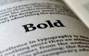
Bold fonts are an essential part of headline and title design, helping to capture attention and create a strong visual impact. Whether used in print, web design, or digital advertising, bold fonts have the ability to instantly grab a reader’s attention and convey important messages. In this article, we will explore the role of bold fonts in design, how to effectively use them for headlines and titles, and review some of the most popular bold fonts available today. Additionally, we will discuss font pairing techniques, readability concerns, and industry-specific use cases for bold typography.
Headlines are a key element of any design, from websites to advertisements and print publications. Bold fonts are often chosen for headlines because they create emphasis and stand out against other elements on the page. They help establish a clear visual hierarchy, making it easy for readers to identify the most important information at a glance. Additionally, bold fonts convey a sense of authority and urgency, which can be crucial in marketing and promotional materials.

Titles, like headlines, need to be attention-grabbing and clear. Using bold fonts for titles ensures that they stand out from the rest of the content and create a visual anchor for the design. Bold fonts help draw the reader’s eye to the most important message on the page, ensuring that it is seen first. For titles, it’s important to strike the right balance between being bold enough to stand out while maintaining readability and aesthetic appeal.
Not all bold fonts are created equal. There are certain characteristics that make some fonts more effective for headlines and titles than others. Here are some key features to look for when selecting bold fonts:
There are numerous bold fonts available, each offering unique characteristics that suit various design styles. Below, we’ve compiled a list of some of the most popular bold fonts for headlines and titles, along with examples of where they are commonly used.

In web design, bold fonts are often used for headlines to improve readability and draw attention to key messages. They help to create contrast with body text and other elements on the page. When using bold fonts on websites, it’s important to consider how the font will render across different screen sizes and devices. Here are some tips for using bold fonts effectively in web design:
Pairing bold fonts with other fonts can create dynamic and visually appealing designs. Font pairing is an art that requires a good sense of balance and contrast. When pairing fonts, it’s important to choose fonts that complement each other while maintaining a clear visual hierarchy.
Here are a few tips for pairing bold fonts with other fonts:
While bold fonts can make your headlines stand out, it’s crucial to consider readability. Bold fonts are not always appropriate for long paragraphs or smaller text sizes, as they can reduce legibility if overused. When using bold fonts for headlines and titles, be mindful of font size, letter spacing, and line height to ensure the text is still easy to read.
Larger font sizes tend to work better with bold fonts. However, increasing the size of a bold font may require adjustments to letter spacing (kerning) and line height to maintain readability. Tight letter spacing can make bold text look cramped, while proper spacing enhances legibility.
Different industries have their own preferences and standards when it comes to typography. Bold fonts are frequently used in the following industries to make headlines and titles more impactful:
In conclusion, bold fonts are a powerful tool for creating striking and effective headlines and titles. When used correctly, they can capture attention, establish a clear visual hierarchy, and convey important messages with impact. Designers should be mindful of font selection, font pairing, and readability when incorporating bold fonts into their work. Whether for print, web, or digital platforms, bold fonts remain an essential part of modern typography and design, offering endless possibilities for creativity and expression.
