

Movie posters are an essential element in the promotion of films, as they create an immediate visual impact that can attract audiences. One of the most powerful tools in a designer’s arsenal is the use of bold fonts, which can convey the tone, theme, and genre of the movie in a single glance. In this article, we will explore the significance of bold fonts in movie posters, examine the design choices behind some iconic examples, and discuss why they are so effective in capturing audience attention.
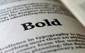
Typography in movie posters plays a crucial role in communicating the film’s identity. Designers use bold fonts to establish a hierarchy of information, making sure the title stands out against other visual elements like images or taglines. Bold fonts, in particular, are often chosen for their ability to convey strength, urgency, or excitement, all of which are qualities that can pique the curiosity of potential viewers.
Bold fonts are frequently used to establish the genre of a film. For instance, action movies like The Avengers or Die Hard often utilize blocky, bold fonts to emphasize intensity and excitement, while horror films may opt for bold, distorted fonts that evoke fear and suspense. This immediate association helps viewers understand the nature of the film without needing to read detailed descriptions.
Bold fonts are effective because they are immediately attention-grabbing. In the competitive visual landscape of movie marketing, posters must stand out whether displayed on a billboard, in a theater, or on a digital platform. Bold typography ensures the title and key information are legible from a distance, even when surrounded by other competing elements.
The use of bold fonts ensures that even from a distance, the movie title remains readable. This is especially important in crowded places where posters must compete for attention. By employing a strong, bold typeface, designers can guarantee that the title will be noticed at first glance, creating an immediate impression.
Beyond readability, bold fonts contribute to the overall visual impact of a movie poster. A well-chosen bold typeface can become an iconic part of a film’s branding. For example, the bold, all-caps font used in the Jurassic Park poster not only conveys the film’s thrilling adventure but has become synonymous with the franchise itself.
Over the years, several movie posters have become iconic due to their use of bold typography. Let’s take a closer look at some famous examples:
The original Star Wars poster is one of the most recognizable in cinema history. Its bold, slanted title font helped establish a sense of movement and adventure, reflecting the epic space saga. The boldness of the font also conveyed strength, hinting at the monumental nature of the story.
The poster for Jaws is iconic, thanks in part to its use of bold, red lettering. The sharp, bold font mimics the danger and sharpness of the shark’s teeth, creating an immediate sense of terror. The boldness of the font helps cement the film’s thrilling and dangerous atmosphere.
The Dark Knight uses a bold, gritty font for its title, which complements the film’s dark and brooding tone. The sharp edges and heavy weight of the font reflect the tension and seriousness of the film, setting it apart from more lighthearted superhero fare.

When designers choose fonts for movie posters, they consider several factors. The genre, tone, and target audience all influence the decision to use a bold typeface. Here are some key considerations:
In recent years, there has been a shift toward more minimalist poster designs that still use bold fonts effectively. Films like Inception and Blade Runner 2049 employ bold typography that’s clean and modern, emphasizing simplicity while still making a strong statement.
Minimalism is a growing trend in poster design, with bold fonts playing a central role. A minimalist poster with a large, bold font can capture attention without the need for excessive visual clutter. The simplicity allows the bold typography to stand out and make a lasting impression.
Many modern movie posters feature custom-designed bold fonts that are unique to the film. This creates a cohesive brand identity that extends beyond the poster and into other marketing materials. For example, the custom font for Guardians of the Galaxy gives the film a distinct, recognizable aesthetic that reinforces its unique tone and style.
Bold fonts have long been a cornerstone of movie poster design. Their ability to convey emotion, establish genre, and create visual impact makes them a powerful tool for designers. From the classic fonts of Star Wars and Jaws to the modern, minimalist bold fonts of films like Inception, bold typography continues to shape the way audiences experience movies before they even step into the theater. As trends evolve, bold fonts will remain an essential element in creating memorable and impactful movie posters.
Whether it’s through custom designs or the use of classic bold typefaces, movie posters rely on bold typography to communicate their message clearly and effectively. In the ever-competitive world of movie marketing, bold fonts ensure that the film’s title is both seen and remembered.
