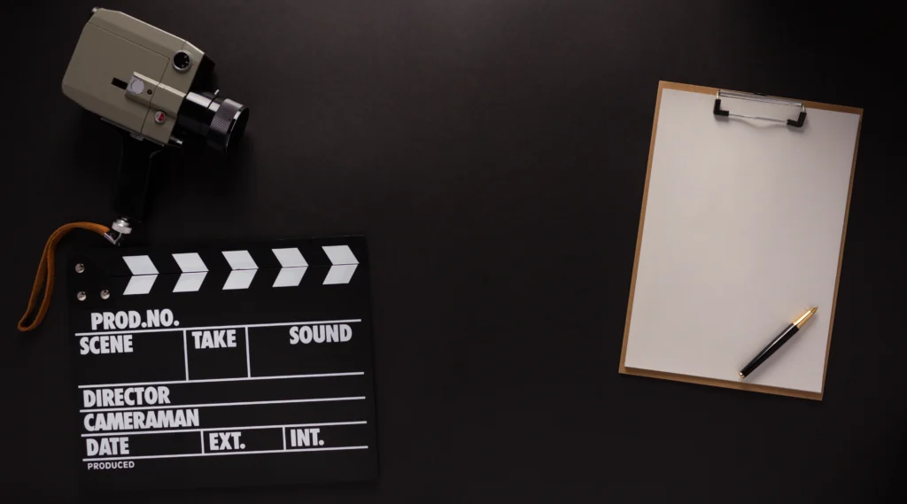
Movie title fonts play a crucial role in setting the tone and visual identity of a film. The right font can captivate audiences before they even know the plot. Whether it’s the bold, dramatic typography of a blockbuster action movie or the elegant script of a romantic drama, custom movie title fonts are designed with purpose, leaving a lasting impression on viewers.
This article delves into the art and science of custom movie title fonts, exploring how they are created, the design principles behind them, and their significance in film marketing. We’ll also take a closer look at iconic examples and discuss how these fonts help define the genre and appeal of a movie.

Fonts are more than just a way to present the title of a movie; they are a crucial part of the movie’s branding and marketing. A well-designed font can:
With such a critical role to play, movie title fonts need to be crafted with precision and creativity to convey the right message.
Creating a custom font for a movie title involves several design principles that align with the movie’s themes, genre, and target audience. Here are some key principles that designers consider:
The primary function of any movie title font is to be easily readable, whether it’s displayed on a large cinema screen, a billboard, or a mobile device. While some genres may opt for more intricate or stylized fonts, the text must remain legible to the audience at all times. This ensures that the movie title is instantly recognizable.
The font style should align with the movie’s genre to establish the right tone. For example:
By choosing a font that reflects the genre, filmmakers ensure that audiences can identify the tone of the movie from the first visual cue.
A custom font helps create a unique identity for the film. Just like a movie’s plot and characters, the title font should stand out and be memorable. For instance, the Star Wars logo has become iconic, instantly recognizable even without the movie title itself. Similarly, fonts used in films like Harry Potter and Jurassic Park have achieved legendary status in pop culture.

Some custom fonts have left an indelible mark on the world of cinema, becoming almost as famous as the movies they represent. Below are a few iconic examples:
The Star Wars title font is one of the most recognizable in film history. Designed by Suzy Rice and later refined by Joe Johnston, the bold, blocky typography captures the epic scale of the franchise. Its futuristic, yet timeless feel complements the film’s blend of science fiction and fantasy.
The Harry Potter font, designed by Marcus Burlile and licensed by Warner Bros, perfectly conveys the magical and mysterious atmosphere of the series. The lightning bolt in the letter “P” reflects the iconic scar of the titular character, creating an immediate connection to the film’s protagonist.
Designed by Chip Kidd, the Jurassic Park title font combines the natural and the prehistoric. Its serif font style, combined with the silhouette of a T-Rex, evokes both the seriousness of the film and the awe-inspiring presence of dinosaurs. This title font has become synonymous with adventure and scientific wonder.
Fonts can influence how audiences perceive a movie even before they watch it. Custom fonts often play a subconscious role in shaping first impressions. For example:
These elements, combined with the right design, can draw audiences in and spark curiosity about the film.

The process of creating a custom movie title font involves several steps, often requiring collaboration between filmmakers, graphic designers, and typographers. Here is a breakdown of the process:
Before creating a custom font, designers must fully understand the movie’s vision, genre, and intended audience. This allows them to tailor the font to reflect the film’s core message.
Designers often start by sketching multiple ideas based on the film’s themes. These sketches can range from abstract designs to direct representations of the film’s mood or setting.
Once the initial sketches are approved, the designer digitizes the font and makes adjustments for readability and impact. This step also includes fine-tuning details like kerning, ligatures, and alternate glyphs to ensure a professional appearance.
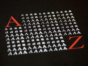
The custom font is tested in different contexts, such as movie posters, trailers, and merchandise, to ensure it works across various media. Feedback is gathered from the filmmakers, and any necessary tweaks are made to perfect the design.
Custom movie title fonts are far more than just decorative elements; they are a vital part of a movie’s identity and marketing strategy. These fonts can convey the film’s genre, tone, and atmosphere while making a lasting impact on audiences. From the iconic typography of Star Wars to the magical design of Harry Potter, custom fonts have become integral to how we experience and remember films.
By understanding the importance of legibility, alignment with genre, and uniqueness, designers can create fonts that not only captivate but also define a movie’s legacy. In the end, custom fonts are as much a part of storytelling as the script, characters, and cinematography.
For moviegoers, the next time you watch a film, take a moment to appreciate the typography—there’s a world of creativity behind every letter.