In the world of design, typography plays a pivotal role in capturing attention and conveying messages effectively. Display fonts, in particular, are a powerful tool for creating eye-catching titles that stand out. Whether you’re designing a website, a poster, or a social media graphic, the right display font can make all the difference. This article delves into the intricacies of display fonts, offering valuable insights and examples to help you choose the perfect typeface for your next project.
What Are Display Fonts?

Display fonts are a category of typefaces specifically designed for use at large sizes, such as in headlines, titles, and logos. Unlike text fonts, which are optimized for readability in body text, display fonts prioritize aesthetics and impact. They often feature unique, elaborate designs that make them ideal for grabbing attention.
Characteristics of Display Fonts

Display fonts come in a wide variety of styles, but they share some common characteristics:
- Bold and Expressive: Display fonts often feature thick strokes and dramatic shapes that make them stand out.
- Decorative Elements: Many display fonts include intricate details, such as swashes, serifs, and embellishments.
- Limited Readability at Small Sizes: Due to their elaborate designs, display fonts are not suitable for body text and are best used at larger sizes.
- Versatility in Style: From vintage to modern, display fonts can evoke a wide range of moods and themes.
Why Use Display Fonts for Titles?

Display fonts are particularly effective for titles because they can instantly draw the viewer’s eye and set the tone for the content that follows. Here are some reasons why you should consider using display fonts for your titles:
- Visual Impact: Display fonts are designed to be noticed. Their bold and unique designs can make your titles pop, ensuring they grab attention immediately.
- Brand Identity: A well-chosen display font can reinforce your brand’s identity and make your content instantly recognizable.
- Emotional Resonance: Different fonts evoke different emotions. Display fonts can help you convey the right mood, whether it’s excitement, elegance, or nostalgia.
- Differentiation: In a sea of content, a distinctive display font can help your titles stand out from the competition.
Popular Types of Display Fonts

There are countless display fonts available, each with its own unique style and personality. Here are some popular types of display fonts, along with examples of when and how to use them:
1. Serif Display Fonts

Serif display fonts feature small lines or strokes attached to the ends of letters. They are often associated with tradition, elegance, and authority. Examples include:
- Bodoni: A classic serif font that exudes sophistication and is perfect for high-end fashion or luxury brands.
- Playfair Display: A modern serif font with a touch of vintage charm, ideal for editorial designs and wedding invitations.
2. Sans-Serif Display Fonts

Sans-serif display fonts lack the small lines or strokes found in serif fonts, giving them a clean and modern appearance. They are versatile and can be used in a wide range of contexts. Examples include:
- Futura: A geometric sans-serif font that is timeless and works well for tech companies and minimalist designs.
- Helvetica Now Display: A contemporary take on the classic Helvetica, perfect for corporate branding and modern websites.
3. Script Display Fonts

Script display fonts mimic handwriting and calligraphy, offering a personal and artistic touch. They are ideal for projects that require a sense of elegance and creativity. Examples include:
- Lobster: A playful and informal script font that is great for casual branding and social media graphics.
- Great Vibes: A flowing and elegant script font that is perfect for wedding invitations and luxury branding.
4. Decorative Display Fonts

Decorative display fonts are highly stylized and often thematic, making them suitable for specific projects where a unique look is desired. Examples include:
- Bebas Neue: A bold and condensed font that is ideal for posters and headlines.
- Poppins: A geometric sans-serif font with a modern and clean aesthetic, suitable for a variety of design projects.
How to Choose the Right Display Font

Selecting the right display font for your project can be a daunting task, given the plethora of options available. Here are some tips to help you make the right choice:
- Consider the Context: Think about the purpose of your design and the message you want to convey. A playful font may not be suitable for a corporate report, just as a formal font may not work for a children’s book.
- Match the Mood: Choose a font that aligns with the emotional tone of your content. For example, a bold and modern font may be appropriate for a tech startup, while a delicate script font may be better suited for a wedding invitation.
- Test Readability: Ensure that the font is legible at the size you intend to use it. Some display fonts may look stunning at large sizes but become unreadable when scaled down.
- Pair with Complementary Fonts: Display fonts often work best when paired with simpler, more neutral fonts for body text. This creates a balanced and harmonious design.
Best Practices for Using Display Fonts

To make the most of display fonts in your designs, follow these best practices:
- Use Sparingly: Display fonts are meant to grab attention, so use them sparingly to avoid overwhelming your audience. Reserve them for headlines, titles, and key messages.
- Maintain Hierarchy: Establish a clear typographic hierarchy by using display fonts for the most important elements and simpler fonts for secondary text. This guides the viewer’s eye and ensures readability.
- Experiment with Pairings: Don’t be afraid to experiment with different font pairings to find the perfect combination. Tools like Google Fonts and Adobe Fonts offer a wide range of options to explore.
- Consider Responsiveness: Ensure that your display fonts are responsive and look good on all devices, from desktops to mobile phones. Test your designs on multiple screen sizes to ensure consistency.
Examples of Effective Use of Display Fonts

To illustrate the power of display fonts, let’s look at some real-world examples where they have been used effectively:
1. Movie Posters
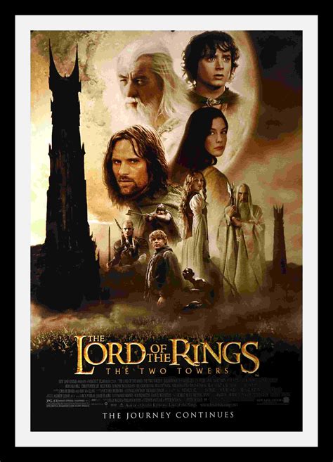
Movie posters often rely on display fonts to create a strong visual impact and convey the genre and tone of the film. For example:
- Star Wars: The iconic Star Wars logo uses a custom display font that has become synonymous with the franchise.
- The Grand Budapest Hotel: The poster for this film uses a vintage-style display font that complements its quirky and nostalgic theme.
2. Brand Logos

Many brands use display fonts in their logos to create a distinctive and memorable identity. Examples include:
- Coca-Cola: The Coca-Cola logo features a custom script display font that is instantly recognizable worldwide.
- Disney: The Disney logo uses a whimsical display font that reflects the magic and fantasy of its brand.
3. Editorial Design

Magazines and newspapers often use display fonts for their headlines to grab readers’ attention and set the tone for the articles. For example:
- Vogue: Vogue’s iconic logo uses a bold serif display font that exudes elegance and sophistication.
- The New York Times: The newspaper’s headlines often use a modern sans-serif display font that conveys authority and credibility.
Conclusion
Display fonts are an essential tool in the designer’s arsenal, offering a powerful way to create eye-catching titles that capture attention and convey the right message. By understanding the different types of display fonts and how to use them effectively, you can elevate your designs and make a lasting impression. Remember to consider the context, mood, and readability when choosing a display font, and don’t be afraid to experiment with different styles and pairings. With the right display font, your titles can truly shine and leave a lasting impact on your audience.
Q&A
Q: Can display fonts be used for body text?
A: Display fonts are not recommended for body text due to their elaborate designs, which can hinder readability at smaller sizes. They are best reserved for headlines, titles, and other large-scale applications.
Q: How many display fonts should I use in a single design?
A: It’s generally best to limit yourself to one or two display fonts per design to maintain a cohesive and balanced look. Using too many display fonts can create visual clutter and confuse the viewer.
Q: Where can I find high-quality display fonts?
A: There are many resources for finding high-quality display fonts, including Google Fonts, Adobe Fonts, and independent foundries like Hoefler & Co. and Fontspring. Always ensure that you have the proper licensing for any fonts you use in your projects.
