


Website banners play a crucial role in capturing the attention of visitors and conveying essential messages. The right font can elevate the impact of a banner, making it more visually appealing and effective in communicating the desired message. Choosing the appropriate fonts for website banners is essential for driving engagement, conveying brand identity, and guiding user behavior. This article explores the best practices for selecting fonts that are not only visually striking but also functional for website banners.
Fonts are a crucial part of website design, especially when it comes to banners. Banners are often the first thing users see when visiting a website, making them an essential element for leaving a lasting impression. The right font can help set the tone for the website and influence how users perceive the brand. Whether promoting a product, announcing an event, or providing important information, the font choice directly affects readability, aesthetics, and message delivery.
Readability is paramount in banners since they are designed to be seen quickly. Fonts that are difficult to read can lead to user frustration and reduced engagement. Effective fonts for banners should have clear letterforms that are easily discernible at various sizes. Avoid using overly ornate or complex fonts that can hinder readability.

The visual appeal of the banner is another key consideration. The font you choose must complement the overall design of the banner and website. It should harmonize with the brand’s identity and evoke the right emotions. A well-designed banner with the wrong font can appear unprofessional or inconsistent with the site’s tone.
Several factors need to be considered when selecting fonts for website banners. These include the type of message you are conveying, the audience you are targeting, and the overall design aesthetics of your website. Here are the main considerations:

There are several font styles that work particularly well for website banners. These fonts are versatile, visually striking, and easy to read at various sizes. Let’s explore some of the most effective font categories for banners:
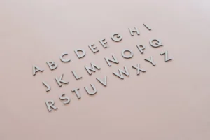
Sans-serif fonts are characterized by their clean, modern appearance. They lack the small lines or “serifs” at the ends of letter strokes, which makes them appear streamlined and easy to read. Sans-serif fonts are often used in banners because of their readability and contemporary look. Examples of popular sans-serif fonts for banners include:
Serif fonts have small lines or extensions at the ends of the letters, giving them a classic and traditional feel. These fonts are excellent for banners that need to convey authority, elegance, or a sense of history. Popular serif fonts for banners include:
Script fonts mimic the look of handwritten text and are often used to add a personal, creative touch to banners. However, they should be used sparingly, as they can sometimes sacrifice readability for aesthetic appeal. Here are some script fonts that work well in banners:
Display fonts are designed specifically for large-scale use, such as in headlines and banners. They are often more decorative or stylized than traditional fonts, making them perfect for grabbing attention. Popular display fonts for website banners include:

Using more than one font in a website banner can enhance its visual appeal and structure. However, pairing fonts requires careful consideration to avoid clashing styles or an unbalanced design. Here are some tips for successful font pairing in banners:
To maximize the effectiveness of fonts in website banners, there are a few best practices to follow:
The right fonts can make all the difference in the success of a website banner. They help convey messages quickly, enhance the aesthetic appeal, and guide the user’s attention. Whether you’re using sans-serif, serif, script, or display fonts, the key is to maintain readability, complement the overall design, and stay true to your brand’s identity. By following the best practices and considering font pairings, contrast, and hierarchy, you can create website banners that are not only visually appealing but also highly effective in driving engagement.
