

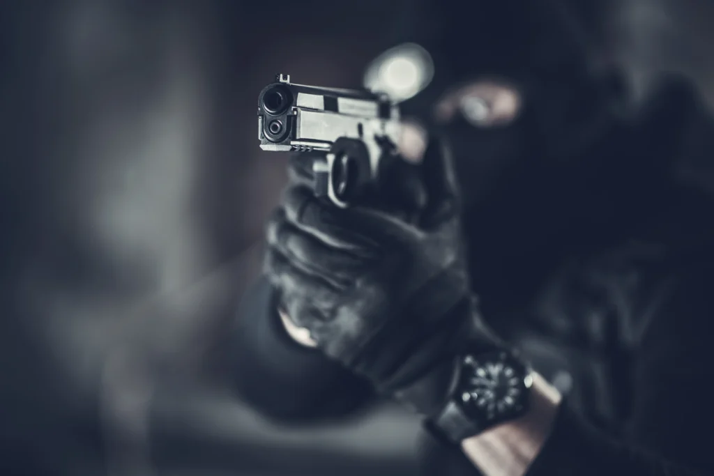
Fonts play a critical role in conveying the tone, style, and energy of a movie, particularly in action films, where bold visuals and captivating text draw in the audience. Whether it’s the gritty intensity of a high-speed chase or the futuristic feel of a dystopian battle, the fonts featured on action movie posters help to set the scene. In this article, we’ll delve into the fonts that have dominated action movie posters, highlighting the key typography choices that have made these designs so iconic.
Typography plays an essential role in all visual design, but when it comes to action movie posters, the choice of font can make or break the effectiveness of the poster. The fonts must not only complement the imagery but also evoke the emotions tied to the film’s genre. In action films, this often means selecting fonts that exude strength, movement, and intensity.
For action movie posters, the typography usually:
Sans-serif fonts have become a popular choice for action movie posters due to their clean, bold, and modern look. Their simplicity allows the design to emphasize power and efficiency, which aligns well with the fast-paced, high-octane nature of action films.
Some iconic action films that have used sans-serif fonts in their posters include:
Blocky, bold fonts are a staple in action movie posters. These fonts convey raw power and toughness, making them perfect for action films filled with explosions, fights, and high-stakes drama. The thick lines and large, imposing characters demand attention and communicate the scale of the action.
Examples of action films using bold and blocky fonts include:
Action movies often feature high-speed chases and intense movement, and typography can capture that dynamic energy. Fonts with angular, slanted, or italicized elements suggest motion, making them a common choice for films that emphasize speed or futuristic technology.
Key examples of films that use angular or slanted fonts to communicate motion include:
Futuristic action films often incorporate metallic or industrial-style fonts to match their advanced technology and dystopian settings. These fonts, which often appear shiny, rigid, or mechanical, work well for movies involving machinery, robots, or dystopian futures.
Some examples of metallic and industrial fonts in action films include:
In action movies that emphasize rawness or violence, grungy and distressed fonts can be an effective choice. These fonts are often rough around the edges, reflecting the chaos and intensity of the plot. The fonts’ imperfections highlight the grittiness of the movie’s theme.
Some notable examples of this style in action movie posters include:
While action movie posters typically feature bold and aggressive fonts, some films opt for a more minimalist approach to let the imagery take center stage. These fonts are usually understated and simple, providing a clean canvas that highlights the action in the visuals.
Examples include:
Some action movie posters use a combination of fonts to create a more complex or layered effect. This approach can draw attention to specific elements of the title, tagline, or credits while maintaining an overall cohesive design. Often, the primary title uses a bold, impactful font, while a secondary font may be more subtle for supporting text.
Examples of effective font combinations include:
Some action movies have become so iconic that their fonts are instantly recognizable, creating a lasting visual identity that resonates with audiences long after the film’s release. These fonts often become synonymous with the film itself, contributing to the branding and cultural impact of the franchise.
Examples of iconic action movie fonts include:
Fonts are more than just design elements in movie posters—they are a crucial part of a movie’s branding. A well-chosen font can become so closely associated with the film that it becomes an intrinsic part of its identity. In many cases, action films with long-standing franchises continue to use the same font style for consistency and recognizability, allowing the font itself to become part of the marketing.
Consider the following examples:
As technology and design trends evolve, so too do the fonts used in action movie posters. Today, designers are often pushing the boundaries of typography by experimenting with new font styles, customization, and layering techniques to create striking visuals that resonate with modern audiences. There is a growing trend toward combining typography with visual effects, such as textures, lighting, and three-dimensionality, giving fonts more depth and impact.
Notable trends in modern action movie fonts include:
Typography is an integral part of action movie posters, serving as more than just a tool for delivering information. It acts as a visual representation of the film’s tone, theme, and genre. From the bold blocky fonts that emphasize power and strength to the sleek, angular designs that convey motion, fonts in action movie posters are carefully chosen to enhance the overall impact of the design.
As design trends continue to evolve, the fonts used in action movie posters will undoubtedly adapt, but their importance in setting the tone and attracting audiences will remain constant. Whether it’s the high-octane energy of a car chase or the futuristic appeal of a dystopian world, the right font can make all the difference in capturing the essence of the movie and leaving a lasting impression on viewers.
