

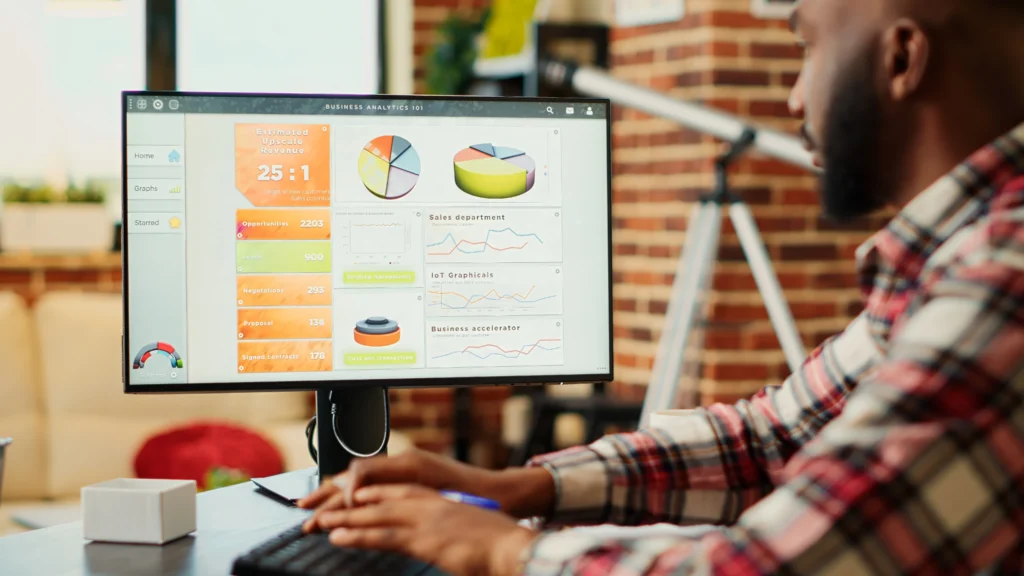
Data visualization has become an essential tool for communicating complex information in a clear and engaging way. Whether it’s charts, graphs, or infographics, the effectiveness of a data visualization depends not only on the design elements like colors, shapes, and layout but also on typography. Fonts play a crucial role in enhancing readability, guiding the viewer’s attention, and ensuring that the data is presented in a digestible format. In this article, we’ll explore the best fonts for data visualization design and how to choose the right typeface for your visual projects.
Typography is not just about choosing a font that looks nice. In data visualization, the font you select affects the clarity of the data being communicated, as well as the viewer’s ability to process and understand the information. The right font can make a visualization feel professional and organized, while the wrong font can make it look cluttered or difficult to read. Here are some reasons why typography is so important in data visualization:
Choosing the right font for your data visualization isn’t always straightforward. Several factors should guide your decision to ensure that your chosen typeface enhances the overall design and communication of your data. Below are the key considerations to keep in mind when selecting fonts:
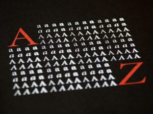
Readability is perhaps the most crucial factor in data visualization design. The font you choose should be legible at different sizes, especially for elements like axis labels, legends, and titles. Sans-serif fonts are often preferred for digital displays due to their clean, simple lines that make them easier to read on screens. Serif fonts, on the other hand, are better suited for print but can also work in digital designs if used carefully.
The weight and style of a font influence its visibility and impact. Bold fonts can be used to highlight important data points, while lighter weights are often better for secondary information. It’s important to strike a balance—using too many bold fonts can overwhelm the viewer, while too many light fonts can make the text hard to read. A combination of weights (e.g., bold for headings and regular for body text) creates a nice contrast and improves the overall legibility of the data visualization.
The size of the font is directly related to how easy it is to read. In data visualization, large fonts are typically used for titles and key data points, while smaller fonts are used for supporting details like axis labels and annotations. It’s essential to ensure that the font size is scalable so that even when zoomed in or out, the text remains legible.
In some data visualizations, you may need to use more than one font. When pairing fonts, choose complementary styles that work well together. For instance, pairing a bold sans-serif font with a light serif font can create an appealing contrast without making the design feel too busy. Make sure the fonts don’t clash, and maintain visual harmony throughout the project.
Now that we understand the key considerations in choosing fonts, let’s take a look at some of the best fonts for data visualization design. These fonts are widely appreciated for their readability, versatility, and overall effectiveness in presenting complex data clearly and professionally:
Helvetica is a classic and widely used sans-serif font that is known for its simplicity and clean lines. It is highly legible, making it perfect for data visualization. Its neutral design allows it to work in a variety of contexts, from financial charts to infographics. Helvetica is versatile and can be used for both titles and body text.
Roboto is another popular sans-serif font that combines modernity with a sense of warmth. It’s designed to be highly readable on both screens and printed materials, making it a great choice for digital data visualizations. The font comes in a wide range of weights, which makes it easy to create a visual hierarchy.
Lato is a sans-serif font known for its clean and friendly appearance. It is often used in web design and data visualization for its excellent readability, even at small sizes. Lato is great for infographics and dashboards, as it ensures that data is easy to process without overwhelming the viewer.
Open Sans is another highly readable sans-serif font that is frequently used in data visualization design. Its clean lines and open letterforms make it a great choice for displaying large amounts of data. Open Sans is particularly well-suited for dashboards, graphs, and charts where clarity is paramount.
Source Sans Pro is an open-source font designed for clarity and ease of reading. It’s an excellent choice for data visualizations that need to be accessible across multiple platforms. With its modern design, Source Sans Pro performs well both on the web and in print, making it a versatile option for all kinds of data visualizations.
Font selection is just one part of the equation. To make your data visualization truly stand out, you need to think about how the fonts will work with your color schemes. A harmonious pairing of typography and colors will increase the visual appeal and make your data easier to interpret. For example:
Choosing the right font for your data visualization design is essential for communicating your data effectively. The font you select should be easy to read, complement the data, and create a clear visual hierarchy. Sans-serif fonts like Helvetica, Roboto, and Open Sans are often the best choices due to their readability and versatility. When paired with an effective color scheme, these fonts can elevate your data visualization, making it more accessible, engaging, and professional. By keeping legibility, font weight, and size in mind, you can ensure that your data visualizations are not only aesthetically pleasing but also informative and easy to understand.
