


In today’s fast-paced business and creative environments, creating presentation slides that captivate your audience is essential. While content is crucial, the fonts you choose play an equally important role in delivering a clear, effective, and engaging message. Selecting the right fonts can elevate your presentation, making it more visually appealing and professional. In this article, we will explore the best fonts for modern presentation slides, along with tips on how to effectively pair and use them to make a lasting impression.
Fonts are more than just letters; they are powerful tools that communicate tone, personality, and professionalism. A well-chosen font enhances readability and can set the mood for your presentation, while a poor choice can detract from your message. Here are a few reasons why fonts are essential in modern presentations:
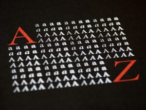
When it comes to fonts, there are several broad categories that work exceptionally well for presentations. Let’s dive into the most popular font types that offer both functionality and aesthetic appeal.
Sans-serif fonts are a go-to choice for modern presentations due to their clean and minimalistic design. Their lack of decorative elements makes them highly readable, especially on digital screens. Examples of popular sans-serif fonts include:
Serif fonts are characterized by the small lines or “serifs” at the end of each letter stroke. They are traditionally associated with formal, authoritative, and academic presentations. While not as common in digital-first presentations, serif fonts can be used effectively for titles or important points where you want to convey a sense of professionalism or sophistication. Notable serif fonts include:
Display fonts are highly stylized fonts that are intended for use in headings or titles rather than body text. These fonts can inject creativity and personality into your slides, but they should be used sparingly to avoid overwhelming the audience. Some common display fonts include:
Monospaced fonts give every letter the same width, making them ideal for technical or code-based presentations. They evoke a sense of precision and are often used in programming slides. Popular monospaced fonts include:
Choosing the right font is just the beginning. Here are some best practices to ensure that your font usage enhances your presentation:
Stick to two or three font styles throughout your presentation. Using too many fonts can make your slides look cluttered and unprofessional. For example, you can use one font for headings, one for subheadings, and another for body text.
Your font size should be large enough to read from a distance, typically around 24pt or larger. Make sure your text contrasts well with the background for optimal readability.
Maintain consistency in your font choices across all slides. Inconsistent font styles can confuse the audience and detract from your presentation’s professionalism.
Font pairing is the art of combining two or more fonts that complement each other. A sans-serif font for headings paired with a serif font for body text is a popular and visually appealing combination.
Avoid excessive use of bold, italics, or underlining. These styles should be reserved for emphasis and should not be overused, as they can make your text hard to read and visually overwhelming.
Font pairing is a crucial element of presentation design, and the right combinations can make your slides more dynamic and engaging. Here are a few popular pairings to consider:
Fonts are an often-overlooked yet critical aspect of creating an impactful presentation. By choosing the right fonts—whether it’s a clean sans-serif for readability, a serif for formality, or a display font for creativity—you can elevate the effectiveness and professionalism of your slides. Remember to prioritize readability, maintain consistency, and pair fonts thoughtfully to ensure your message resonates with your audience. Armed with the tips and font recommendations from this guide, you’re ready to create modern presentation slides that stand out.
