

Superhero movies have become a dominant force in modern cinema, captivating audiences with their iconic characters, epic battles, and compelling narratives. One of the key visual elements that help define these movies is the design of their logos, particularly the fonts used. Fonts in superhero movie logos are carefully selected to represent the tone, style, and personality of the film and its characters. In this article, we’ll explore the significance of fonts in superhero movie logos, examine examples from well-known franchises, and discuss the impact they have on branding and audience perception.
Fonts are an essential component of visual branding, and this is especially true for superhero movies. The font used in a superhero movie logo helps communicate key elements such as the tone of the film, the personality of the hero, and the overall aesthetic of the movie universe. Well-designed fonts can enhance recognition and memorability, making the logo an integral part of the movie’s identity.
Fonts in superhero movie logos serve multiple purposes:
Superhero movie logos often feature custom-designed fonts that become synonymous with the characters they represent. Here, we’ll take a look at some of the most iconic superhero movie logos and the fonts that helped define them.
The “Superman” logo is one of the most recognizable symbols in the world of superhero movies. The bold, uppercase serif font used in early Superman movie logos exudes strength and heroism, aligning with the character’s role as a symbol of hope and justice. Over time, the font has evolved but retained its iconic style, emphasizing Superman’s enduring legacy.
In contrast to Superman, the “Batman” logo typically uses dark, gothic fonts that reflect the dark and brooding nature of the character. The fonts in various Batman movies have often featured sharp, angular designs with a strong emphasis on shadows and contrasts, symbolizing the duality of Bruce Wayne’s identity and Gotham City’s gritty atmosphere.
Spider-Man’s logo has undergone several iterations across different film adaptations. The fonts used in the “Spider-Man” logos typically feature curved lines and playful, web-like designs that emphasize the character’s agility, youthfulness, and light-hearted persona. These fonts often complement the web-slinger’s colorful costume and fast-paced action scenes.
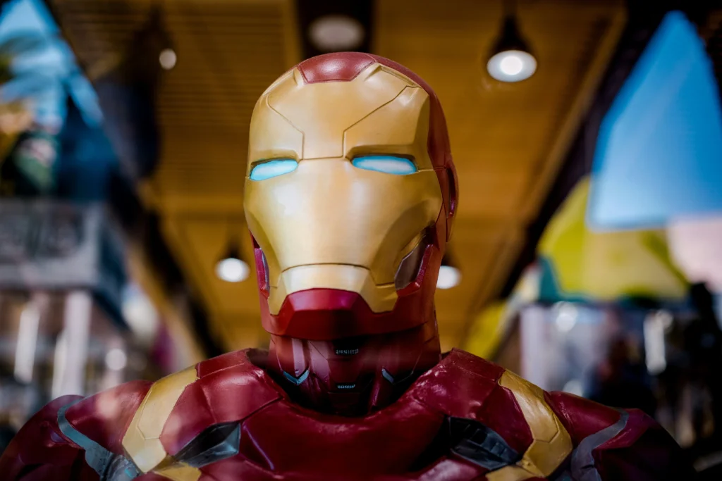
The font used in “The Avengers” logo is bold, modern, and futuristic, reflecting the film’s ensemble of heroes from different worlds and backgrounds. The font’s sleek lines and metallic feel communicate a sense of unity and power, which aligns with the film’s themes of teamwork and saving the world from catastrophic threats.
Superhero movie logos do more than just display the name of the film—they communicate the themes, tone, and energy of the story. Here are some common ways fonts in superhero logos achieve this:
As superhero movies have evolved over the years, so have the fonts used in their logos. The early superhero films of the 1970s and 1980s often featured more traditional serif or sans-serif fonts, reflecting the simplicity of comic book designs at the time. As film technology and design trends have advanced, so too have the logos, incorporating more dynamic and sophisticated typography to match the high-budget, blockbuster nature of modern superhero films.
The typography styles in superhero logos can be grouped by decades:
In superhero movie logos, fonts are either custom-designed specifically for the movie or adapted from pre-existing typefaces. Custom fonts offer more flexibility in conveying a unique brand identity, but pre-existing fonts can provide familiarity and consistency across various media.
Fonts play an undeniably important role in shaping the identity of superhero movies. From bold and powerful to sleek and futuristic, the typography used in superhero movie logos can define the tone of the film, reflect the character’s traits, and build a strong visual connection with audiences. As superhero films continue to evolve, so too will the fonts that bring these larger-than-life heroes to the big screen.
As we’ve explored, fonts in superhero movie logos go beyond mere aesthetics; they are a crucial part of visual storytelling, helping to establish and reinforce a film’s identity. Whether through custom-designed fonts that perfectly capture a hero’s essence or pre-existing fonts that evoke familiarity, typography remains a powerful tool in superhero branding. As we move forward into a new era of superhero films, it will be exciting to see how fonts continue to evolve and define the next generation of cinematic heroes.
