

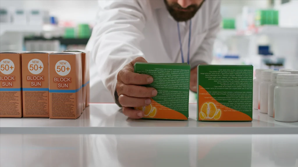
Fonts play a crucial role in modern packaging design, directly influencing how consumers perceive a product and its brand. With the competitive nature of the marketplace, packaging must not only protect the product but also capture the attention of potential buyers, making typography an essential design element. Choosing the right font can elevate the packaging design, communicating the brand’s values, personality, and the product’s qualities.
In this article, we will explore the role of typography in packaging design, look at various font categories, and examine case studies to show how the right font choices can contribute to the success of a product in the market.
Typography has long been used as a key tool in brand communication, and packaging design is no exception. A well-chosen font can create a strong visual impact, increase brand recognition, and help consumers make an instant connection with the product.
Brands often leverage typography in packaging design to:
There are several font categories commonly used in packaging design, each bringing a different mood and effect to the overall aesthetic of the product. Let’s explore the most popular categories and how they contribute to modern packaging design.
Serif fonts are known for their small decorative strokes at the ends of letterforms, giving them a classic and sophisticated feel. Brands that use serif fonts in their packaging often aim to convey a sense of heritage, trust, and high-quality craftsmanship.
Serif fonts are ideal for:
Case study: Burberry uses a refined serif font in its packaging, aligning with its reputation for timeless elegance and British luxury.
Sans-serif fonts, characterized by their clean lines and absence of decorative strokes, are highly versatile and modern. They are frequently used in packaging for their readability and sleek, minimalist appearance.
Sans-serif fonts are ideal for:
Case study: Apple uses a clean, sans-serif font for its product packaging, reinforcing its image of modernity, simplicity, and innovation.
Script fonts mimic handwriting, adding a personal and artistic touch to packaging designs. These fonts can evoke a sense of elegance, playfulness, or nostalgia, depending on the style of the script.
Script fonts are ideal for:
Case study: Ben & Jerry’s uses a playful script font in its packaging, which aligns with the brand’s fun, quirky, and approachable personality.
Font hierarchy refers to the arrangement and emphasis of different text elements on the packaging to guide the viewer’s eye. Establishing a clear font hierarchy ensures that key information is conveyed effectively and in the right order of importance.
In packaging design, font hierarchy can be applied by:
Case study: Coca-Cola uses a combination of font sizes and styles to highlight its brand name and tagline, creating a visually dynamic and effective packaging design.
Fonts have a psychological impact on consumers, influencing their emotions, perceptions, and purchasing decisions. Understanding the psychology behind fonts can help brands create packaging that resonates with their target audience.
Key psychological effects of fonts include:
Case study: Innocent Drinks uses a friendly, rounded sans-serif font that aligns with its brand values of health, fun, and sustainability.
Many successful packaging designs combine multiple fonts to create a cohesive and visually appealing look. Pairing fonts with contrasting styles can create visual interest and improve the overall communication of the brand message.
When combining fonts in packaging design, it’s important to:
Case study: Toblerone uses a combination of bold serif fonts for the product name and a clean sans-serif font for additional information, creating a balanced and effective design.
Typography trends are constantly evolving, and staying ahead of the curve can help brands maintain a modern and relevant aesthetic. In 2025, several trends are emerging in packaging typography that are shaping the design landscape.
Key typography trends for packaging in 2025 include:
These trends reflect consumers’ desire for bold, easy-to-understand designs while also allowing room for artistic expression and brand differentiation.
Fonts are a powerful tool in modern packaging design, offering endless possibilities to communicate a brand’s personality, values, and product qualities. By selecting fonts that resonate with target audiences, emphasize key information, and complement the overall design, brands can create packaging that stands out and drives consumer engagement.
Whether using a classic serif font for a luxury product, a bold sans-serif for a tech item, or a playful script for a creative brand, typography can make or break the success of a packaging design. As trends continue to evolve, staying informed and making thoughtful font choices will ensure that your packaging design remains impactful, relevant, and effective in today’s competitive market.
