

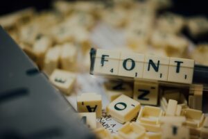
DC Comics films have had a significant cultural impact over the years, not only through their storylines and characters but also through their visual identity. Fonts play a critical role in creating the right atmosphere, mood, and tone for these films. From the iconic logos to the opening credits and promotional materials, font choices in DC Comics films are often carefully selected to enhance the overall aesthetic of the franchise. This article will explore the most prominent fonts used in various DC Comics films, delving into their significance, impact, and how they contribute to the cinematic experience.
Fonts are an essential part of a film’s branding, helping to establish a visual identity that resonates with audiences. In DC Comics films, fonts often serve several purposes:
The choice of font can make or break the design of a superhero film, as it must evoke the right emotions and appeal to the target audience. Let’s examine the specific fonts used in some of the most iconic DC Comics films and their significance.
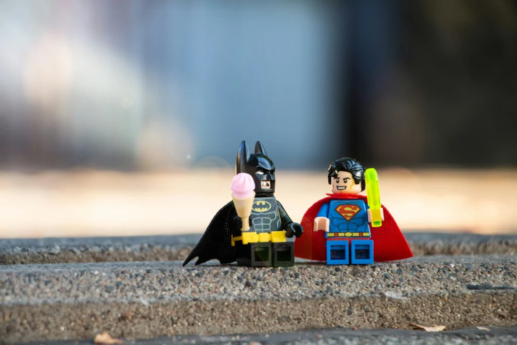
One of the most recognizable fonts in DC Comics films is the one associated with Superman. The “Superman” font, also known as “Futura Display,” has become synonymous with the character since its introduction in the 1978 film starring Christopher Reeve.
The bold, uppercase typeface is clean and futuristic, reflecting Superman’s role as an iconic symbol of hope and justice. The font is used not only in the title sequences but also across merchandise, posters, and branding. Its simplicity allows it to stand out, representing Superman’s no-nonsense attitude and heroic persona.
“Futura Display” was chosen for Superman because it reflects the timeless and futuristic qualities of the character. Its geometric shapes and sharp edges make it perfect for a hero who is both modern and classic. This font has continued to be used in many Superman adaptations, from animated series to later films such as “Man of Steel” (2013).
Batman films, especially those directed by Tim Burton and Christopher Nolan, have featured fonts that evoke the dark, gritty nature of Gotham City. The most notable font used in the Batman films is “Gotham Bold,” which was used in “The Dark Knight” trilogy. However, earlier Batman films, such as Burton’s “Batman” (1989), employed more gothic fonts to match the film’s darker, more stylized tone.
In Tim Burton’s Batman films, the fonts often featured gothic and serif elements, contributing to the overall eerie, noir atmosphere of Gotham. The fonts used in the marketing materials and opening credits had an old-world feel, reflecting the mysterious and enigmatic nature of Batman as a vigilante figure.
In contrast, Christopher Nolan’s Batman trilogy adopted a more modern and sleek approach. “Gotham Bold” was the font of choice, mirroring the more realistic and grounded take on the character. Its clean lines and no-frills design reflect Batman’s efficiency and determination. The font has been used extensively in promotional materials, posters, and logos, becoming an integral part of the franchise’s branding.
Wonder Woman’s films have adopted fonts that blend elegance with strength, mirroring the character’s dual nature as both a warrior and a princess. The 2017 film “Wonder Woman” utilized a custom font inspired by ancient Greek typography, which adds a historical and mythical element to the branding.
The custom font used in the “Wonder Woman” logo and promotional materials draws inspiration from ancient Greek lettering, reflecting the character’s origins in Greek mythology. The use of sharp, angular lines and serif features gives the font a timeless, regal quality while still conveying power and authority.
The elegant yet bold font choices in “Wonder Woman” perfectly encapsulate the film’s themes of heroism, bravery, and femininity. The font’s clean and structured design reflects Wonder Woman’s disciplined nature, while its historical influences honor her mythological roots.
In “Justice League” (2017), the fonts used needed to unify the different heroes while still allowing each to maintain their unique identity. The film’s logo features a custom sans-serif typeface that is bold and strong, symbolizing the coming together of powerful individuals to form a united team.
The font used in “Justice League” was designed to be neutral yet impactful, representing the unity of the team. It avoids being too stylized to ensure that it doesn’t detract from the logos of the individual heroes. The use of a blocky, bold typeface adds to the overall sense of strength and teamwork.
While the “Justice League” font unifies the team, each hero’s branding maintains its distinct style. For instance, Superman continues to use “Futura Display,” while Batman retains his “Gotham Bold” font. This balance allows the characters to shine individually while also contributing to the collective identity of the Justice League.
Aquaman’s 2018 film adopted a font that evokes the character’s connection to the ocean. The “Aquaman” logo features a custom typeface with a flowing, wave-like design that reflects the fluidity and power of water. The use of sleek, rounded edges in the font gives it a modern, aquatic feel, perfectly capturing the essence of the underwater hero.
The font used in “Aquaman” is not just a reflection of the ocean but also symbolizes the strength and majesty of the character. The sleek curves and smooth lines of the font mirror the natural flow of water, while the boldness of the design conveys Aquaman’s power as a hero. This font successfully bridges the gap between nature and heroism, making it an ideal choice for the film.
In contrast to the more serious tones of other DC films, “Shazam!” (2019) adopted a fun and whimsical approach to its font design. The “Shazam!” logo features a bold, comic-book-inspired typeface with lightning bolt elements, reflecting the film’s lighthearted and humorous tone.
The font used in “Shazam!” is reminiscent of classic comic book lettering, paying homage to the character’s roots in the Golden Age of comics. The bold, playful design captures the youthful energy of the protagonist, a teenager who transforms into a superhero. The inclusion of lightning bolt motifs within the font adds a dynamic and energetic feel, perfectly matching the film’s theme of superpowered fun.
One of the key elements in the branding of DC Comics films is font consistency. Each superhero has their own distinct visual identity, and the fonts used in their respective films help to reinforce this identity. By maintaining consistency in font choices across films, DC ensures that each character remains instantly recognizable and retains their unique style.
Consistency in font choices also allows for a cohesive visual experience, particularly in crossover films like “Justice League,” where multiple characters from different franchises appear together.
The fonts used in DC Comics films play a crucial role in shaping the visual identity of the characters and the films themselves. From the timeless appeal of Superman’s “Futura Display” to the dark and modern “Gotham Bold” of Batman, each font choice reflects the unique characteristics of the heroes and their stories. Fonts not only enhance the aesthetic appeal of the films but also contribute to the overall storytelling experience. By carefully selecting fonts that align with the tone and themes of each film, DC Comics has created a lasting visual legacy that continues to captivate audiences around the world.
