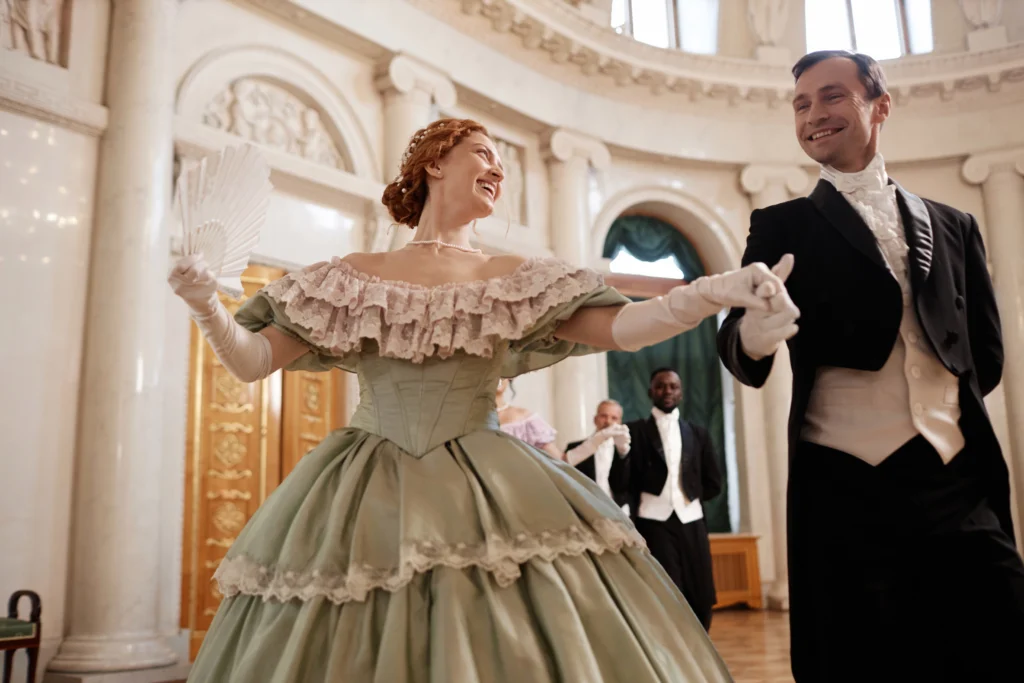
Historical dramas are beloved for their ability to transport viewers back to different eras, evoking the essence of time periods with stunning costumes, elaborate sets, and compelling narratives. One often overlooked element that contributes significantly to the authenticity of these productions is the use of fonts. Fonts are more than just a design element; they set the tone and atmosphere of a story, reflecting the era in which the drama is set. In this article, we will delve into the fonts commonly used in historical dramas, exploring their significance and providing examples from iconic productions.

Fonts used in historical dramas must align with the cultural and historical context of the time period being portrayed. This helps create a sense of immersion for the audience, reinforcing the visual and emotional impact of the story. The right font can transport the viewer to ancient empires, medieval kingdoms, or the opulent courts of the Renaissance.
Typography serves several functions in historical dramas, including:
Serif fonts are a popular choice in historical dramas due to their traditional, formal appearance. Serif fonts, characterized by the small lines or strokes at the end of larger strokes, are often associated with old printing methods, giving them an authentic, classical look. These fonts are commonly used in titles, intertitles, and even within scenes themselves, such as on signage or documents that appear in the story.
Some of the most commonly used serif fonts in historical dramas include:
For example, the opening titles of the popular series The Tudors use a serif font that mirrors the style of early modern European texts, adding to the show’s authenticity.
Blackletter fonts, also known as Gothic script, are used to reflect periods from the Middle Ages, particularly in dramas set in medieval Europe. The font style, with its dense, ornate strokes, was commonly used in manuscripts during the medieval period. These fonts evoke a sense of formality and antiquity, making them ideal for historical dramas set during these centuries.
Notable historical dramas that have used blackletter fonts include:
Blackletter fonts provide an imposing and majestic atmosphere, perfectly suited for epic tales of kings, queens, and battles.
Script fonts are often used in historical dramas that focus on aristocratic or romantic settings, particularly in the Regency and Renaissance periods. These fonts resemble cursive handwriting, conveying elegance, sophistication, and personal touch. They are often used in letters, invitations, and other personal correspondence depicted in the drama.
Some notable examples of script fonts in historical dramas include:
These fonts add a touch of personal flair and opulence, making them ideal for courtly and upper-class settings.
While sans-serif fonts are more commonly associated with modern and minimalist design, they can also be effectively used in historical dramas. Sans-serif fonts are clean and legible, making them suitable for title sequences and on-screen text in dramas set in more contemporary historical periods, such as the 19th or 20th centuries.
Examples of sans-serif fonts in historical dramas include:
Although simple, sans-serif fonts are versatile and can be adapted to fit various historical settings.
Some historical dramas go a step further by commissioning custom fonts to create a unique visual identity that aligns with the era being portrayed. Custom fonts allow for greater creative control and the ability to incorporate specific elements of a historical period into the typography.
For instance:
Custom fonts are an excellent way for filmmakers and designers to differentiate their productions and create a memorable brand identity for their historical dramas.
Subtitles are a critical component of many historical dramas, particularly those set in non-English-speaking regions or featuring multiple languages. The choice of font for subtitles is crucial, as it needs to balance readability with the overall aesthetic of the show. Fonts for subtitles are typically simple and clean, ensuring that the text is easy to read without distracting from the visuals.
Some commonly used fonts for subtitles in historical dramas include:
These sans-serif fonts are favored for their clarity and neutrality, making them a practical choice for subtitle text across different genres and time periods.
In historical dramas, fonts play an essential role in creating an immersive and authentic experience for viewers. From serif fonts that evoke the classical elegance of past centuries to custom fonts designed specifically for a show, typography helps to shape the visual language of a production. By carefully selecting fonts that align with the historical period and aesthetic of the drama, filmmakers can enhance the storytelling and transport audiences to different eras with greater impact.
As more historical dramas continue to captivate audiences around the world, the careful consideration of typography will remain a vital aspect of the design process. Whether it’s the ornate curves of blackletter fonts in medieval settings or the sleek minimalism of sans-serif fonts in early 20th-century stories, the fonts used in historical dramas are more than just text—they are a reflection of the time, place, and mood that shape the narrative.
Ultimately, fonts in historical dramas not only contribute to the visual style but also serve as subtle yet powerful tools that communicate the essence of the era to the audience. As we move forward, we can expect even more innovative and thoughtful uses of typography in period storytelling, allowing both creators and viewers to enjoy a richer, more immersive historical experience.