

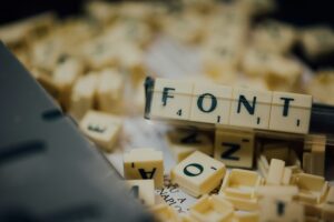
Pixar Animation Studios is known for its masterful storytelling, innovative animation, and breathtaking visuals. But beyond the colorful characters and intricate worlds, there’s a subtler element that plays a key role in shaping the atmosphere and feel of its films—fonts. From title sequences to in-film text, fonts help convey the tone and narrative, working in harmony with the animation to tell the story in a visually cohesive way. In this article, we’ll dive into the various fonts used in Pixar animations, their significance, and how they contribute to the overall magic of the films.
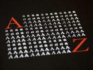
Fonts in animation, especially in Pixar films, do more than just communicate words; they evoke emotions, create personality, and blend with the visual storytelling. A font can signal a movie’s genre, era, or even character traits, helping the audience subconsciously align with the narrative’s mood. The choice of typeface can enhance the immersion by connecting viewers more deeply with the story’s environment, from whimsical fairy tales to futuristic adventures.
Pixar has a rich history of selecting fonts that perfectly complement its storytelling style. Here’s a breakdown of font choices in some of Pixar’s most iconic films:
Pixar often goes beyond off-the-shelf typefaces by creating custom fonts for its films. Custom typography allows Pixar to tailor the design precisely to the tone of the story, giving the film a unique identity. For example, the font in Coco was specially designed to reflect the Mexican heritage central to the film’s narrative. The letterforms are inspired by traditional Mexican sign painting, with decorative serifs and bold strokes, contributing to the film’s cultural authenticity.
Custom fonts not only give Pixar movies a distinct visual signature but also play a significant role in world-building. Consider Wall-E, where the futuristic world is enhanced by the use of sleek, mechanical fonts that emphasize the tech-heavy, dystopian future. Similarly, in Ratatouille, the Parisian setting is enriched by the use of elegant and stylish fonts that reflect French signage, food menus, and art.

Title sequences and end credits are often places where fonts take center stage in Pixar films. The typeface used in these sequences sets the mood for what’s to come or wraps up the story in a visually cohesive way. For instance, the closing credits of The Incredibles use a mix of dynamic fonts and graphics, echoing the action-packed nature of the movie. Meanwhile, the end credits in Cars feature bold, racing-inspired typography that reflects the high-speed thrills of the film.
In some films, the fonts themselves are animated, adding a dynamic visual layer to the storytelling. In Inside Out, for example, the title font appears to shift and move, mimicking the emotional chaos that is central to the movie’s plot. This playful use of animated type adds to the visual interest and engages the audience right from the start.
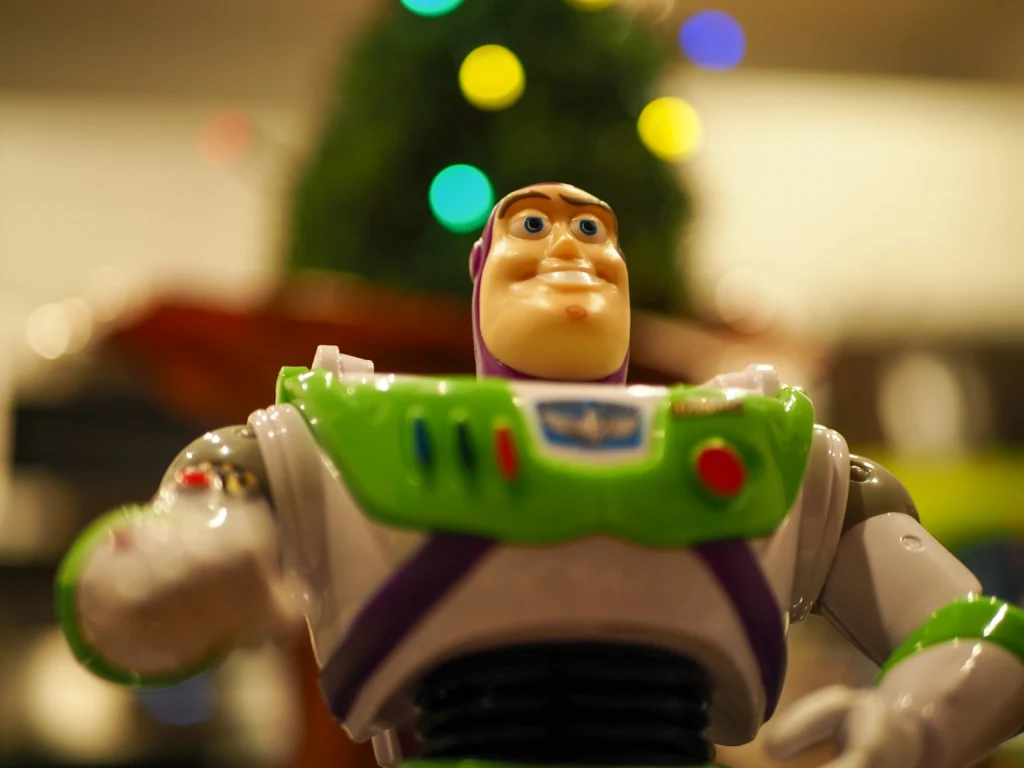
Fonts can also reflect the personalities of individual characters within a Pixar film. For instance, the typeface used for Buzz Lightyear’s packaging in Toy Story is bold and futuristic, aligning with his space ranger persona. On the other hand, Woody’s packaging font is more traditional, reminiscent of classic Western film posters, highlighting his old-fashioned, cowboy charm.
In Pixar films, fonts can also evolve alongside character development. A prime example is Ratatouille, where the menus and signage throughout the movie reflect the growth of the protagonist, Remy. The early, rough fonts in the film give way to more polished, elegant fonts as Remy becomes a more refined chef, symbolizing his personal transformation.
One of the reasons Pixar’s font choices resonate so deeply with audiences is their ability to evoke nostalgia and emotion. Whether it’s the retro typography of The Incredibles or the handwritten, sketch-like fonts in Up, these typefaces bring a sense of familiarity and emotional connection. The fonts often align with cultural or historical references that evoke specific feelings, creating a deeper bond with the story and characters.
As technology continues to evolve, so too does Pixar’s use of fonts. With advances in digital typography, Pixar is able to experiment with new ways of integrating fonts into their animations. For example, virtual reality (VR) or augmented reality (AR) could offer fresh opportunities for dynamic and immersive type treatments. The future may bring even more interactive and responsive fonts that change based on the viewer’s perspective or the unfolding storyline.
Fonts are an essential part of Pixar’s visual storytelling, enhancing everything from character development to world-building. The thoughtful and often playful use of typography helps immerse the audience in the film’s atmosphere, while also contributing to the emotional impact of the story. As Pixar continues to push the boundaries of animation, it will be fascinating to see how its use of fonts evolves in future projects. Whether through custom typefaces or animated letters, fonts will always play a vital role in bringing Pixar’s beloved stories to life.
