

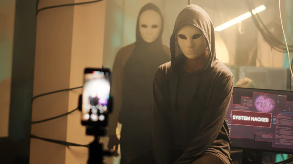
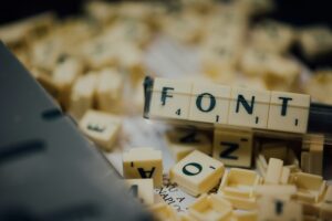
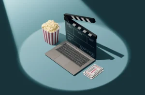
Thriller movie trailers often evoke feelings of tension, suspense, and excitement. The fonts used in these trailers play a crucial role in setting the mood and tone, conveying the right atmosphere even before a word is spoken or a scene is shown. In this article, we’ll explore the types of fonts used in thriller movie trailers, how they enhance the genre’s distinct mood, and provide examples that showcase these fonts in action.
Fonts are more than just letters on a screen; they are a key design element that can influence how a viewer perceives a film. In thriller trailers, where suspense and psychological tension are paramount, fonts help to enhance the narrative. A well-chosen font can subtly hint at the genre, build anticipation, and leave a lasting impression on the viewer.
Here are some reasons why fonts matter in thriller movie trailers:
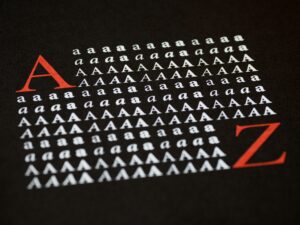
The fonts used in thriller trailers often share a few key characteristics. These features are carefully chosen to evoke the right emotions, whether it’s fear, suspense, or intrigue. Let’s break down the primary characteristics:
Over the years, certain fonts have become synonymous with the thriller genre. Let’s look at a few iconic examples that have been used in well-known thriller movie trailers:
Trajan is one of the most widely used fonts in movie posters and trailers across genres, including thrillers. Its elegant and timeless design creates a sense of importance and drama, making it an ideal choice for thrillers that want to convey a sense of gravitas.
Example: Trajan has been used in the trailers for films like Se7en (1995) and The Silence of the Lambs (1991).
Helvetica Neue is a versatile sans-serif font that is commonly used in thriller trailers, especially those with a modern or tech-centric theme. Its clean, no-nonsense appearance helps to create tension and focus, which is crucial in building suspense in trailers.
Example: Helvetica Neue has been featured in trailers for movies like Gone Girl (2014) and Prisoners (2013).
Bebas Neue is known for its tall, condensed letterforms and modern style. This makes it a popular choice for thriller trailers, where the goal is to grab the viewer’s attention quickly and deliver information in a bold, impactful way.
Example: Bebas Neue was used in the trailer for The Girl with the Dragon Tattoo (2011).
Avenir is a geometric sans-serif typeface that offers a contemporary look. It is often used in thriller trailers that aim for a clean, modern aesthetic while maintaining a sense of intrigue. Its smooth curves and straight lines create a balanced and professional appearance, perfect for high-budget thrillers.
Example: Avenir was prominently featured in the trailer for Inception (2010).
While fonts are crucial, the color schemes and font pairings used in thriller trailers also play a significant role in creating an immersive experience for the audience. The use of dark, moody tones combined with high-contrast fonts can make the text more readable and effective in building tension.
Some key principles of color and font pairing in thriller trailers include:
The fonts used in thriller trailers work hand in hand with other elements like sound design, editing, and cinematography to create a gripping experience. Here are a few ways fonts enhance the suspense in thriller trailers:
Here are some famous thriller movie trailers that have used fonts effectively to enhance suspense and deliver a lasting impact:
In recent years, many thriller trailers have begun using custom fonts created specifically for the film. These custom typographies help distinguish the movie from others in the genre and provide a unique visual signature that reflects the film’s themes. For example, the font used in the Joker (2019) trailer is a custom design that perfectly matches the movie’s unsettling tone and character-driven narrative.
Creating a custom font for a thriller trailer requires a deep understanding of the film’s themes, tone, and style. The font must align with the narrative and evoke the right emotions while remaining legible and functional in a fast-paced trailer environment.
As technology advances, we are likely to see more innovative uses of fonts in thriller trailers. Motion typography, where fonts are animated or interact with the visuals, is becoming increasingly popular in modern trailers. This trend allows fonts to become part of the storytelling process, moving beyond static text to dynamic, evolving elements.
Furthermore, as filmmakers continue to experiment with virtual reality (VR) and augmented reality (AR) experiences, fonts in thriller trailers may become even more immersive. Imagine watching a trailer where the text follows your gaze or interacts with your environment, amplifying the suspense and tension in entirely new ways.
In conclusion, fonts play an integral role in thriller movie trailers. They are silent storytellers, conveying the mood, tone, and intensity of the film even before the first scene is revealed. From bold, heavy lettering to sleek, modern typefaces, fonts help build anticipation and immerse the audience in the psychological tension that defines the thriller genre.
Whether it’s a classic serif font like Trajan or a custom-designed typeface for a particular film, the right font choice can make all the difference in how a thriller trailer is perceived. As technology continues to evolve, we can expect to see even more creative and innovative uses of fonts in the world of thriller cinema.
By understanding the importance of typography in these trailers, designers and filmmakers can create more effective and engaging promotional materials that captivate audiences and set the stage for the suspenseful experience that awaits in the full film.
