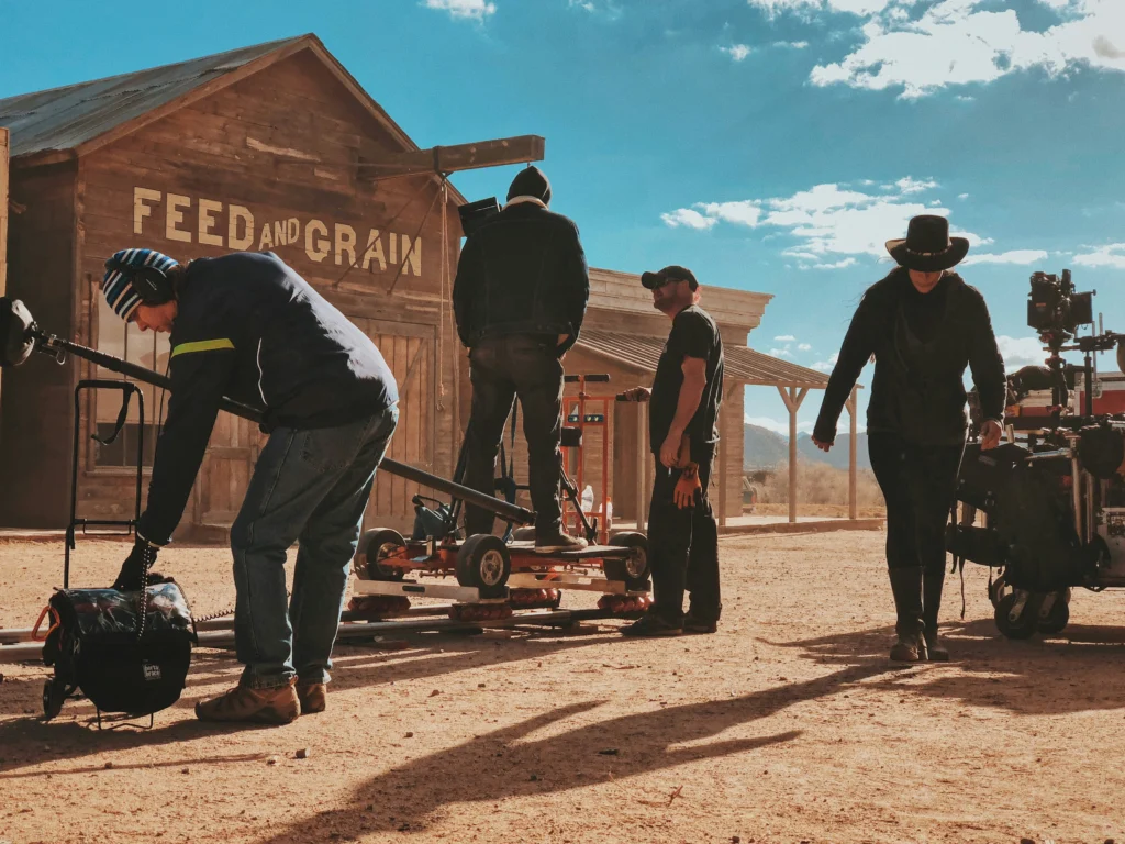
Western movies have long been a beloved genre, celebrated for their portrayal of frontier life, cowboys, and epic landscapes. A significant part of the genre’s identity comes from its visual style, particularly the fonts used in promotional materials such as posters. Over the years, Western movie posters have utilized specific fonts that evoke the rugged, wild, and adventurous spirit of the Old West. These fonts contribute not only to the aesthetics but also to the emotional appeal of the genre. This article explores the fonts that have shaped Western movie posters and why they remain impactful today.
The visual identity of Western films draws heavily from the cultural memory of the American frontier. Fonts used in Western movie posters often mimic the designs seen on old wooden signs, saloons, and wanted posters from the 19th century. These fonts are characterized by their bold, slab-serif lettering and rustic, worn textures that reflect the ruggedness of the Wild West. The typography creates an instant connection with the genre, setting the tone for the movie.
Some key elements that define Western fonts include:
In the golden age of Western films, certain fonts became synonymous with the genre. These fonts were often hand-drawn by artists and designers to capture the essence of the film. Many classic Westerns utilized unique typography, but a few stand out for their widespread influence.
The Playbill font, with its bold slab serifs and historical references to old theatre posters, has become iconic in Western movie designs. Its strong, upright letterforms give it a distinctive and commanding presence on posters. Playbill has been used in many Western movie titles to create an immediate connection to the past.
This font is reminiscent of the old-fashioned printing presses used in the 1800s. The slab serif design gives it a bold and authoritative appearance, making it a favorite choice for movie titles in classic Western posters. Its thick, strong lines evoke the feeling of old newspaper headlines and wanted posters, drawing the audience into the film’s historical setting.
Egyptian Slate is another slab serif font that has found its way into Western poster design. Its rugged, geometric letterforms give it a timeless look that fits well with the themes of exploration and survival in the harsh landscapes of the West. This font was often used in posters for films that focused on more dramatic, serious themes within the genre.
As the Western genre has evolved, so too have the fonts used in its posters. While many modern Westerns still draw from traditional font styles, there has been a shift toward more minimalist and contemporary designs. These new designs reflect the changing tone of modern Western films, which often blend traditional Western tropes with new cinematic elements.
The Cowboy Western font is a modern reinterpretation of classic Western typography. It combines bold slab serifs with a more polished and streamlined look, making it perfect for contemporary Western movies that still want to evoke a sense of history. The font’s clean lines and balanced proportions make it versatile for both film titles and promotional text.
Mesquite Std is a font that retains the rugged appeal of older Western fonts but incorporates a more decorative flair. Its rounded, irregular shapes give it a hand-drawn, artisanal feel, which fits well with the adventurous spirit of Western films. This font is often used in posters for movies that mix elements of the Western with other genres, such as action or fantasy.
The Ranger font is a contemporary take on Western typography, with sharp edges and bold forms. It has been used in posters for neo-Western films that update the traditional Western narrative for a modern audience. The strong, angular design of the Ranger font helps convey themes of conflict and survival, which are central to many modern Westerns.
While the fonts used in Western movie posters vary, they tend to share several key characteristics that help define their association with the genre:
Typography plays a crucial role in Western movie marketing. The fonts used on posters are often the first element the audience interacts with, setting the mood and expectations for the film. A well-chosen font can evoke a sense of nostalgia, excitement, or adventure, all of which are key emotions associated with Westerns. Movie studios and designers carefully select fonts that not only fit the film’s theme but also appeal to a wide audience.
The fonts used in Western movie posters are more than just a visual tool—they are a key part of the genre’s identity. From the bold slab serifs of the classic Western era to the sleek, modern designs of today, Western fonts continue to evolve while retaining their roots in the rugged frontier aesthetic. These fonts help communicate the themes, emotions, and settings of Western films, making them an indispensable part of the genre’s visual language.
As Westerns continue to be made, the typography in their promotional materials will likely keep adapting, but the core elements of strength, boldness, and ruggedness will remain. Fonts are a vital part of how these stories are marketed and remembered, giving viewers a visual cue of the excitement and drama they can expect from the genre.