

Fonts play a critical role in user experience across different platforms. Whether it’s a website, mobile application, or a printed medium, the choice of typeface can significantly influence readability, aesthetic appeal, and even brand perception. However, finding fonts that not only look great but also perform well across multiple devices and screen sizes can be a challenge. In this article, we explore high-quality fonts that are versatile and optimized for all platforms.
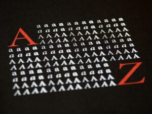
A high-quality font goes beyond just looking attractive. It should meet specific criteria that ensure its usability across various platforms and devices. The following are key characteristics that define a high-quality font:
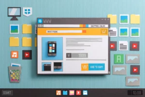
Choosing the right font for web platforms is essential for ensuring an optimal browsing experience. Here are some of the best high-quality fonts specifically designed for web use:
Roboto is a popular sans-serif font designed by Google, primarily for use in digital interfaces. It is highly versatile, modern, and well-suited for mobile and web applications. Roboto features a geometric structure with open curves, making it both aesthetically pleasing and easy to read on any screen size. Its lightweight nature allows for fast loading times, making it perfect for websites and mobile apps.
Open Sans is another widely-used web font that’s designed for legibility across devices. Created by Steve Matteson, it is a humanist sans-serif typeface that works exceptionally well in digital environments. Open Sans is highly legible at small sizes, making it an ideal font for body text on websites. It also offers a wide range of weights, from light to extra bold, which enhances its versatility.
Lato is a clean, modern font that is frequently used in web design due to its friendly yet professional appearance. It is known for its crisp lines and well-balanced letterforms, making it a reliable option for both headings and body text. Lato’s extensive character set and multiple weight options add to its adaptability across web platforms.

On mobile platforms, readability and performance are crucial. Fonts must render well on smaller screens and be optimized for mobile operating systems. Here are some high-quality fonts that are perfect for mobile apps:
SF Pro is Apple’s proprietary typeface, designed specifically for iOS, macOS, and watchOS. It is optimized for screen readability, ensuring a smooth and consistent user experience across Apple devices. SF Pro’s simple and modern design makes it perfect for mobile apps, where space and clarity are critical.
Montserrat is a widely-used font in both web and mobile design, known for its sleek geometric style. It is particularly effective in mobile applications due to its bold, clean lines and rounded shapes, which make it easy to read even on smaller screens. Montserrat’s multiple weights and flexibility make it a top choice for mobile interfaces.
Nunito is a modern sans-serif typeface that combines a balanced stroke width with rounded edges, providing a friendly and inviting appearance. It is ideal for mobile applications because of its excellent legibility on small screens and its ability to scale without compromising quality. Nunito is often used in user interface (UI) design for mobile apps.

While web and mobile platforms require fonts that are optimized for screen viewing, print platforms have different needs. High-quality fonts for print must ensure clarity and aesthetic appeal at both large and small sizes. Here are the best fonts for print design:
Garamond is a classic serif font known for its elegance and readability in print. It has been used in printed books for centuries and continues to be a go-to font for publishing, editorial design, and formal documents. Garamond’s traditional letterforms make it suitable for any printed material that requires a timeless, professional look.
Baskerville is another serif font that is perfect for print platforms, particularly in the publishing industry. Its refined and sophisticated letterforms create a sense of formality, making it ideal for books, magazines, and brochures. Baskerville’s sharp contrast between thick and thin strokes makes it highly readable in print.
Helvetica is one of the most versatile fonts in the world and is widely used in both print and digital media. Its clean and neutral design makes it suitable for a wide variety of printed materials, including advertisements, posters, and corporate documents. Helvetica’s clarity and simplicity make it an excellent choice for print design.
Selecting the right font for your project can make a significant difference in how the content is perceived. Here are some tips to ensure you choose a font that works well across all platforms:
Choosing high-quality fonts that work seamlessly across platforms is crucial for ensuring a positive user experience, enhancing brand consistency, and maintaining visual appeal. Whether you are designing for the web, mobile, or print, selecting fonts that offer legibility, versatility, and scalability will ensure your content shines. Fonts like Roboto, Open Sans, SF Pro, and Garamond stand out as excellent choices for their respective platforms, but always remember to test, evaluate, and prioritize readability for your unique design needs.
In today’s digital landscape, where users interact with content on various devices and platforms, using high-quality fonts is an investment in creating an enjoyable, professional, and cohesive user experience.