


Typography plays a crucial role in shaping how users perceive a brand or platform. From influencing readability to guiding emotions, fonts have a psychological impact that extends far beyond aesthetics. In the digital age, where first impressions are made within seconds, the right font can establish trust, while the wrong one may drive potential customers away. This article explores how fonts affect user trust, delving into the psychology behind typography and offering practical tips for designers to create trust-based designs.
Understanding how fonts affect trust begins with exploring the psychology behind typography. Fonts are more than just design elements; they evoke emotions, trigger cognitive responses, and shape perceptions. When it comes to trust, typography affects the way users interact with content, influencing their decision to engage further or leave a website altogether.
Fonts are one of the first elements users notice when they visit a website or read a brand’s content. Studies have shown that people form judgments about websites and brands in just 50 milliseconds. During this time, typography plays a significant role in shaping those initial impressions. For instance, a clean and professional font can create a sense of credibility, while an overly ornate or casual font might suggest unprofessionalism.
The emotional resonance of typography cannot be overstated. Different fonts evoke different feelings in users, which can directly influence how they perceive a brand’s trustworthiness. For example:
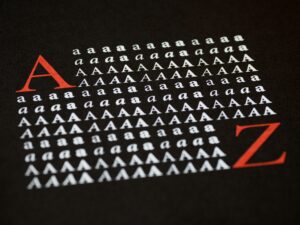
Readability is one of the most important factors in building trust through typography. If users have to strain to read content, they are more likely to lose interest or even question the credibility of the information presented. Legible fonts make the user experience smooth, enhancing trust and encouraging users to explore the content further.
Many designers face the dilemma of balancing legibility with aesthetics. While visually striking fonts may grab attention, they can also hinder readability if overused or improperly applied. For instance, using an elaborate script font for body text may reduce readability, frustrating users and eroding their trust. Instead, combining an aesthetically pleasing headline font with a legible body text font can enhance both the design and readability.
Consistency is key in creating a coherent brand identity and fostering trust. Users expect brands to present themselves consistently across all platforms, from websites to emails and advertisements. Inconsistent typography can confuse users, making a brand appear disorganized and untrustworthy. When a brand uses the same font style, size, and spacing throughout its marketing materials, it creates a unified experience, building familiarity and trust over time.
Inconsistent typography can lead to a fragmented user experience. When users encounter multiple fonts within a website, they may feel that the brand lacks focus or professionalism. For instance, using a playful font on one page and a formal one on another can create a jarring effect, reducing overall trust in the brand.
To maintain consistency in typography and enhance trust, consider the following best practices:

The fonts that work for one industry might not be suitable for another. Each industry has different expectations when it comes to typography, and selecting the wrong font can harm the credibility of a brand. For instance, financial institutions often favor serif fonts to communicate reliability, while tech companies may opt for sans-serif fonts to convey innovation and simplicity.
Fonts are an essential part of a brand’s visual identity, and over time, they become synonymous with the brand itself. Think of brands like Coca-Cola or Google, where the typography is so distinct that it instantly evokes the brand in the minds of consumers. By using consistent fonts that resonate with their audience, brands can foster a sense of loyalty and familiarity.
Typography is one of the most recognizable aspects of a brand. When users see familiar fonts across different mediums, it reinforces the brand’s image and builds trust. Brands that consistently use the same fonts in their logo, website, and marketing materials create a stronger connection with their audience, encouraging long-term loyalty.
In conclusion, fonts are more than just design choices—they are powerful tools that influence user trust, emotional response, and brand perception. The right font can instill confidence, while the wrong one may lead to confusion and doubt. By understanding the psychology behind fonts, ensuring readability, maintaining consistency, and choosing fonts that align with industry expectations, designers can create a seamless, trust-based user experience.
Ultimately, typography is a cornerstone of digital design, playing a vital role in shaping how users interact with brands. As the digital landscape continues to evolve, paying attention to the nuances of fonts and their effects on user trust will be crucial for creating successful, trustworthy digital experiences.
