


Choosing the right font is one of the most important decisions you will make when designing any type of visual content. A font can set the tone, establish identity, and ensure readability across different platforms and mediums. In the fast-evolving world of design, staying updated with the latest font trends is crucial. This article will guide you on how to choose trendy fonts that not only look modern but also align with your brand’s identity and message.
Before diving into font trends, it’s important to understand why font selection is so critical. The right font can elevate the design and make your brand more recognizable, while the wrong one can cause confusion and create a negative user experience. Fonts influence how your audience perceives your content, whether it’s through a website, advertisement, or social media post.

Font trends evolve over time, influenced by design movements, technology, and cultural shifts. Here are some of the most notable font trends for 2025 and beyond:
Minimalism continues to dominate design, and fonts are no exception. Clean, simple fonts with ample spacing are being preferred for their clarity and elegance. These fonts focus on functionality and are often used in modern web design and branding.
In contrast to minimalism, retro and vintage fonts are making a comeback. These fonts evoke nostalgia, taking inspiration from the past while incorporating contemporary design elements.
Bold fonts are being used more frequently to make a statement and grab attention. These fonts are ideal for headlines, call-to-action buttons, and any design element that needs to stand out.

Choosing the right trendy font isn’t just about picking what’s popular. It’s about making sure the font suits your message, brand, and target audience. Here’s a step-by-step guide to help you select the perfect font:
Your font choice should reflect the values and personality of your brand. A law firm, for example, might opt for a traditional serif font to convey professionalism and reliability, while a fashion brand might lean toward modern, sans-serif fonts to reflect innovation and style.
Different fonts perform better on different platforms. For websites and digital media, fonts that are easy to read on screens, such as sans-serif fonts, are often the best choice. On printed materials, you may experiment with serif fonts, which can be more legible in physical formats.
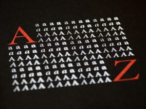
While trendy fonts may look visually appealing, always prioritize readability. A fancy script font might be gorgeous, but if it’s hard to read, it defeats the purpose. Test fonts in real-world scenarios to ensure they work across various devices and sizes.
Many designers use more than one font in a design project. When pairing fonts, ensure they complement each other. A common approach is to pair a bold display font with a simpler body font. For example, using a serif font for the heading and a sans-serif for the body text can create a harmonious and dynamic look.
Let’s take a look at some successful brands that have made great font choices, and how it has helped their identity and communication strategy.
Apple’s use of the font San Francisco is a great example of how font can reinforce brand identity. The clean and modern sans-serif font aligns perfectly with Apple’s minimalist design philosophy and commitment to innovation.
Coca-Cola’s iconic cursive font is a classic example of how fonts can evoke nostalgia and emotion. The flowing script is synonymous with the brand’s rich history and emotional connection to its consumers.
Netflix’s use of the bold, modern font Gotham Bold creates a sense of urgency and excitement. The choice of this typeface aligns with Netflix’s image as a leader in entertainment and innovation.
When using trendy fonts, pairing them effectively is key to a successful design. Here are a few tips for creating harmonious font pairings:
Choosing trendy fonts is not just about following the latest trends. It’s about making strategic design decisions that reflect your brand’s identity and improve communication with your audience. By understanding the trends, knowing your brand’s personality, and pairing fonts effectively, you can create designs that are both visually appealing and functional. Remember that a well-chosen font can enhance readability, evoke emotions, and make a lasting impression on your audience. So, the next time you choose a font, think about how it will shape your design and connect with your viewers.
Ultimately, the best fonts are those that serve the purpose of the content and resonate with the audience, while staying true to the timeless principles of design. Keep experimenting, stay updated with the latest trends, and always consider the context in which the fonts will be used!
