

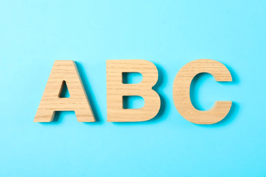
Fonts are one of the most critical aspects of any design, whether it’s for print or digital media. Bold fonts, in particular, are powerful tools in typography that can help to emphasize key messages, grab attention, and convey personality. However, like any design element, bold fonts must be used strategically to achieve the desired effect. In this article, we will explore how to use bold fonts effectively in your designs.
Bold fonts are more than just a typographic style; they are a powerful tool for visual communication. They help to create emphasis, enhance readability, and guide the viewer’s attention. Let’s explore some of the primary reasons why bold fonts are essential in design:
Not all bold fonts are created equal. Different bold typefaces evoke different feelings and fit different design contexts. Here’s how to choose the right bold font for your project:
When selecting a bold font, it’s crucial to think about the brand’s identity and personality. A playful brand may benefit from a rounded, friendly sans-serif font, while a luxury brand may want to opt for a sleek, high-contrast serif font. Bold fonts should align with the tone and aesthetic you wish to communicate.
The boldness of a font should match the visual environment it’s placed in. For example, a bold font can stand out well in a minimalist design, but it might appear overwhelming in a busy layout. Ensure that the bold font you choose complements the overall composition.
When using bold fonts, legibility should always be a priority. Some fonts may look great in bold, but they become hard to read when the weight is increased. Test your chosen font at different sizes to ensure it remains readable in various contexts.
There are many ways to use bold fonts effectively. Here are some strategies for incorporating bold fonts into your designs:
Bold fonts are perfect for headlines or titles because they grab attention instantly. They help to convey the main message and set the tone for the rest of the content. Use bold fonts for:
In digital design, bold fonts are often used for calls to action (CTAs) because they stand out on a page. Whether it’s a “Buy Now” button or a “Sign Up” prompt, bold typography helps direct the user’s attention to important interactive elements.
Bold fonts can also be used strategically within body text to emphasize specific words or phrases. This technique is effective when you want to make particular ideas stand out without overwhelming the reader.
Many brands use bold fonts in their logos to communicate strength and recognition. A bold typeface can help create a memorable and impactful logo that leaves a lasting impression on the audience.
While bold fonts are effective tools, they can also detract from your design if used improperly. Here are some common mistakes to avoid:
Using bold fonts too frequently can dilute their effectiveness. Bold should be used sparingly to ensure it has the desired impact. Too much bold text can overwhelm the viewer and make your design feel cluttered.
Pairing bold fonts with fonts that are too similar in weight or style can create visual dissonance. Ensure that your bold fonts work well with other typefaces, whether it’s through contrast in weight, style, or size.
Bold fonts can look fantastic in larger sizes, but they might become hard to read when used for small text. Avoid using bold fonts for body text, especially in print, as it can cause eye strain and reduce legibility.
To better understand the power of bold fonts, let’s look at a few case studies of successful bold typography implementation.
Nike’s iconic “Just Do It” slogan is a perfect example of bold typography used effectively. The bold, sans-serif font used in their advertisements stands out against any background and evokes strength and determination, aligning with the brand’s ethos.
The New York Times uses bold fonts in its headlines to create a sense of urgency and importance. The bold typefaces in their front-page headlines instantly grab the reader’s attention, making them want to read more about the story.
Apple’s minimalist design philosophy is supported by the use of bold fonts. For instance, the use of bold fonts for product names and key information on the website and marketing materials helps to create a sleek, modern aesthetic while focusing attention on the product.
To make sure that your use of bold fonts is effective, here are some best practices to follow:
Bold fonts are an essential tool in any designer’s toolkit. They are effective in highlighting key elements, creating a visual hierarchy, and adding personality to a design. However, like any design element, they must be used with care and consideration. By selecting the right bold font, using it in appropriate contexts, and avoiding common mistakes, you can ensure that your bold typography is both impactful and effective. Remember, less is often more when it comes to bold fonts—use them strategically to maximize their impact.
