Retro fonts have made a huge comeback in modern design, offering a nostalgic yet fresh twist on contemporary visuals. While some designers shy away from using fonts associated with past decades, others have embraced them as a way to create striking, memorable brand identities and captivating designs. This article will explore how to use retro fonts effectively in modern design, from understanding their history to practical applications and potential pitfalls.
What Are Retro Fonts?

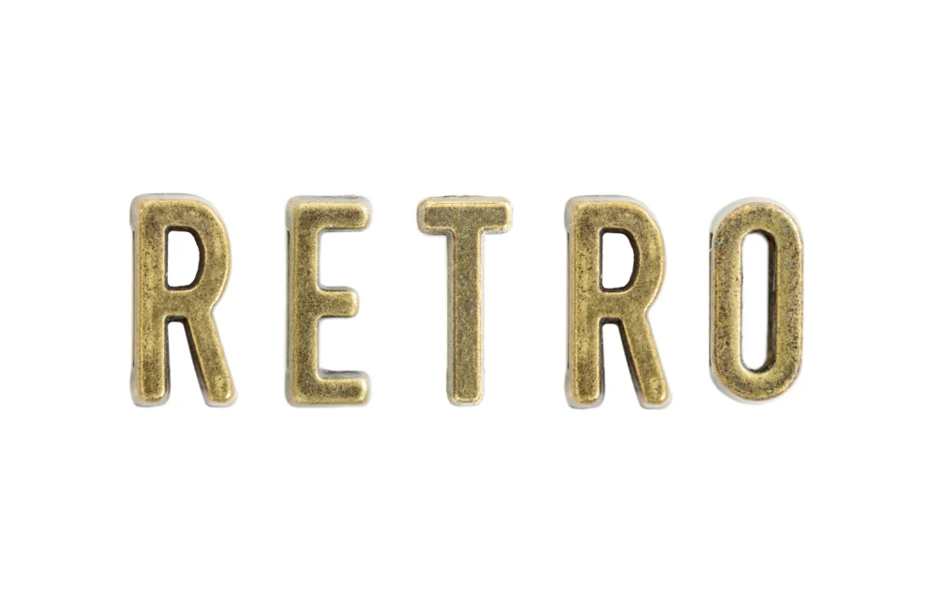
Retro fonts refer to typefaces that evoke the design styles of the past, particularly those popular in the 1950s, 1960s, 1970s, and 1980s. These fonts often feature bold lines, exaggerated curves, and playful design elements. They tap into a sense of nostalgia, offering a visual language that recalls specific eras in pop culture, advertising, and media.
The Evolution of Retro Fonts

To understand how to incorporate retro fonts into modern design, it’s essential to look at their evolution. Retro fonts have been shaped by key movements in graphic design, from Art Deco to Mid-Century Modern, and then from psychedelic typography to digital fonts inspired by the 1980s.
- Art Deco (1920s-1930s): Features sleek, geometric shapes and stylized designs, with a focus on luxury and elegance.
- Mid-Century Modern (1940s-1960s): Embraces minimalist, clean lines with futuristic motifs, often used in advertisements and product packaging.
- Psychedelic Typography (1960s-1970s): Bold, colorful, and often distorted fonts were used in concert posters and music album covers.
- 1980s Digital Fonts: Digital-inspired fonts became synonymous with early computer interfaces and neon-lit signage.
Why Retro Fonts Are Effective in Modern Design

Retro fonts aren’t just about aesthetic appeal; they offer distinct advantages in modern design. Here’s why you should consider using them:
- Nostalgia: Retro fonts trigger positive emotional responses by evoking fond memories of the past, making them perfect for brands aiming to connect with their audience on a deeper level.
- Brand Identity: They help establish a unique brand identity by standing out from the crowd of modern, minimalist fonts.
- Versatility: Retro fonts can adapt to various contexts, from vintage-themed brands to modern, playful designs.
- Trend Influence: Retro styles are cyclical, and what was once old becomes new again, creating a sense of timelessness in design.
Types of Retro Fonts and Their Uses

There are several types of retro fonts, each offering different moods and vibes. Understanding the specific characteristics of each style will help you select the best one for your project.
- Bold Serif Fonts: Often found in vintage advertisements, bold serif fonts create a sense of strength and tradition. These are ideal for brands that want to communicate stability and reliability.
- Script Fonts: Inspired by handwritten styles from the 1950s and 1960s, script retro fonts are perfect for creating a sense of warmth, personal touch, or vintage flair. They are great for logos and invitations.
- Geometric Sans-Serif Fonts: Rooted in mid-century modern design, these fonts are clean, sharp, and minimalist while still evoking a vintage feel. They work well in tech or fashion brands that want to blend modernity with retro influences.
- Distorted/Glitch Fonts: Reflecting the early digital era, glitch fonts add an edgy, futuristic touch to designs while embracing the aesthetic of retro technology. These are suitable for projects that want to invoke the digital age of the 1980s.
How to Use Retro Fonts in Modern Design

Now that we’ve discussed the history and types of retro fonts, let’s dive into how to effectively incorporate them into modern design projects. Here are some practical tips:
1. Match Retro Fonts to Your Brand Personality
It’s crucial to choose a retro font that aligns with your brand’s personality. For example:
- Use bold, heavy fonts for a strong, authoritative look, perfect for tech or automotive brands.
- Opt for playful script fonts to capture the fun, friendly essence of a food or beverage brand.
- Geometric sans-serif fonts can be used for fashion and design brands aiming for modern sophistication with a vintage touch.
2. Combine Retro Fonts with Modern Typography
One of the best ways to incorporate retro fonts is by pairing them with modern typography. The contrast between old and new creates a dynamic and balanced composition. For example, you can use a retro font for the headline and complement it with a clean, minimalist sans-serif font for the body text.
3. Use Retro Fonts for Digital and Print Media
Retro fonts are versatile and can work in both digital and print media. On the web, they can be used in headlines, call-to-action buttons, or social media posts. In print, retro fonts can bring a sense of nostalgia to flyers, posters, and brochures, especially for events like music festivals, pop-up shops, or vintage product launches.
4. Pay Attention to Color and Context
The color palette you choose can greatly affect how a retro font is perceived. Pairing vibrant, bold colors with a 1970s-inspired typeface can evoke a sense of energy and playfulness, while muted tones work better with Art Deco fonts to communicate elegance and sophistication.
Case Studies of Successful Retro Font Usage

Let’s look at a few examples of successful retro font usage in modern design:
- Coca-Cola: Coca-Cola has successfully used retro fonts in their branding, evoking the vintage feel of their 1950s advertisements while still appealing to modern sensibilities.
- Netflix’s “Stranger Things” Branding: The Netflix show uses a 1980s-inspired retro font for its title cards, which taps into nostalgia for the era and sets the tone for the series.
- Levi’s: The brand often uses retro-inspired fonts in its advertisements, combining them with contemporary visuals to appeal to both old and new generations of consumers.
Common Mistakes to Avoid When Using Retro Fonts

While retro fonts can be highly effective, there are some common mistakes to avoid:
- Overuse: Too many retro fonts can overwhelm a design. Use them sparingly and in appropriate contexts to avoid clutter.
- Incompatibility with Modern Aesthetics: Be careful when mixing retro fonts with overly modern design elements, as the contrast can appear jarring.
- Neglecting Legibility: Some retro fonts are highly decorative and can be hard to read, especially in smaller sizes. Ensure that your text remains legible to your audience.
Conclusion
Incorporating retro fonts into modern design offers a wealth of creative possibilities. When used thoughtfully, they can evoke nostalgia, strengthen brand identity, and create a unique visual appeal. By understanding the history, types, and practical applications of retro fonts, you can effectively integrate them into your designs, balancing the old with the new. Remember to choose the right font for your brand, pair it with modern elements, and avoid overuse to maintain the impact of your design. With these tips in mind, you’ll be able to create compelling, timeless designs that speak to both past and present sensibilities.