

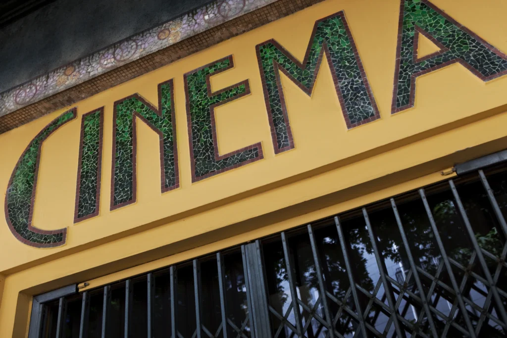
The visual presentation of movie titles has a long-standing history in cinema, offering more than just identification for the film. These fonts convey tone, genre, and often leave a lasting impression on audiences. Over the decades, iconic fonts have become synonymous with famous movies, helping to build memorable cinematic experiences. In this article, we will explore some of the most iconic fonts in cinema history, discuss how they shape the viewer’s perception, and delve into the reasons behind their cultural significance.
Fonts become iconic in cinema when they resonate deeply with both the film’s themes and the audience’s memory. An iconic font is usually distinctive, visually appealing, and evocative of the film’s atmosphere. Several factors contribute to a font’s iconic status:
These factors combine to create fonts that go beyond mere text, becoming a part of the cinematic legacy. Let’s now dive into some of the most iconic fonts that have left their mark on cinema history.
One of the most recognizable fonts in cinema is the scrolling text from the opening of the “Star Wars” films. The font used for the famous introductory crawl is a modified version of the typeface “Futura.” Futura, with its geometric and modern style, was selected because of its futuristic and space-age feel, perfectly aligning with the sci-fi genre.
The use of Futura in “Star Wars” exemplifies how typography can enhance a movie’s storytelling. The bold and simplistic font contrasts sharply with the expansive, imaginative galaxy portrayed on screen, giving the opening crawl an aura of authority and importance. This font, along with the opening music, has become a cultural icon in its own right, instantly recognizable across generations.
Another iconic font in film history is the Trajan typeface, used prominently in the “Jurassic Park” franchise. Trajan is often associated with films set in ancient times or those with epic themes due to its classical Roman letterforms. It conveys authority, grandeur, and seriousness.
For “Jurassic Park,” the choice of Trajan helped establish a sense of awe and adventure, qualities inherent in the film’s exploration of the ancient world of dinosaurs. The font helped solidify the film’s branding and has been used consistently across the franchise’s various sequels and spin-offs.
The “Back to the Future” trilogy is another film series that has become synonymous with its unique font. The font used in the movie’s logo is a custom typeface that combines elements of futurism and retro design, perfectly capturing the time-travel theme of the films.
This custom typeface, often referred to as Biff’s Type, incorporates bold, slanted, and sharp lettering, with each letter appearing as if it’s in motion. The energetic font helped capture the essence of the films’ thrilling adventures through time, cementing it as one of the most memorable fonts in movie history.
Few fonts are as instantly recognizable as the one used in the “Harry Potter” series. The iconic lightning bolt “P” in the movie’s title logo became a defining element of the Harry Potter franchise. The typeface, which combines gothic influences with fantastical elements, perfectly captures the magical world of wizards and spells.
The font’s unique styling, with the sharp edges and bold strokes, gives off a sense of mystery and enchantment, making it a fitting representation of the fantastical nature of the story. The use of this font in various “Harry Potter” merchandise, from book covers to movie posters, has further solidified its legendary status in cinema typography.
Quentin Tarantino’s “Pulp Fiction” is not only iconic for its nonlinear storytelling but also for its use of typography. The bold, retro serif font used in the film’s title sequence is reminiscent of 1970s pulp magazines and B-movie posters. The use of this style plays on the film’s title and genre, paying homage to the low-budget pulp fiction stories that inspired the film.
This typeface choice was a deliberate stylistic decision by Tarantino, further reinforcing the film’s themes and period influences. The font’s heavy, blocky design has become as memorable as the movie’s content, blending seamlessly with its overall aesthetic.
One of the most powerful films in cinema history, “The Godfather,” used a font as elegant and intimidating as the characters it portrayed. The font used in the title is based on the “Cooper Black” typeface, but with significant modifications to achieve a more regal, formal look.
The font’s thick strokes and unique curves make it instantly recognizable and help convey the gravitas of the film. Combined with the puppet string imagery, the font symbolizes the themes of power and control that run throughout the movie, making it an integral part of the film’s branding.
“Blade Runner,” Ridley Scott’s sci-fi masterpiece, used the “Eurostile Bold Extended” font for its title sequence. Eurostile is a geometric sans-serif typeface known for its futuristic appearance, and its use in “Blade Runner” helped convey the dystopian, high-tech world of the film.
Eurostile’s squared-off shapes and wide proportions are reminiscent of industrial design, making it a perfect fit for the tech-heavy, futuristic atmosphere of the film. Its sharp, mechanical look reflects the film’s themes of artificial intelligence, technology, and dystopia.
The fonts discussed here represent just a few examples of how typography has played a crucial role in cinema history. From the futuristic aesthetic of “Star Wars” to the magical design of “Harry Potter,” these fonts have become more than just text—they’ve become integral parts of the films’ identities. The right font choice can elevate a movie’s branding, provide a sense of time or place, and leave a lasting impact on viewers.
These fonts continue to inspire graphic designers and filmmakers, proving that typography is a powerful tool for storytelling. By using carefully selected or custom-designed fonts, films can create an emotional connection with the audience before the story even begins.
Iconic fonts in cinema history are more than just functional—they are an essential part of a film’s identity. Whether it’s the bold simplicity of Futura in “Star Wars” or the classical sophistication of Trajan in “Jurassic Park,” these fonts help shape our experience of the movie. They set the tone, enhance the storytelling, and make the film instantly recognizable. As fonts continue to evolve, their role in cinema will remain as vital as ever, ensuring that the power of typography continues to leave a lasting mark on film history.
