Minimalist fonts exhibit neatness in particular modern settings, whether it’s for branding, the web, product packaging, or mobile applications. The typography style is usually noticeable for its straightforwardness and nothingness which speaks of purity and clarity, hence the formal learning style is often used by professors for essays. This article will analyze the essential role played by minimalist fonts in today’s design world and how to set them to generate a clean and modern design.
What Are Minimalist Fonts?
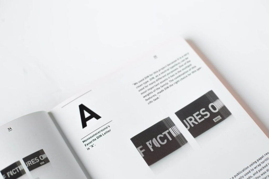
Minimalist fonts are types of letters that emphasize simplicity in their form and lines. These fonts usually have clear shapes with no extra details or decorations, such as excessive curves or flourishes. Common examples of minimalist fonts include Helvetica, Arial, and Open Sans. The primary characteristics are minimalistic fonts are as follows:
- Simple: There are no extra elements to distract.
- Easy to read: Each letter is made conspicuously and simply for reading.
- Versatile: The font can be used in various contexts, from digital design to print.
Why Are Minimalist Fonts So Popular?
- Clarity and Readability: Minimalist layouts with font types are free from interruptions so that a reader can have a clear understanding of what is being said. This is a major issue in the digital space where the sizes of screens differ with mobile phones, tablets, and computers. In web design, an instance of clear typography for proper reading and the fast retrieval of information will always be a major consideration for the designer.
- Modernity: Minimalist fonts are usually identified with modern and business letter styles. This manner of thinking leads to the expression of elegance without being elaborate. Minimalist design with basic fonts generates a futuristic, clean, and organized look, thus, being ideal for the brands that seek to appear progressive.
- Content is Queen: The usage of minimalist fonts helps the content to be center stage. The non-existence of visual elements that mislead from the main messages is the key thing. This is vital for the companies or the designers who aim at effectively conveying the information.
- Usable in Multiple Media Platforms: The reason for such popularity of minimalist fonts lies in their adaptability. These fonts can be applied to a range of media, both digital and print. Be it PowerPoint presentations, website design, product packaging, or advertising materials, minimalist fonts which always bring positive results are used universally.
Minimalist Fonts’ Special Features
To completely understand minimal fonts and use them to the fullest, you have to know the key characteristics that switch them up to a new level:
- Sans Serif: Nearly all minimalist fonts are sans serif. This means they do not utilize small lines or hooks at the ends of the letters. The style is much more modern and clean as opposed to serif fonts which give a classic feeling.
- Geometric Lines: Letter forms of minimalist fonts brand a series of geometric lines like circles, squares, and straight lines. As a result, a perfect balance and tidy image arise.
- Low Contrast: The same stroke thickness mostly characterizes minimalist fonts, by and large, this implies that there is no major distinction between the letter’s thin and thick parts.
- Regular Spacing: In the aviation of fonts, minimalist letter-spacing, and line-spacing are usually more uniform and wider. This increases the optimality of the elasticity of the typography.
Minimalist Font Design Examples
- Websites: The use of minimalist fonts in web design is one of the most effective instances. A purely typographic website that has a minimalist structure persuades customers better. A viewer is not tormented by a plethora of computer-generated graphics but rather is left to ponder about the products or services inquired about.
- Logos and Branding: Less is More in Branding. Many people tend to remember logos using minimalist fonts more easily due to their simple forms. Additionally, the employment of minimalist fonts in the branding sector gives plastic high-tech, modern, and professional looks. This is especially adequate.
- Product Packaging: In this time of phase where people prefer a somewhat clean, ordinary, and minimalist font, these are the best-chosen fonts for product packaging. Printing with simple typographical elements and minimalist designs can stand for more luxury and elegance even without lots of ornamentation.
- Poster Design: Minimalist font types are mainly utilized in posters such are those for events or products that have a contemporary image. Posters made with such fonts generally emphasize essential content and downplay visual stimulation.
Advice on Minimalist Font Usage
- Visual Balance Must Be Maintained: Purity in typography is a design commitment that stands for a commitment to quality. Less is more is a guiding principle in the design of minimalist fashions. Too much space not empty or, opposite, too densely packed layouts should be prevented. A good equilibrium will help the viewer’s eye remain relaxed.
- Spacing Counts: In minimalist typography, spacing is a fundamental element. Be sure there is enough distance between letters, words, and lines so text becomes readable. The appropriate spacing not only structures the design but also comforts the viewers’ eyes.
- Choose the Right Colors:Â Minimalist sorts of fonts work by and large better with plain color palettes like black white or neutral tones. These shades will convey a clean look and will not disturb the attention of the text. Nonetheless, you can test some with accent colors too, to show certain elements off.
- Mix with Small Visual Elements: The best style to accompany minimal fonts is to have simple design elements. Use images, icons, or illustrations that are not overly complicated so that the typographic elements remain the focal point of the design.
Recommended Minimalist Fonts
The following is a list of popular minimalist fonts that are mostly used in different kinds of design including but not limited to the following:
- Helvetica: Helvetica which is one of the popular fonts is very flexible and does regularly appear throughout various design contexts.
- Arial: A simple sans-serif font that is commonly utilized in the field of digital design.
- Roboto: Born out of Google, this font is the embodiment of minimalist beauty together with readability.
- Open Sans: A font that is elegant and clear, therefore most recommended for website and app design.
- Futura: A very geometrical font due to its special lines, which is a go-to design in a futuristic style.
Conclusion
Minimalist fonts are attractive choices for clean, modern, and readable designs. Through retaining simplicity, these types of typesetting create orderly and classy-looking designs without appearing as pretentious. In a scenario where consumer experience and clear pictorial communication are becoming the norm, minimalist fonts afford the best option to achieve both art and utility.