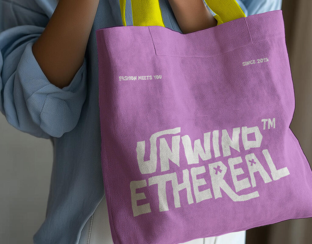
Typography is a critical aspect of design, playing a vital role in how messages are conveyed and how brands express their identity. In recent years, the design world has seen a shift towards bold, modern fonts that not only capture attention but also convey strength, creativity, and confidence. This article explores the rise of bold fonts in fashion and design, examining their impact on modern aesthetics and how they are used to shape brand identities in various industries.
The trend towards bold fonts in fashion and design can be traced back to the early 2010s, when minimalism and clarity became dominant themes. As brands sought to stand out in increasingly crowded markets, many turned to bold typography as a way to make an instant visual impact. The use of heavy, thick letterforms became a hallmark of modern design, with designers leveraging the bold aesthetic to project strength, confidence, and clarity.
This shift has been particularly noticeable in the fashion industry, where brands have adopted bold fonts to communicate their identities in an ever-evolving marketplace. From logos to advertising campaigns, fashion houses such as Balenciaga, Off-White, and Gucci have embraced bold typography to reflect their cutting-edge styles and cultural relevance.
The success of bold fonts in modern design is no accident. Research in psychology and marketing suggests that bold typography has a powerful effect on perception. Bold fonts are associated with strength, authority, and confidence. In a world where consumers are bombarded with information, the ability of bold fonts to capture attention and communicate key messages quickly makes them a valuable tool for designers and brands.
Some key psychological reasons why bold fonts work include:
Luxury fashion brands have been at the forefront of adopting bold typography in their visual identities. Take Balenciaga, for example. Under the creative direction of Demna Gvasalia, the brand has utilized bold sans-serif fonts as a defining characteristic of its logo and overall branding. This design choice reflects Balenciaga’s modern, edgy, and unapologetic approach to fashion.
Similarly, Off-White, founded by the late Virgil Abloh, made extensive use of bold fonts to disrupt traditional fashion norms. Off-White’s branding, which features bold, all-caps typography, communicates a sense of rebellion and innovation, aligning with the brand’s ethos of redefining high fashion through streetwear influences.
These case studies highlight how bold fonts are being used to build brand recognition and communicate core values in the luxury fashion sector.
Beyond fashion, bold fonts have become a mainstay in digital design, especially for websites, apps, and user interfaces. In an era where users often skim content and have limited attention spans, bold typography is crucial for making important elements—such as headlines, calls to action, and navigation menus—stand out.
In web and app design, bold fonts are used to enhance the user experience by improving readability and creating a visual hierarchy. This is especially true in responsive design, where text needs to be legible across various screen sizes and resolutions. Bold fonts ensure that key messages remain clear, even on smaller devices.
While bold fonts offer many advantages, they must be used thoughtfully to avoid overwhelming the design or detracting from the overall message. Here are some best practices for using bold typography effectively:
The future of bold typography is likely to see further experimentation, as designers continue to push the boundaries of what bold fonts can achieve. Some emerging trends in bold typography include:
Bold fonts have become a defining characteristic of modern design, particularly in the fashion and digital worlds. Their ability to capture attention, convey authority, and enhance legibility makes them an invaluable tool for designers seeking to create powerful, memorable visual identities. From luxury fashion brands to cutting-edge digital interfaces, bold typography is here to stay.
As the design landscape continues to evolve, the bold font trend is likely to grow even more prominent, with designers finding new ways to push the boundaries of typography. By embracing bold fonts in thoughtful, strategic ways, brands can stay ahead of the curve and make a lasting impact on their audiences.