When it comes to designing a creative portfolio website, choosing the right fonts is one of the most crucial decisions you’ll make. Fonts play an essential role in setting the tone, enhancing readability, and reflecting your personal or brand identity. The right font can make your portfolio stand out, while the wrong one can make it feel outdated or hard to navigate. In this article, we’ll explore the best modern fonts for creative portfolio websites, how they impact user experience, and what factors to consider when selecting a typeface for your digital showcase.
Why Fonts Matter for Creative Portfolio Websites

Fonts are not just about aesthetics; they are a vital part of user experience. A well-chosen font can communicate your style, reinforce your brand message, and guide visitors through your site with ease. Here’s why choosing the right font is so important:
- Brand Identity: Fonts play a pivotal role in shaping the overall look and feel of your brand. For example, a clean, minimalist font might reflect a modern, professional vibe, while a playful, quirky typeface could be better for a more casual creative portfolio.
- Readability: The clarity of the fonts you choose directly affects how easy it is for users to read your content. Readability is essential for engaging visitors and keeping them on your site longer.
- Emotional Impact: Fonts have the ability to evoke emotions. Whether you want to come across as sophisticated, friendly, bold, or artistic, fonts can help communicate those feelings instantly.
Key Considerations When Choosing Fonts for Your Portfolio

Before diving into specific font suggestions, it’s essential to understand the key factors that should influence your font choice:
- Purpose and Target Audience: Are you targeting corporate clients, or are you catering to a more casual, creative crowd? A corporate portfolio might benefit from clean, professional fonts, while a portfolio for creative artists may embrace more experimental or artistic fonts.
- Font Pairing: Many creative portfolios use multiple fonts. However, too many different typefaces can overwhelm users. Choose one font for headings and another for body text to maintain balance and readability.
- Web Compatibility: The fonts you choose must look good on all devices, browsers, and screen sizes. Web-safe fonts or Google Fonts are often a safe bet for ensuring your text renders well across platforms.
- Load Speed: Fonts with many styles or weights can increase page load times. Opt for streamlined font families that keep load times down without sacrificing style.
Best Modern Fonts for Creative Portfolio Websites

Now, let’s dive into some of the top modern fonts that work exceptionally well for creative portfolio websites:
1. Helvetica Neue

Helvetica Neue is a modern, sans-serif font that’s highly versatile and perfect for a wide range of creative portfolios. It’s clean, minimalistic, and offers excellent readability. This font works well for creative professionals looking to convey a sleek, sophisticated, and contemporary feel.
- Great for: Professional portfolios, designers, photographers, and digital creatives.
- Strengths: Clear and crisp for body text, with a variety of weights to choose from for emphasis.
- Considerations: Avoid overusing bold or extra-heavy weights for long paragraphs as it can strain the eyes.
2. Futura

Futura is another modern sans-serif font that has been a favorite for many designers for decades. Its geometric and clean design makes it perfect for creative portfolios that need a timeless, yet modern aesthetic. Futura is well-known for its ability to stand out, making it ideal for headings or key pieces of text.
- Great for: Web designers, photographers, and those looking for a bold, impactful look.
- Strengths: Versatile, works well for both body copy and headlines.
- Considerations: Avoid using it for long-form text; its geometric shapes can make it harder to read in smaller sizes.
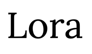
3. Lora

Lora is a serif font with a modern touch. It strikes the right balance between traditional and contemporary. Its excellent readability makes it a perfect choice for those wanting to add some personality to their portfolios without sacrificing professionalism.
- Great for: Writers, bloggers, and any portfolio focused on content creation.
- Strengths: High readability, elegant, and professional.
- Considerations: Serif fonts are best used for text-heavy sites and may not work well for very minimalistic designs.
4. Proxima Nova

Proxima Nova is a popular sans-serif font that’s widely used across the web for its clean, modern look. It offers a perfect balance between geometric precision and humanist curves, making it an excellent choice for creative portfolios that need to be both approachable and professional.
- Great for: Designers, illustrators, and anyone with a creative focus.
- Strengths: Readable, sleek, and works well with other fonts.
- Considerations: May feel too neutral for portfolios that require a more distinctive character.
5. Avenir

Avenir is a contemporary sans-serif typeface that offers both warmth and precision. With its balanced letterforms, Avenir works perfectly for creative portfolios that require a stylish, high-end feel without being overly flashy.
- Great for: Architects, photographers, and creatives in need of a polished, modern font.
- Strengths: Clean lines, timeless design, and excellent legibility.
- Considerations: Like Helvetica, Avenir can feel a bit ubiquitous, so use it thoughtfully to maintain originality.
Font Pairing Ideas for Creative Portfolios

When designing your portfolio, pairing fonts correctly is just as important as selecting the right fonts. Here are some modern font pairings that work well together:
- Helvetica Neue + Lora: A perfect pairing of clean and contemporary sans-serif with elegant serif, ideal for balancing readability and style.
- Futura + Georgia: Combine the bold and modern look of Futura with the timeless, classic feel of Georgia for a sophisticated, easy-to-read design.
- Proxima Nova + Times New Roman: A great choice for those looking for a subtle contrast between modern sans-serif and traditional serif fonts.
Conclusion
Choosing the right fonts for your creative portfolio website is a critical aspect of establishing your identity and providing an enjoyable user experience. Whether you lean toward a sleek, minimalistic look or a more artistic and playful style, the modern fonts listed in this article offer a range of options that can elevate your online presence. Remember to consider factors like readability, brand identity, and web compatibility to ensure your portfolio is both visually appealing and functional. With the right fonts in place, your portfolio will not only look impressive but also help you stand out in a competitive creative market.


