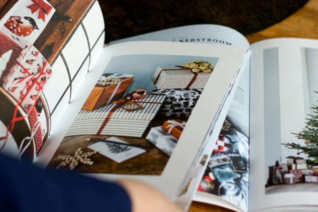
In the fast-paced world of design, typography plays a critical role in shaping how content is perceived. For editorial and magazine design, fonts are not just a functional element; they are essential tools for creating a visual identity, guiding the reader’s experience, and evoking emotions. With the increasing demand for modern and innovative designs, it is crucial to select the right fonts that align with the aesthetic of a publication while also providing clarity and readability. This article explores some of the best modern fonts for editorial and magazine design, considering trends, examples, and case studies to help designers make informed decisions.
Typography is more than just the art of arranging type on a page; it is a design strategy that impacts the mood, tone, and legibility of the content. In editorial and magazine design, fonts help convey a publication’s personality, ensuring the text aligns with the overall theme or purpose. Whether you are designing a lifestyle magazine, a fashion editorial, or a niche publication, typography sets the stage for the reader’s experience. Modern fonts, in particular, have become integral to contemporary magazine designs, offering versatility, elegance, and a strong visual appeal.
Modern fonts cater to the needs of contemporary publications by offering clean lines, balanced proportions, and aesthetic harmony. They are often sleek, minimalistic, and visually appealing, which makes them perfect for the digital age where simplicity and clarity are paramount. Some of the defining characteristics of modern fonts include:
When selecting fonts for editorial and magazine design, it’s essential to consider how they complement the overall layout and purpose of the publication. Below are some of the best modern fonts that are widely used in the design world for their versatility, aesthetic appeal, and readability.
Helvetica Neue is one of the most widely used modern sans-serif fonts, known for its clean lines and exceptional versatility. It is a refinement of the original Helvetica typeface, designed to be more visually balanced and easier to read in various sizes. It is ideal for both headers and body text, making it a favorite choice for many editorial and magazine designers.
Futura is a geometric sans-serif font that has been a staple in modern design since its creation in 1927. With its sharp, clean shapes and almost futuristic feel, Futura is commonly used in fashion magazines and high-end editorial layouts where elegance and sophistication are key. Its modern appeal comes from its ability to blend well with both serif fonts and other sans-serif typefaces.
Avenir, designed by Adrian Frutiger, is a humanist sans-serif font that blends the organic nature of traditional serif fonts with the clean, crisp lines of modern sans-serif typefaces. This versatility makes it an excellent choice for editorial design, particularly when you want to create a sophisticated yet approachable atmosphere.
Garamond is a classic serif typeface that is known for its elegant curves and timeless appeal. It is one of the most popular choices for editorial design because it conveys sophistication and reliability. Garamond’s high readability and aesthetic charm make it perfect for long-form articles and books, and it can complement modern sans-serif fonts in a magazine layout.
Proxima Nova is a modern sans-serif typeface known for its versatility and clean lines. It offers a perfect balance of readability and style, making it a popular choice for both digital and print publications. Proxima Nova is often used in editorial designs that require a modern, approachable, and slightly friendly tone.
Examining how modern fonts are applied in real-world editorial design can provide valuable insights into their practical use. Below are some notable examples of how well-known publications effectively use modern fonts to elevate their editorial designs.
The New York Times has long been a leader in editorial design, blending timeless fonts with modern sans-serifs. They often use Helvetica Neue for its clean appearance in digital and print formats, while also incorporating more traditional fonts like Times New Roman for body text to maintain readability in longer articles. The combination of modern and classic fonts enables the publication to maintain its journalistic integrity while appealing to contemporary readers.
Vogue has embraced the power of Futura, one of the most iconic modern fonts in the fashion industry. The typeface’s geometric design adds an air of sophistication and clarity, making it the perfect choice for fashion magazines where style and readability are paramount. Futura is frequently used for headings and magazine cover designs, helping Vogue maintain its chic and minimalist brand identity.
Wired is known for its bold, experimental design choices, and its use of modern fonts like Avenir and Proxima Nova is a testament to its forward-thinking editorial approach. The publication embraces a clean, futuristic look, often pairing modern fonts with innovative layouts and imagery to capture its tech-savvy audience’s attention.
Modern fonts play a pivotal role in shaping the identity and readability of editorial and magazine designs. By selecting fonts that are visually appealing, readable, and appropriate for the publication’s tone, designers can create layouts that engage readers and enhance their experience. Fonts like Helvetica Neue, Futura, Avenir, Garamond, and Proxima Nova offer a perfect blend of sophistication, clarity, and versatility, making them excellent choices for contemporary editorial design. By analyzing case studies and trends, designers can make informed decisions about how to use these fonts effectively in their own projects.
The key takeaway is that modern fonts are more than just design tools—they are integral to creating a unique and engaging reader experience in editorial and magazine design. Whether you are designing for print or digital formats, choosing the right font can make a significant impact on how your content is perceived and enjoyed.