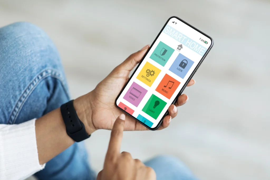
In today’s fast-paced, mobile-first world, the design of an app can often be the deciding factor in whether it succeeds or fails. The user experience (UX) is shaped by several elements, and typography is one of the most crucial aspects. Modern sans-serif fonts, known for their clean, simple lines, have become a staple for app design, offering readability, elegance, and modernity. In this article, we’ll explore the best modern sans-serif fonts for apps, their unique characteristics, and why they are favored by designers for creating intuitive, user-friendly interfaces.

Sans-serif fonts are characterized by the absence of the small projecting features known as “serifs” at the ends of letters. This gives the font a clean, minimalist look, which makes them perfect for digital applications. Unlike their serif counterparts, sans-serif fonts emphasize clarity and simplicity, traits that are highly valued in modern digital design, especially in mobile and web applications where space and readability are essential.
In app design, sans-serif fonts are popular because they scale well across different screen sizes, making them suitable for both small mobile devices and larger tablet or desktop screens.
Choosing the right font for your app can make or break the user experience. Here’s why sans-serif fonts have become an indispensable tool for app designers:

Let’s take a look at some of the most popular sans-serif fonts that app designers are using today. Each of these fonts offers unique qualities that make them stand out in the crowded world of typography.
Helvetica Neue is a classic font that has stood the test of time, and for good reason. Its clean lines and neutral character make it perfect for any app, whether you’re designing for a social media platform or a productivity tool. Helvetica Neue offers a wide range of weights, making it versatile enough to use across different text elements within your app.
Key features:
Designed by Google, Roboto is the default font for Android apps. It blends geometric shapes with friendly curves, making it ideal for both user interfaces and content-heavy applications. Roboto was designed with digital environments in mind, so it looks great on screens of all sizes.
Key features:
Open Sans is a highly readable font with a friendly, approachable feel. It is widely used in web and app design due to its open shapes and neutral, yet friendly, appearance. Open Sans is optimized for both print and web, making it a versatile choice for app designers who want consistency across platforms.
Key features:
Lato is another highly popular sans-serif font that has a humanistic feel to it. Designed by Łukasz Dziedzic, Lato is used extensively in both web and mobile applications. It strikes a balance between a modern look and a more classical style, which makes it highly versatile.
Key features:
SF Pro is Apple’s system font for iOS, macOS, and watchOS. It is clean, professional, and works well in a variety of app environments. Designed to offer clarity and legibility, SF Pro has become synonymous with Apple’s design language, which focuses on minimalism and simplicity.
Key features:

While all of the above fonts have their strengths, choosing the right one depends on the type of app you are designing and the overall user experience you want to provide. Here are some factors to consider:

When using sans-serif fonts in your app, there are some best practices you should follow to ensure that your typography enhances the overall user experience.
Modern sans-serif fonts are the cornerstone of effective app design. With their clean lines, adaptability, and clarity, they provide the foundation for creating user interfaces that are both aesthetically pleasing and highly functional. Whether you’re designing a mobile app for iOS or Android, selecting the right sans-serif font can make a significant difference in the user experience.
By considering factors such as readability, design consistency, and audience, you can choose the perfect sans-serif font to elevate your app’s design. Fonts like Helvetica Neue, Roboto, Open Sans, Lato, and SF Pro offer great flexibility and are widely used by designers to create intuitive, engaging, and modern applications.
As app design continues to evolve, sans-serif fonts will remain a popular choice, thanks to their timeless appeal and suitability for the digital space. By adhering to best practices, such as maintaining hierarchy and ensuring responsiveness, designers can make the most of these fonts to craft compelling and user-friendly apps.