

Fonts are an essential element of movie posters, playing a crucial role in creating a visual identity for films. They can evoke emotions, communicate genres, and set the tone for the audience before the movie even begins. As design trends shift and movie marketing evolves, so do the fonts used on posters. This article explores the current and emerging movie poster font trends, with examples of popular films and their posters. Understanding these trends will help designers and filmmakers make informed choices when creating a visual identity for a movie.
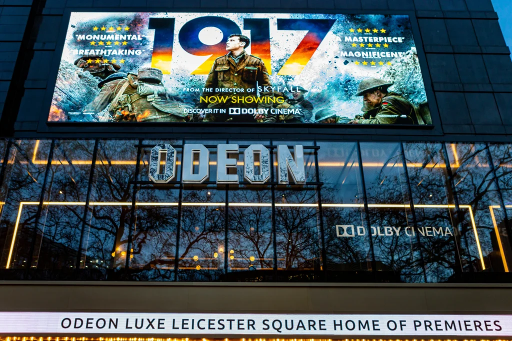
Bold, sans-serif fonts have become a dominant trend in movie posters, especially for action-packed blockbusters and science fiction films. These fonts convey strength, clarity, and modernity. They stand out on posters, making titles easy to read, even from a distance, and are highly adaptable across various media formats, from print to digital screens.
The popularity of sans-serif fonts can be attributed to their versatility and the growing influence of minimalism in design. These fonts deliver a clean and contemporary aesthetic, making them ideal for fast-paced, intense films.
Retro and vintage fonts are experiencing a resurgence, especially in films that evoke nostalgia, celebrate past eras, or are set in historical contexts. These fonts instantly transport audiences back to a specific time period and help create an immersive atmosphere.
Retro fonts bring a sense of timelessness and charm to posters, evoking sentimental emotions from audiences. They often combine serif elements with ornamental touches to create designs that resonate with specific decades or historical periods.
Handwritten and script fonts are often used in indie and drama films, giving posters a personal, human touch. These fonts can make a film feel more intimate, as if the title was written by hand. They convey authenticity, creativity, and emotion, making them perfect for films with deeply personal or artistic narratives.
Handwritten fonts are becoming more common in movie posters, especially in genres that value emotional depth or a strong artistic identity. They create a sense of approachability and originality that draws audiences in.
Minimalist typography is gaining traction as part of the broader trend toward simplicity in design. These fonts, often thin and clean, work well for drama, thriller, and high-concept films. By stripping away excessive design elements, minimalist fonts focus attention on the movie’s title and evoke a sense of sophistication.
Minimalist fonts allow for greater focus on other design elements, such as imagery, while still ensuring that the title remains prominent. The trend aligns with the modern aesthetic of sleek, functional design that many filmmakers are now gravitating toward.
Many blockbuster films and franchises are opting for custom fonts that help create a unique and recognizable brand identity. These fonts are often designed specifically for the movie and are used consistently across all marketing materials. Custom fonts allow films to stand out from the crowd and can even become iconic in their own right.
Custom fonts give films a distinctive look that enhances brand recall. For major franchises, these fonts often become part of the cultural zeitgeist, appearing on merchandise and spinoff materials, creating a cohesive identity for the entire cinematic universe.
Experimental typography involves breaking the rules of traditional design to create innovative and visually striking posters. This trend is often seen in avant-garde films, horror movies, and psychological thrillers, where the typography itself can reflect themes of chaos, disorder, or the surreal. These fonts can be distorted, fragmented, or layered to create a sense of unease or intrigue.
Experimental typography is a powerful tool for evoking emotions and making bold statements in film marketing. It pushes the boundaries of what fonts can communicate, often serving as a visual metaphor for the film’s deeper themes.
Movie poster fonts are more than just design elements—they are a visual language that communicates a film’s essence, genre, and tone. From bold sans-serif fonts for action-packed blockbusters to experimental typography that challenges conventions, the trends in movie poster fonts are constantly evolving. Whether filmmakers are evoking nostalgia with retro fonts or building a unique brand with custom typefaces, the choice of font plays a critical role in the overall success of a movie’s marketing campaign.
As design continues to evolve, so too will the typography trends in movie posters. Designers and marketers must stay attuned to these trends, ensuring that the fonts they choose resonate with audiences and enhance the film’s visual identity. Ultimately, a well-chosen font can help a movie poster stand out in a crowded marketplace and leave a lasting impression on viewers.
