


In today’s fast-paced, technology-driven world, professional fonts must function seamlessly across a variety of devices. Whether it’s a desktop, tablet, smartphone, or even a smartwatch, readability, legibility, and aesthetic appeal are crucial. Professional fonts play a significant role in maintaining brand consistency, enhancing user experience, and communicating effectively across platforms.
This article explores the importance of choosing professional fonts, the technical considerations behind selecting fonts that work well on multiple devices, and how to ensure your typography stands out, no matter the screen size or resolution.
Professional fonts go beyond just looking good—they enhance readability, create brand identity, and ensure accessibility for a wide range of audiences. These fonts are crafted with precision to deliver a polished, cohesive feel that aligns with the goals of modern businesses.
Your brand is your identity. The fonts you choose can make or break how your business is perceived by your audience. A professional font conveys trust, reliability, and authority, while a poorly chosen font can confuse your audience and dilute your message.
Good typography improves readability and user experience. Fonts designed for professional use are optimized for various screen sizes and ensure that content is legible without straining the eyes. Whether it’s a lengthy blog post, a website, or an app, selecting the right font ensures that users can easily digest the content.
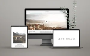
In an era where content is consumed on multiple platforms, ensuring that your fonts perform well across all devices is essential. Responsive design extends beyond layouts; fonts should adapt to screen sizes while retaining their clarity and appeal. There are several factors to consider when choosing professional fonts for cross-device use:
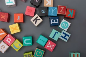
Fonts are generally categorized into two primary families: serif and sans-serif. Each category has its own set of characteristics that make it more or less suitable for certain devices or content types.
Another important aspect of choosing fonts is the weight and style variations that the font family offers. Professional fonts typically come in a wide range of weights (light, regular, bold, etc.) and styles (italic, condensed, etc.), allowing for flexibility and consistency in design.
Avoid relying solely on thin fonts for mobile devices, as they may lose clarity when displayed on smaller screens or in low-light settings. Instead, opt for font families with varied weights that can adapt to different device conditions.
To make sure your fonts are professional across all devices, several best practices can help you ensure compatibility and optimal performance. These include testing across devices, using modern font formats, and paying attention to typography details.
When it comes to web fonts, the most widely used formats are WOFF (Web Open Font Format) and WOFF2. These formats are compressed for fast loading while maintaining high quality. Ensuring that your professional fonts are available in these formats guarantees they will be supported across most modern browsers and devices.
The right font size and line spacing can make a huge difference in the readability of your content across devices. Mobile users tend to require larger font sizes and more generous line spacing, while desktop users may prefer tighter text arrangements. It’s essential to create a clear hierarchy in your typography so that users can easily navigate the content.
Several professional fonts are widely regarded for their versatility and cross-device performance. These fonts are known for their readability, compatibility, and clean design, making them perfect choices for businesses looking to maintain a professional image.
Roboto is a modern, geometric sans-serif font that is highly popular in web and mobile design. It is used extensively in Google’s Android operating system and is known for its clarity and readability, even on small screens.
Open Sans is another versatile sans-serif font that works well across devices. It offers great legibility at both small and large sizes, making it ideal for responsive design. It is widely used in websites, apps, and even printed material.
Montserrat is a clean and stylish font with geometric simplicity. Its bold appearance and variety of weights make it suitable for both display and body text. It is a popular choice for brands that want a modern and professional look across platforms.
Professional fonts are essential to creating a cohesive, visually appealing, and functional design across all devices. From improving readability to reinforcing brand identity, the right font choice plays a crucial role in maintaining a professional image. By considering factors such as font family, weight, size, and modern formats, designers can ensure that their typography works seamlessly across various screen sizes and resolutions.
As the digital landscape continues to evolve, staying up-to-date with the latest font technologies and best practices is vital for businesses and designers alike. By selecting professional fonts optimized for cross-device use, you can ensure that your message is clear, impactful, and accessible to users, no matter how they access your content.