


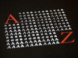
Choosing the right font for your PowerPoint presentation can make a significant impact on how your audience perceives your message. A well-selected font enhances readability, visual appeal, and overall professionalism. In this article, we’ll explore the top fonts for PowerPoint slides, providing insights into their best uses, styles, and the impressions they create.

Fonts play a crucial role in visual communication. The right font can establish a connection with the audience, reinforce the tone of your presentation, and ensure that your content is easy to read. A poorly chosen font, on the other hand, can lead to confusion, distractions, and even a lack of engagement. Let’s break down why font selection is critical:
Serif fonts are known for their classic, elegant appearance. They are often used in professional settings where authority, tradition, and trustworthiness are key. Here are some top serif fonts that work well in PowerPoint presentations:
Times New Roman is one of the most recognizable serif fonts. It’s been used in printed publications for decades and remains a top choice for formal presentations. Its legibility makes it ideal for slides that require dense text, like financial reports or academic papers.
Georgia offers a more modern take on the traditional serif style. Its larger character size makes it easy to read on screens, even at smaller font sizes. Georgia is a versatile choice for corporate presentations or content that needs a professional yet approachable tone.
Sans-serif fonts are clean, modern, and often preferred for digital formats, including PowerPoint presentations. These fonts have no serifs, or “feet,” which gives them a sleek, minimalist look. They are widely used for tech, business, and creative presentations. Let’s take a look at some of the best sans-serif fonts:
Arial is one of the most widely used sans-serif fonts, known for its simplicity and versatility. It’s an excellent choice for clear, straightforward slides. Its neutral design makes it ideal for any type of presentation, from corporate to educational.
Calibri is the default font for many Microsoft products, including PowerPoint. It has a clean, modern aesthetic that works well for professional presentations. Calibri is particularly effective when used in bullet points and headings due to its balance between simplicity and readability.
The titles and headings of your slides need to stand out and grab attention. Bold, impactful fonts are typically preferred for these elements, ensuring they are easy to read and highlight key points. Below are some fonts that excel in this role:
As the name suggests, Impact is a bold, attention-grabbing font perfect for titles and headings. Its thick strokes and strong presence make it ideal for conveying urgency or importance in your slides. However, due to its weight, it’s best used sparingly for headlines only.
Helvetica Bold is a widely recognized sans-serif font known for its clarity and precision. It’s a popular choice for headings due to its balanced design and professional appeal. Helvetica’s neutral tone makes it adaptable to various presentation themes.

The body text of your slides is where the bulk of your information is presented, so the font you choose should be legible, even from a distance. A clear, unembellished font ensures that your audience can focus on the content without straining their eyes.
Verdana was designed for digital displays, making it an excellent choice for body text in PowerPoint slides. Its large x-height and wide letter spacing improve readability on screens, ensuring your audience can follow along with ease.
Tahoma is another great option for body text, with its narrow letterforms and high legibility. It works well in both small and large text sizes, making it versatile for different presentation formats.
When you’re presenting creative ideas, such as in marketing pitches or design concepts, you may want to use more unique fonts to express your style. Here are a few options that stand out in more artistic presentations:
Futura is a geometric sans-serif font known for its modern, forward-looking style. Its clean lines and minimalistic design make it a favorite for creative presentations. Futura conveys sophistication and innovation, making it perfect for design or tech-related slides.
Avenir is another geometric sans-serif font with a contemporary feel. It strikes a balance between elegance and creativity, making it suitable for artistic and professional presentations alike. Its versatility allows it to be used for both titles and body text.

Choosing the right font pairings can elevate the visual appeal of your slides. Pairing a bold, attention-grabbing font for titles with a clean, simple font for body text creates a balanced design. Here are some effective font pairings:
Font choice plays a significant role in the success of your PowerPoint presentation. Whether you’re aiming for a professional, creative, or clean look, the fonts you select can greatly impact how your message is received. From classic serif fonts like Times New Roman and Georgia to modern sans-serif options like Arial and Futura, there are numerous fonts to suit every presentation style. Pairing the right fonts for titles and body text is key to maintaining clarity and visual appeal. By considering the needs of your audience and the tone of your presentation, you can ensure that your slides are both readable and engaging.
Next time you’re preparing a PowerPoint presentation, experiment with these fonts and pairings to find the perfect fit for your content.
