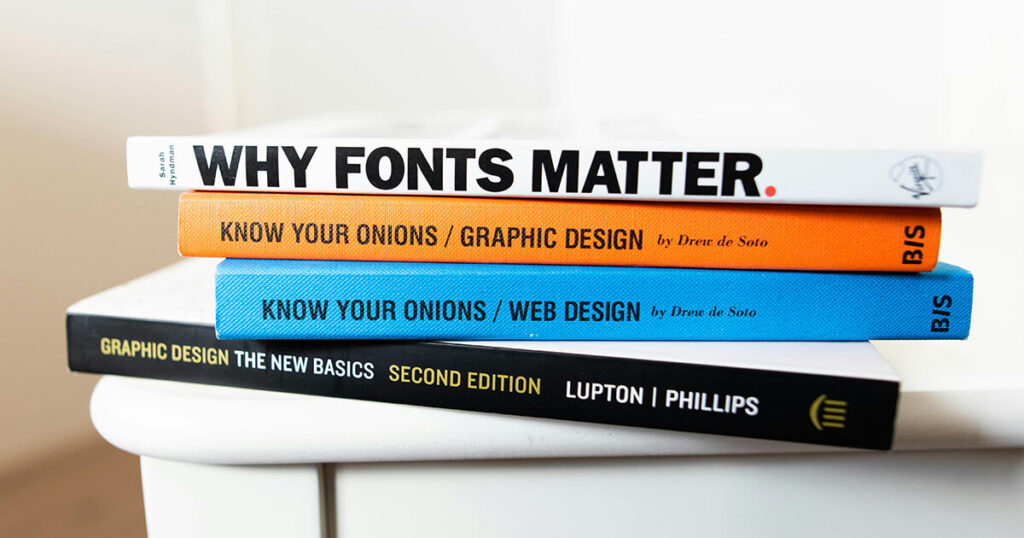
Typography is not only about letters selection to deliver a message; it is also a major factor in which a person forms ideas and engages with the object. Fonts can be applied as a means of emotional release, visual stacking, and information guidance. The visual environments in which duplicate or contrast the, typography which expresses the feelings, is a basic element in emotional expression, the tone of voice, and the context.
A very important function of typography is to establish the design’s atmosphere. For instance, a dynamic, modern sans-serif font can communicate a sense of safety and innovation that suits best tech brands or corporate communications. However, a soft serif font could be an expression of a delicate high-end luxury brand that implies fashion and tradition. The visual language that tells a story can, in fact, be the choice of font at the very beginning that brings the message to the right audience.
Typography needn’t just be visually aesthetic and attractive, it should also help the reader through the narrative. Fonts with different weights and size create a hierarchy, thus the viewer is directed at the crucial parts of a design. Headings are frequently fuller and more striking to attract attention, while body text is more neutral and easier to read. This arrangement helps the reader to comprehend the content in order, unlike when a multi-faceted story or a brand message is being told.
Fonts are devices that transfer emotions and perceptions. A handwritten script font could be one example, as a result, it often has an aura of warmth and becoming personal, it is widely used in commemoration invites and innovative project presentations. On the contrary, a font in geometric shapes of sharp angles and corners can lead to the eye seeing things accurately and in good order, often used for architecture or engineering purposes respectively. The feelings that typography builds allow for the designers to stay true to the storytelling art. They can make sure that the design, through its emotions, stays with the narrative central idea, and goes back to the initial impact of the words.
A brand’s success in storytelling lies in equality, which is an aspect of typography. The typeface that the company decides on goes to a large extent and becomes part of the brand together with colors, images, and logos. The logo that accompanies the text is the very same across channels, this results in a brand that spreads the storytelling web and creates familiarity with its client. The power of this uniformity is not only on the brand’s voice but also on the trust it builds with the audience who relies upon it over time.
Along with typography, visual storytelling presents not only “the pretty signs” but also practical ways for expressing ideas and emotions. In the process of applying these signs in a brand’s identity design, marketing campaign layout, or editorial content, one must remember that the chosen font has a fundamental influence on the audience’s perception as well as understanding. Through applying typography’s magic, designers can improve their storytelling, making visuals that are below the surface.