

Typography plays a pivotal role in graphic design, web design, branding, and virtually any other field that requires the visual representation of text. To truly appreciate the art of type and design, it’s essential to understand the anatomy and structure of fonts. This knowledge allows designers and typographers to make informed decisions about font selection, pairing, and customization to communicate effectively through text. In this article, we’ll explore the core components that make up font anatomy and structure, discussing their functions and significance, and how they impact the overall design.
Font anatomy refers to the various individual parts of a letterform that come together to form a complete typeface. These parts each serve a functional role, influencing the overall readability, legibility, and aesthetic quality of a typeface. Understanding these elements is fundamental to understanding how different fonts behave and how they can be effectively used in design projects.
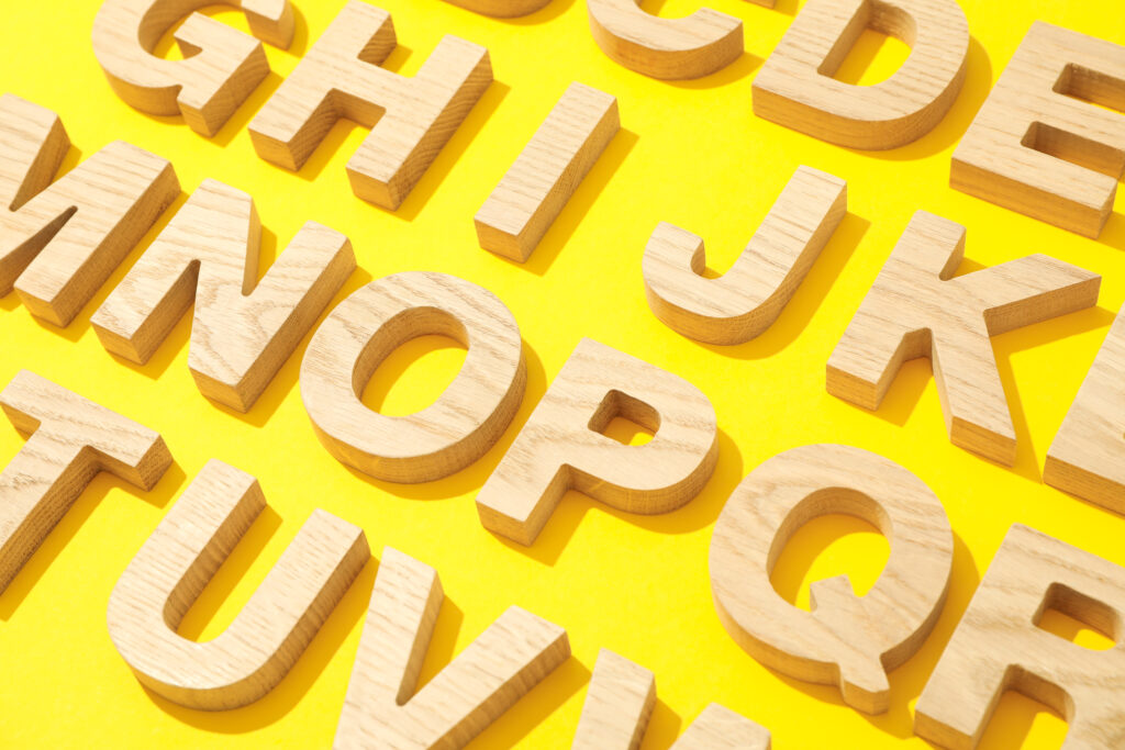
There are several key components in font anatomy that every designer should be familiar with. Here are the most common ones:
While font anatomy refers to the individual parts of a letter, font structure focuses on how those parts come together to create cohesive letterforms. It’s the way these components align and interact that dictates the font’s overall personality and usability in design.
The structure of a font is crucial for legibility, especially when used for long texts. Factors such as the width of the strokes, the shape of the letters, and the space between them all influence how easy it is for the human eye to process the text.
The way fonts are structured has evolved significantly over time. For instance, early typefaces like the ones used in the printing press were influenced by the hand-lettered forms of the time. These fonts were designed to mimic the shapes of calligraphy and used more elaborate strokes, which were more difficult to read at small sizes. Over time, typefaces have become more streamlined to enhance readability, especially with the rise of digital media. Fonts like Helvetica, which is known for its clean and minimalistic structure, gained popularity because of their versatility and clarity in both print and digital environments.
Typography is often divided into distinct categories, or classifications, based on their structural features. These classifications help designers determine which fonts are most appropriate for a specific design project.
Here are the most commonly recognized classifications in typography:
Choosing the right font pairings is essential for creating balanced, readable designs. The structure of the fonts you select plays a key role in how well they work together. Generally, contrasting typefaces with different structures (e.g., a serif paired with a sans-serif) create dynamic combinations that draw attention, while fonts with similar structures create a more harmonious look.
Font anatomy and structure play a pivotal role in branding because typography is often one of the first elements people encounter in a brand’s visual identity. The right font choice can evoke the desired emotions and convey the brand’s personality effectively.
A well-known example is the redesign of the Yahoo logo. The company’s rebranding effort involved selecting a new typeface with a cleaner and more modern structure, aiming to convey a sense of reliability and approachability. The font’s round and friendly structure helped shift the perception of the brand from outdated to contemporary and fun, in line with the company’s vision for growth.
Understanding font anatomy and structure is essential for designers who want to craft visually compelling and effective designs. The parts of a letterform, from its baseline to its ascender, and the structural relationships between these parts, directly influence the readability, aesthetic appeal, and emotional impact of the text. By mastering these concepts, designers can make informed decisions that elevate their work, whether in branding, advertising, or any other design field. Whether you are selecting fonts for a website, designing a logo, or working on printed materials, keeping font anatomy and structure in mind is key to achieving impactful, high-quality designs.
