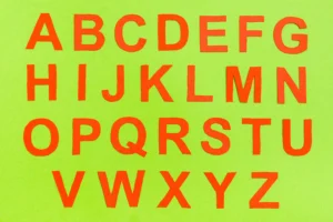
In the digital age, fonts play a crucial role in shaping the user experience across various platforms. Whether it’s a website, mobile app, or print media, the choice of font can significantly impact readability, brand identity, and overall aesthetic appeal. This article delves into the world of versatile fonts, exploring their importance, characteristics, and applications across different platforms. We will also provide examples of fonts that excel in versatility and discuss best practices for selecting and using fonts effectively.
The Importance of Versatile Fonts

Fonts are more than just a means of displaying text; they are a powerful tool for communication. The right font can convey emotions, establish brand identity, and enhance user experience. Versatile fonts, in particular, are essential because they can adapt to various contexts and platforms without losing their effectiveness. Here are some reasons why versatile fonts are important:
- Consistency Across Platforms: A versatile font ensures that your brand maintains a consistent look and feel across different platforms, from websites to mobile apps to print materials.
- Improved Readability: Versatile fonts are designed to be legible across different screen sizes and resolutions, ensuring that your content is accessible to a wide audience.
- Enhanced Aesthetic Appeal: A well-chosen font can elevate the visual appeal of your design, making it more engaging and professional.
- Cost-Effectiveness: Using a single versatile font across multiple platforms can save time and resources, as you won’t need to purchase or design multiple fonts for different uses.
Characteristics of Versatile Fonts

Not all fonts are created equal when it comes to versatility. Some fonts are designed specifically for print, while others are optimized for digital screens. Versatile fonts, however, possess certain characteristics that make them suitable for a wide range of applications. Here are some key characteristics of versatile fonts:
- Legibility: Versatile fonts are easy to read, even at small sizes or on low-resolution screens.
- Scalability: They maintain their clarity and aesthetic appeal when scaled up or down, making them suitable for both headlines and body text.
- Multiple Weights and Styles: Versatile fonts often come in a variety of weights (e.g., light, regular, bold) and styles (e.g., italic, condensed), allowing for greater flexibility in design.
- Cross-Platform Compatibility: They are designed to work well across different operating systems, browsers, and devices, ensuring consistent rendering.
- Neutral Aesthetic: Versatile fonts tend to have a neutral or timeless design, making them suitable for a wide range of applications without appearing dated.
Examples of Versatile Fonts

There are countless fonts available today, but some stand out for their versatility. Here are a few examples of fonts that are widely regarded as versatile and suitable for various platforms:
- Helvetica: Known for its clean and neutral design, Helvetica is a popular choice for both print and digital media. Its wide range of weights and styles makes it highly adaptable.
- Roboto: Designed by Google, Roboto is optimized for digital screens and is the default font for Android. Its geometric design and readability make it a versatile choice for web and mobile applications.
- Open Sans: Another Google font, Open Sans is known for its legibility and neutral design. It works well for both body text and headlines, making it a versatile option for various platforms.
- Lato: Lato is a sans-serif font that combines a modern aesthetic with a humanist touch. Its balanced design makes it suitable for both digital and print media.
- Georgia: A serif font designed for screen readability, Georgia is often used for body text on websites. Its classic design also makes it suitable for print media.
Best Practices for Selecting and Using Versatile Fonts

Choosing the right font is only the first step; how you use it is equally important. Here are some best practices for selecting and using versatile fonts effectively:
- Consider the Context: Think about where and how the font will be used. A font that works well for a corporate website may not be suitable for a creative portfolio.
- Test Across Platforms: Before finalizing a font, test it on different devices, browsers, and operating systems to ensure consistent rendering.
- Pair Fonts Wisely: When using multiple fonts, ensure they complement each other. A common practice is to pair a serif font with a sans-serif font for contrast.
- Limit the Number of Fonts: Using too many fonts can create a disjointed look. Stick to two or three fonts to maintain a cohesive design.
- Pay Attention to Hierarchy: Use different weights and styles to create a visual hierarchy, guiding the reader’s eye through the content.
- Optimize for Readability: Ensure that the font size, line height, and spacing are optimized for readability, especially on smaller screens.
Versatile Fonts in Web Design

Web design is one of the most common applications for versatile fonts. The choice of font can significantly impact the user experience, affecting everything from readability to load times. Here are some considerations for using versatile fonts in web design:
- Web-Safe Fonts: These are fonts that are pre-installed on most devices and browsers, ensuring consistent rendering. Examples include Arial, Times New Roman, and Verdana.
- Web Fonts: Web fonts are hosted on a server and can be downloaded by the browser, allowing for greater design flexibility. Google Fonts and Adobe Fonts are popular sources for web fonts.
- Performance: Some web fonts can be large in file size, affecting page load times. Optimize font files and use font-display properties to ensure a smooth user experience.
- Responsive Design: Ensure that your fonts are responsive, meaning they adapt to different screen sizes and resolutions. This may involve adjusting font sizes and line heights for different devices.
Versatile Fonts in Mobile Applications

Mobile applications present unique challenges for font selection, given the limited screen real estate and varying device capabilities. Here are some tips for using versatile fonts in mobile apps:
- Prioritize Readability: Mobile screens are smaller, so it’s crucial to choose fonts that are easy to read at small sizes. Sans-serif fonts like Roboto and Open Sans are popular choices.
- Consider Touch Targets: Ensure that text is large enough to be easily tapped, especially for interactive elements like buttons and links.
- Adapt to Different Devices: Test your fonts on various devices and screen sizes to ensure they render correctly. Consider using scalable vector fonts for better adaptability.
- Optimize for Performance: Mobile devices often have limited processing power and memory, so choose fonts that are optimized for performance. Avoid using too many font weights and styles, as this can increase load times.
Versatile Fonts in Print Media

While digital media has become increasingly dominant, print media still plays a significant role in many industries. Versatile fonts are just as important in print as they are in digital media. Here are some considerations for using versatile fonts in print:
- Legibility: Print fonts need to be highly legible, especially for body text. Serif fonts like Georgia and Times New Roman are commonly used for print due to their readability.
- Resolution: Print media typically has a higher resolution than digital screens, allowing for more detailed and intricate fonts. However, ensure that the font remains legible when printed at different sizes.
- Color and Contrast: Consider the color and contrast of the font against the background. High contrast is essential for readability, especially in printed materials like brochures and posters.
- Consistency with Digital Media: If your print materials are part of a larger branding strategy, ensure that the fonts used are consistent with those used in digital media.
Conclusion
Versatile fonts are an essential tool for designers and content creators, offering the flexibility to adapt to various platforms and contexts. By understanding the characteristics of versatile fonts and following best practices for their selection and use, you can enhance the readability, aesthetic appeal, and overall user experience of your designs. Whether you’re working on a website, mobile app, or print material, the right font can make all the difference. Remember to test your fonts across different platforms, prioritize readability, and maintain consistency to ensure a cohesive and professional look. With the right approach, versatile fonts can help you create compelling and effective designs that resonate with your audience.
Q&A
Q: What makes a font versatile?
A: A versatile font is one that is legible, scalable, and compatible across different platforms and devices. It often comes in multiple weights and styles, allowing for greater flexibility in design.
Q: Can I use the same font for both web and print?
A: Yes, many fonts are designed to be versatile and can be used for both web and print. However, it’s important to test the font in both contexts to ensure it maintains its readability and aesthetic appeal.
Q: How many fonts should I use in a single design?
A: It’s generally recommended to stick to two or three fonts in a single design to maintain a cohesive look. Using too many fonts can create a disjointed and unprofessional appearance.
Q: Are web fonts better than web-safe fonts?
A: Web fonts offer greater design flexibility and a wider range of options, but they can also impact page load times. Web-safe fonts, on the other hand, are pre-installed on most devices and ensure consistent rendering. The choice depends on your specific needs and priorities.
Q: How do I ensure my fonts are readable on mobile devices?
A: Choose fonts that are designed for screen readability, such as sans-serif fonts like Roboto and Open Sans. Ensure that the font size is large enough to be easily read on small screens, and test the font on various devices to ensure consistent rendering.


