

As one of the pivotal elements in art, fonts also represent modern design. Fonts are regarded by many not only as a means for laying out text but as a whole separate medium that transmits visual information: they can change meaning, bring a mood, and influence the brand image. This article will detail the reasons font selection is so significant in modern design.
One of the best ways to achieve a strong visual identity is by making the brand or product a brand name that is more easily recognizable, while the font is a key part of that identity. The right choice of font can create a positive first impression. For instance, Times New Roman and Georgia are the commonly used serif fonts that express a formal, traditional, and professional attitude. On the contrary, sans-serif fonts like Arial and Helvetica lead one to think of a more modern, less complicated, and more transparent feeling.
To illustrate, the use of an old-fashioned and complicated font by a tech brand could undermine the image of an innovator that it wants to convey. An opposite example is a brand in the arts sector that may choose more artistic and imaginative fonts to showcase its character. Therefore, choosing the most appropriate font not only reflects the brand identity but can also attract the right audience.
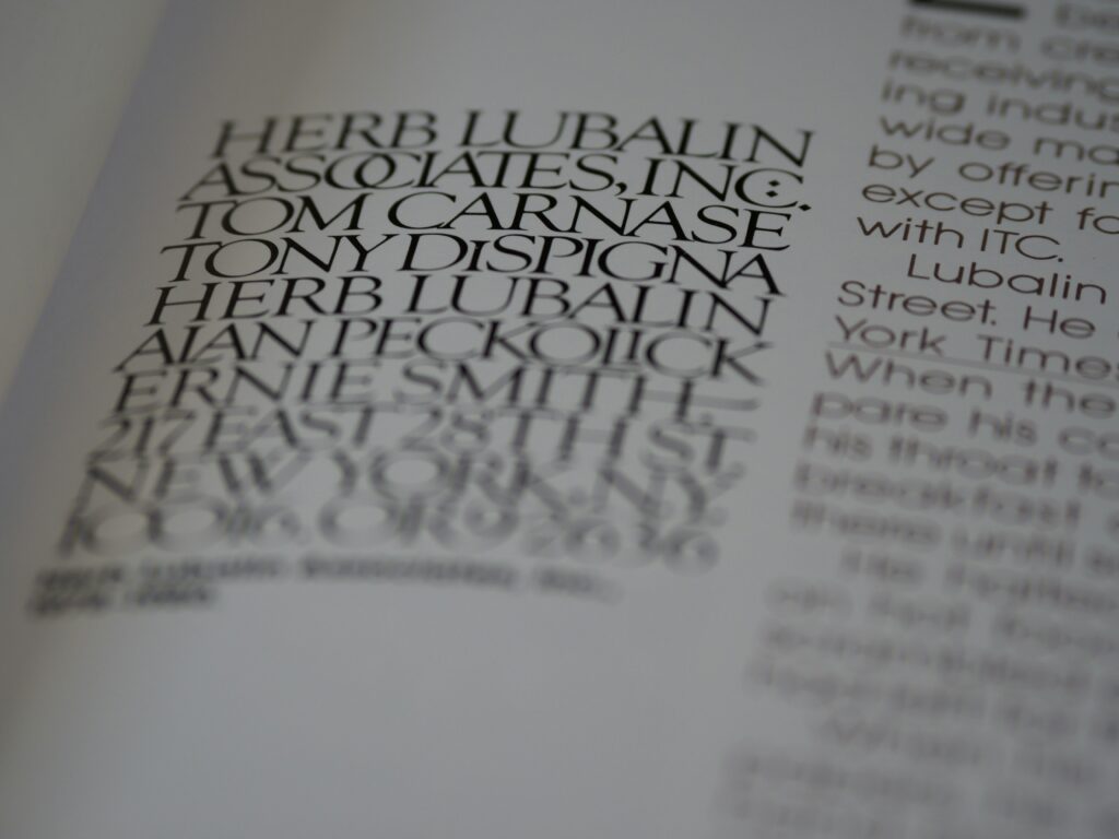
Every font has its own typical features that can trigger some emotions and particular moods. For example, fonts that are smooth and slick might evoke the feeling of luxury or romance. At the same time, bold and strong fonts may be interpreted as confident, daring, or assertive.
Designers often apply these characters to fonts intentionally to send a specific message that reflects the emotion they want to stir in the viewer’s mind. Fonts are a part of the visual language that promotes the content. For example, calligraphy or script fonts usually accompany wedding invitations to express a romantic and formal atmosphere. Band concerts might use rough and edgy fonts for posters to create a feeling of being spontaneous and full of energy. All in all, the choice of the right font can help the audience to understand not only the emotions but also the calming or wondering moods of the implicit message grasped before any words are seen.
Choosing an appropriate font is what helps ensure audience reading by the selection of the right font. It may be irrelevant if the design is incredibly beautiful; however, the message can be hard to decode due to lousy reading.
Modern designers face the great challenge of balancing aesthetics with clarity when selecting fonts. For instance, it is common use of sans-serif fonts, such as Arial, or Helvetica in long web texts, since their plain sense of form is evident. On the contrary, serif types might be preferable in print materials due to their additional strokes that help the eye to read long sentences. Besides the type of font, size and letter spacing (kerning) play significant roles in readability too. In the case, that the font is too tight or small, the readers will face a struggle to understand the text, as a result, the user experience will be negative.
Fonts could be very crucial in exploratory designs like PowerPoint presentations, websites, or magazines; they can organize and separate information through the right font choice. Designers usually play a range of two or three different font types for title, subtitle, and body text. This will help the audience to scan and see the information presented with clarity.
The use of contrasting fonts, for instance, pairing serif fonts for titles with sans-serif fonts for body text, will also produce a clear visual structure overall. People will comprehend data much easier if there is a clear visual hierarchy. If the font is not clearly different, the design will become confusing, and the important data can be lost.
Creativity is what designers strive to achieve in the design field today. One of the keys to a successful project is the user choosing unique and creative fonts while other techniques are similar. Today, the designers are provided with a board of options which includes creating the font type thus giving the design a special look.
Nonetheless, in font selection creativity is not enough, the appropriateness of the brand and audience is crucial. Of course, a font that is out of the box could draw the viewer’s attention but it could also be a huge turnoff to the audience if it does not mesh with the message. The balance between creativity and functionality is critical in font selection that is effective.
In the branding process, consistency is not only important but also pivotal in modern design. Good brands relevantly put the same or similar fonts on their logos, websites, advertisements, and social media. This consistency in the font selection scheme aids a brand’s strength when it comes to recognition and also the creation of a professional image.
If a brand regularly alters its fonts without any reason, it could be regarded as messy by the audience and could also be a source of confusion. Therefore, consistent font selection is key to the development of a reliable and credible brand image.
With the advancement of technology and design styles, typography trends are also forever changing. Currently, the digital era is dominated by a clean and minimalistic sans-serif font because of its wide use on various digital platforms. On the other hand, the classic serif font gets back in the game due to its virtue of modern designs being elegant.
Additionally, the custom or the ones that are designed especially for brands are making a little habit out of them. It adds a pinch of uniqueness and helps the brand to stand alone. Relying on the typographic trend will ensure the designs will look fresh and cover the current issues while still, cognizing how well they fit with the brand and the message being conveyed.
Choosing a font in modern design goes far beyond the mere text style selection. Fonts are capable of creating brand identity, conveying emotions, ensuring readability, helping to organize information, adding creativity, maintaining brand consistency, and following the trends of design that are on the rise. Hence, making the right font choice will not just enhance the aesthetics of a design but also facilitate the message delivery to the audience more effectively. Making a detailed choice of a font is one of the essentials for the designer, who should think of it as a main point in not only looking aesthetically beautiful but also in functioning well and aligning with the purpose of the design itself.
