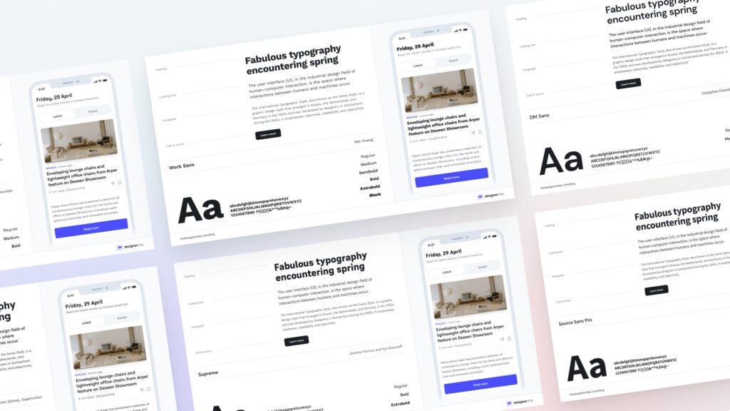
In the digital landscape of 2026, user attention is the most valuable currency. While high-definition imagery and immersive video capture the eye, it is typography that carries the weight of communication. Choosing readable fonts for website and user interface design is crucial in this context. Readable fonts are not merely an aesthetic choice; they are the fundamental building blocks of User Experience (UX). Whether a user is navigating a complex FinTech dashboard or reading a long-form article on a mobile device, the ease with which they can process text determines the success of the interface.
The transition from “Generative Design” to “Human-Centric Clarity” has defined this year’s design trends. Designers are no longer just looking for “cool” typefaces; they are analyzing x-heights, stroke contrasts, and aperture widths to ensure that content is accessible to everyone, including those with visual impairments or cognitive disabilities. This article explores the science of readability, the best font families for UI, and the technical principles that ensure your text is as clear as your vision.
Before diving into specific fonts, it is crucial to distinguish between legibility and readability. Legibility refers to the design of the typeface itself—how easy it is to distinguish one character from another (e.g., telling a capital “I” apart from a lowercase “l” or the number “1”). Readability, on the other hand, is about how blocks of text are arranged. It is the result of font choice combined with size, spacing, and color.
A font might be highly legible in a logo but fail the readability test when used for a 1,000-word blog post. In UI design, we must optimize for both. High legibility ensures that a user can quickly identify a “Delete” button without hesitation, while high readability ensures they can read an entire Terms of Service document without suffering from eye strain.
For decades, sans-serif fonts have been the “gold standard” for digital interfaces. Their clean lines and lack of decorative “feet” (serifs) make them incredibly resilient to various screen resolutions. In 2026, the preference for sans-serif continues, particularly as interfaces become more data-dense and mobile-first.
The technical reason for this dominance lies in “aliasing.” On older screens, the fine details of serif fonts would often blur. While modern “Retina” and 4K displays handle serifs much better, the psychological association between sans-serif and “modernity” or “efficiency” persists. Furthermore, the geometric simplicity of sans-serif fonts allows for better scaling across responsive designs—from a smartwatch face to a massive smart-TV dashboard.
While sans-serif wins for utility, serif fonts are making a significant comeback in editorial and luxury branding. In 2026, we see a trend called “The Sophisticated Web,” where serifs are used to convey authority, history, and warmth. Because modern screens are now sharp enough to render fine serifs perfectly, the technical barriers have vanished.
Serifs are often preferred for long-form reading. The “feet” of the characters are thought by some typographers to create a horizontal flow that guides the eye along the line, though scientific studies on this remain mixed. What is certain is that serifs provide a distinct “personality” that sans-serifs often lack. They are ideal for literary sites, news journals, and high-end fashion e-commerce where the brand narrative is as important as the product.
The most significant technical advancement in 2026 typography is the widespread adoption of Variable Fonts. Traditionally, if a designer wanted to use “Light,” “Regular,” “Bold,” and “Black” weights of a font, the website had to load four separate files. A variable font is a single file that can transition between these weights (and even widths or slants) on a continuous spectrum.
This is a game-changer for accessibility. With variable fonts, we can dynamically adjust the weight of a font based on the user’s ambient lighting. If a user is in a dark room, the font can become slightly bolder to prevent “halation” (the glow of white text on dark backgrounds). This level of responsiveness ensures that readability is maintained regardless of the physical environment, a core tenet of modern inclusive design.
The impact of typography on business outcomes is measurable. A famous study by the MIT AgeLab found that different fonts used in automotive interfaces directly affected “glance time.” In high-stress or high-speed environments, a legible font could literally be the difference between safety and an accident. In the world of e-commerce, the stakes are similarly high regarding conversion rates.
Consider a 2025 case study from a major global news outlet. By increasing their body font size from 14px to 18px and switching to a variable sans-serif with optimized line height, they saw a 22% increase in average time-on-page and a 15% reduction in bounce rate. Users didn’t just find the site prettier; they found it physically easier to consume the content, leading to deeper engagement and more ad revenue.
Not all interfaces are created equal. For financial dashboards, coding environments, or data-heavy applications, the requirements change. Here, Monospaced fonts (where every character takes up the same horizontal space) or “tabular num” settings are essential. This ensures that columns of numbers align perfectly, allowing the user to scan for discrepancies or trends at a glance.
In 2026, we also see the rise of “Contextual Typography.” In medical apps, for instance, certain letters or numbers that are commonly confused (like ‘O’ and ‘0’) are designed with distinct features to prevent errors in dosage or patient ID tracking. Designing for these specialized niches requires a deep understanding of the “user’s task” rather than just a general eye for beauty.
Finally, the choice of font must align with the brand’s psychological profile. A font is the “tone of voice” of your interface. A rounded sans-serif like Quicksand feels friendly and approachable, making it perfect for a social app or a children’s platform. Conversely, a sharp, geometric font like Montserrat feels architectural and bold, suiting a creative agency or a construction firm.
When selecting a font, always consider your primary demographic. Older audiences benefit from higher contrast and slightly larger weights. Younger, tech-savvy audiences may appreciate tighter, more minimalist designs. Testing your font choices with real users using “cloze tests” (reading comprehension tests) is the only way to truly validate that your typography is working as intended.
Typography is the silent partner of UI design. In 2026, the move toward readable fonts is driven by a mix of high-resolution hardware, the technical flexibility of variable fonts, and a growing commitment to digital accessibility.
By treating typography as a science rather than just a decoration, designers can create interfaces that are not only beautiful but also accessible, inclusive, and highly effective.