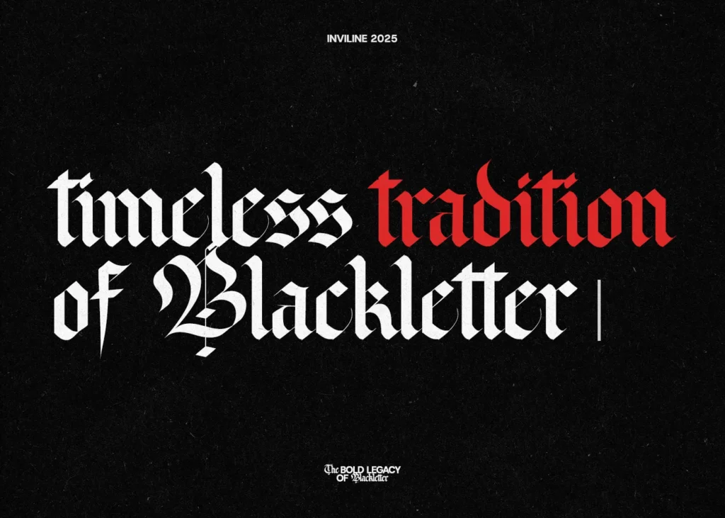
Blackletter fonts, known as Gothic script, originated during the medieval period around the 12th century. Monks meticulously crafted these fonts in handwritten manuscripts. The distinctive heavy strokes and intricate details became iconic. Initially developed in Europe, blackletter fonts quickly symbolized authority, tradition, and religious texts.
By the 13th century, a form called Textura gained immense popularity. Textura featured dense, vertical lines and uniform strokes. Scribes across Germany and France widely adopted this style. The Gutenberg Bible, printed in 1455, prominently featured Textura, establishing its dominance. Consequently, Textura became synonymous with printed religious texts.
In the early 16th century, Fraktur emerged prominently in Germany. This style offered more decorative, elegant flourishes compared to Textura. Fraktur’s distinctive curved strokes made it popular among printers and artists. Martin Luther’s writings extensively utilized Fraktur, reinforcing its association with German identity. Thus, Fraktur dominated German typography for centuries, especially in printed books and official documents.
Also Read : History of Elegant Script Font: Origins, Evolution & Modern Usage
Simultaneously, other blackletter variants, such as Schwabacher and Bastarda, appeared. Schwabacher presented rounded strokes and softer edges. German printers favored it for everyday publications. Bastarda, meanwhile, combined Textura and cursive styles, becoming popular throughout France and Italy. Printers frequently used Bastarda for informal texts, literary works, and personal writings.
In the late 16th century, blackletter fonts began losing dominance due to readability concerns. Roman typefaces, such as Garamond and Baskerville, emerged prominently in Europe. Roman fonts offered clearer legibility and greater flexibility. Consequently, publishers gradually replaced blackletter fonts with these simpler, clearer typefaces. The shift accelerated during the 17th and 18th centuries across most European countries.
Nevertheless, Germany remained loyal to blackletter typography until the early 20th century. Germans perceived blackletter fonts as culturally significant and deeply patriotic. Official government publications, newspapers, and literature consistently used Fraktur. The font became deeply tied to German national identity, reinforcing cultural pride.
World War II significantly impacted blackletter fonts. Initially embraced by the Nazi regime as a symbol of traditional German culture, blackletter fonts appeared frequently in propaganda materials. Surprisingly, in 1941, the regime abruptly declared blackletter as “Jewish-influenced” and prohibited its use. This sudden reversal severely reduced blackletter’s popularity and widespread usage throughout Germany.
Despite historical declines, blackletter fonts experienced a revival in graphic design from the late 20th century onward. Designers rediscovered their dramatic, gothic appeal, especially within branding and logo design. Heavy-metal music bands, for example, frequently adopted blackletter typography, leveraging its dark, powerful aesthetic. Tattoo artists also favored blackletter scripts, attracted by their strong visual impact and historical authenticity.
Today, blackletter fonts appear frequently in popular culture and entertainment. Gothic-themed movies, video games, and literature consistently feature them for atmospheric effect. Fashion brands such as Chrome Hearts and Vetements have embraced blackletter fonts to convey exclusivity and rebellion. These cultural adoptions have significantly increased blackletter’s visibility, particularly among younger audiences.
The digital age greatly transformed the creation and distribution of blackletter fonts. Designers digitized traditional styles, creating versatile versions easily used in modern software. Popular blackletter digital fonts, such as Old English Text and Cloister Black, gained widespread availability online. The accessibility facilitated designers in incorporating blackletter fonts across diverse media easily.
Currently, blackletter fonts find use in multiple design contexts. Branding materials, particularly for breweries, coffee shops, and artisan products, frequently utilize their distinctive style. Designers regularly select blackletter fonts for book covers, album artwork, and merchandise, capitalizing on their eye-catching appeal. Social media content creators employ them effectively to create memorable visuals, increasing audience engagement significantly.
Also Read : Robotic Engineer Career Path: Get Started
To achieve maximum visual impact, designers must carefully apply blackletter fonts. Using blackletter fonts sparingly helps maintain readability and ensures focus on key design elements. Pairing blackletter fonts with simpler sans-serif fonts, such as Arial or Helvetica, creates effective visual contrasts. Additionally, ensuring adequate spacing between letters and words significantly improves readability and overall design appeal.
Choosing appropriate blackletter fonts depends on specific projects and contexts. Traditional projects or historical-themed designs benefit significantly from authentic blackletter styles such as Textura or Fraktur. Conversely, contemporary designs aimed at younger audiences often require stylized, simplified blackletter fonts. Always considering readability and design context ensures successful font selection.
Looking forward, blackletter typography will undoubtedly continue evolving creatively. Modern font designers constantly experiment with blending traditional blackletter elements and contemporary design trends. Technological advancements, including variable fonts, allow designers increased flexibility and customization options. Therefore, future blackletter fonts will likely showcase innovative forms, greater readability, and diverse styles.
From medieval manuscripts to digital typography, blackletter fonts have navigated centuries of stylistic and cultural changes. Despite periods of decline, their distinctive aesthetic ensures continued popularity among designers, artists, and brands globally. With ongoing innovations and cultural interest, blackletter fonts promise sustained prominence and creativity in future typography and design projects.