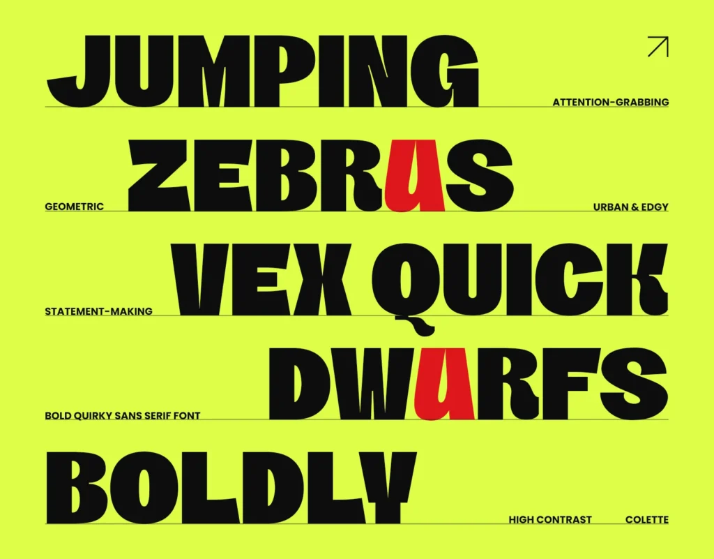
Sans serif fonts began their journey quietly during the late 18th century. The term “sans serif” means “without serifs,” referring to letters without decorative strokes. Initially, they appeared as bold, striking letters in advertisements and public notices. Designers considered them unconventional and bold compared to traditional serif fonts of that era. However, early usage remained sparse due to limited popularity.
In the early 19th century, sans serif fonts gained visibility across Europe. In England, designers introduced them as “grotesque,” emphasizing their unusual appearance. Soon after, French typographers created a similar style called “antique.” Germany adopted its own variant, branding it as “Grotesk.” Despite differing names, all shared common features: clean lines, simplicity, and functional aesthetics.
A crucial turning point occurred in 1896 when Germany’s Berthold Type Foundry released Akzidenz-Grotesk. This font set the foundation for modern sans serif typography. Its crisp design and balanced proportions appealed strongly to businesses, publishers, and advertisers. Due to its readability, Akzidenz-Grotesk soon became widely adopted for commercial printing and signage throughout Europe.
Also Read : History of Blackletter Font: Origins, Evolution, and Modern Usage
Moving into the 20th century, sans serif fonts found significant supporters among influential design movements, notably the Bauhaus. Established in Germany in 1919, the Bauhaus school prioritized functional simplicity, minimalist aesthetics, and industrial practicality. Sans serif fonts perfectly embodied these ideals, driving the school’s designers to create several iconic typefaces.
In 1927, German designer Paul Renner introduced Futura, a sans serif font embodying geometric perfection. Futura eliminated unnecessary flourishes, relying solely on basic geometric shapes and symmetrical lines. Immediately praised for clarity, legibility, and striking modernity, Futura swiftly dominated advertising, editorial design, and public signage worldwide. Consequently, it became synonymous with modernist aesthetics.
Helvetica, developed by Swiss designers Max Miedinger and Eduard Hoffmann in 1957, marked another milestone. Originally named Neue Haas Grotesk, Helvetica featured subtle curves and uniform strokes, maximizing readability. Companies across the globe quickly adopted Helvetica for corporate identities, logos, packaging, and signage. Its universal appeal firmly cemented Helvetica as the quintessential sans serif font for decades.
In parallel with Helvetica, Swiss designer Adrian Frutiger introduced Univers in 1957. Unlike Helvetica’s uniformity, Univers offered more variations in weight and style. Frutiger envisioned Univers as a versatile, cohesive type family suitable for extensive design applications. Its systematic structure and diverse range made Univers extremely popular among graphic designers, publishers, and corporate branding specialists.
Entering the late 20th century, digital technology reshaped typography dramatically. The invention of computers significantly altered font creation, accessibility, and usage. Sans serif font transitioned from physical type blocks into digital outlines, expanding their versatility exponentially. Due to their simplicity, sans serif fonts thrived in the digital environment, becoming the standard for websites, software interfaces, and digital content.
In 1982, Arial emerged as a significant digital sans serif font designed specifically for IBM printers. Arial quickly gained popularity due to its clean appearance and compatibility with digital displays. Soon, Microsoft adopted Arial widely, embedding it within its software packages and operating systems. Thus, Arial became one of the most widely recognized and extensively used sans serif fonts globally.
Today, contemporary sans serif fonts encompass numerous variations. Designers continuously experiment, creating fonts like Proxima Nova, Roboto, Gotham, and Montserrat. Proxima Nova, created by Mark Simonson in 2005, combined modern proportions with geometric clarity. Roboto, Google’s system font since 2011, gained rapid adoption through Android and digital platforms. Gotham, designed by Tobias Frere-Jones in 2000, achieved fame through political campaigns and media brands. Montserrat, inspired by urban typography, gained popularity across web design and branding initiatives.
Brands worldwide consistently utilize sans serif fonts for their modern, approachable, and timeless appeal. Leading technology companies such as Apple, Google, and Microsoft prefer sans serif typography due to readability and versatility. Fashion labels, including Chanel and Calvin Klein, also rely heavily on sans serif fonts. Their clean appearance ensures clarity across packaging, advertisements, and digital marketing materials, enhancing consumer engagement.
Successful design projects depend heavily on strategic use of sans serif fonts. Designers must consider legibility, particularly on digital platforms and mobile devices. Pairing sans serif fonts with serif fonts creates balanced visual contrasts, improving readability and aesthetics. For digital content, choosing sans serif fonts specifically optimized for screen viewing significantly enhances user experience.
Looking ahead, sans serif fonts will continue evolving due to technological advances and design trends. Variable fonts, offering customizable styles and weights, will become increasingly prevalent. Designers predict greater experimentation combining sans serif fonts with dynamic visual elements, animations, and interactive digital experiences. Consequently, future sans serif typography promises innovation, adaptability, and ongoing popularity across diverse applications.
Sans serif fonts successfully navigated centuries of typographic evolution, remaining consistently relevant across multiple generations. Initially perceived as unconventional, their practical simplicity and versatility ensured widespread acceptance. With continual digital innovation and creative experimentation, sans serif fonts promise sustained prominence within graphic design, branding, and digital media. Their timeless quality ensures designers worldwide will continuously embrace sans serif typography in future creative