Typography is a fundamental element in design, shaping how we perceive and interact with written content. The transition from serif to sans-serif fonts represents a significant shift in typographic history, reflecting changing design philosophies, cultural influences, and technological advancements.
Serif fonts, characterized by the small strokes at the ends of letters, have their roots in ancient Roman inscriptions. These decorative elements helped to enhance the legibility of stone carvings. As printing technology advanced in the 15th century, serif fonts like Garamond and Times New Roman became common in books and newspapers, favored for their elegance and readability. The formal, structured nature of serif fonts made them ideal for printed materials, especially those used in formal settings.
The shift to sans-serif fonts began in the 19th century. The Industrial Revolution and modernist movements like Bauhaus led designers to explore more minimal, clean fonts. Sans-serif typefaces, which lack the small decorative strokes of serifs, became associated with modernity and efficiency. The rise of advertising, signage, and poster design further popularized sans-serif fonts, which were easier to read from a distance and in larger sizes. They became known for their simplicity and accessibility, appealing to a broader audience.
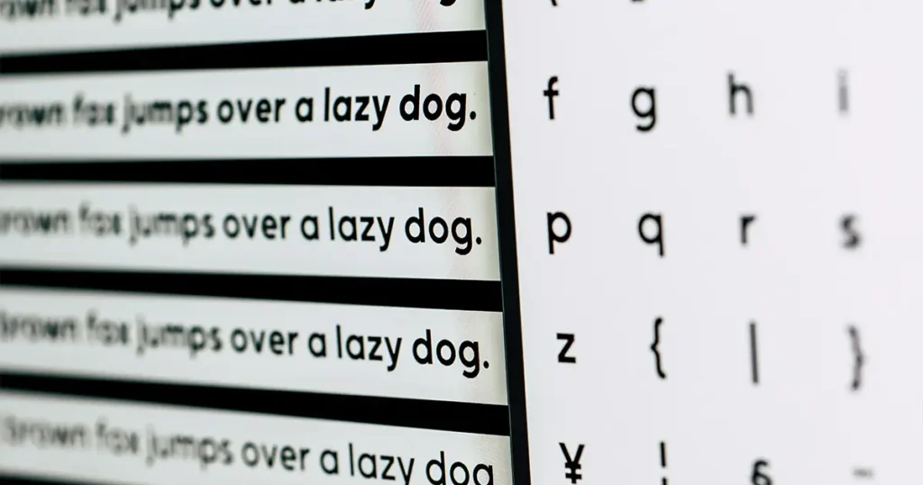
With the advent of the digital era, sans-serif fonts gained even more prominence. Early computer screens had low resolutions, which made sans-serif typefaces like Helvetica and Arial more legible on screen. As technology evolved and digital design became more prevalent, sans-serif fonts became the go-to choice for websites, apps, and interfaces. Their clean lines were ideal for both print and digital mediums, offering high legibility at various sizes.
In the world of modern web design and user interfaces, sans-serif fonts became standard. Their versatility, clarity, and readability across devices made them indispensable for digital-first communication. They helped define the minimalist aesthetic that dominated 21st-century design, emphasizing function alongside form.
Typography continues to evolve, with serif and sans-serif fonts each serving distinct roles. Serif fonts remain a symbol of tradition and formality, while sans-serif fonts epitomize modernity, simplicity, and efficiency. The shift from serif to sans-serif reflects the changing nature of design, as we seek clarity, accessibility, and minimalism in both print and digital communication. Each style has its place, contributing to the diverse landscape of design in the modern world.