In the modern marketplace, a brand is far more than just a product or a service; it is an emotional connection, a promise of quality, and a distinct personality. While color palettes and logos often take center stage in design discussions, there is a silent architect working behind the scenes to shape consumer perception: Typography. The Importance of Typography in Building a Strong Brand cannot be overstated, as it shapes how a brand’s message is received and remembered. Typography is the art and technique of arranging type to make written language legible, readable, and appealing when displayed. In the context of branding, it is the visual manifestation of a brand’s voice.
As we navigate 2026, the digital landscape is more crowded than ever. Consumers are bombarded with thousands of marketing messages daily. In this high-velocity environment, typography serves as a critical tool for differentiation. It dictates how a message “feels” before the words are even read. Whether it is the authoritative serif of a global newspaper or the playful sans-serif of a tech startup, the choice of font tells a story. This article explores the multifaceted role of typography in brand building, backed by psychological insights, historical context, and contemporary case studies.
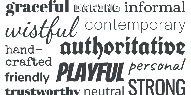
Typography is not merely a decorative choice; it is a psychological trigger. Every typeface carries a set of connotations that influence how a viewer perceives a brand’s reliability, friendliness, or innovation. This phenomenon is often referred to as “typographic personality.”
Research in the field of design psychology has consistently shown that people associate specific font styles with human traits. For instance, Serif fonts—those with small decorative lines at the ends of strokes—are frequently associated with tradition, respectability, and institutional authority. Conversely, Sans-Serif fonts are perceived as modern, clean, and efficient. When a brand chooses a font that contradicts its core values, it creates a sense of cognitive dissonance in the consumer, often leading to a lack of trust.
A brand’s voice is the purposeful expression of its personality through words and visual style. If the brand were a person, typography would be their tone of voice. Just as a person can sound aggressive, soothing, or professional, a typeface can project these same qualities.
Consider the difference between a high-end luxury fashion brand and a grassroots environmental non-profit. The luxury brand might use an elegant, high-contrast serif (like Didot or Bodoni) to convey exclusivity and heritage. The non-profit might opt for a rounded, friendly sans-serif (like Gotham or Open Sans) to communicate accessibility and community. By selecting a specific font family, a brand creates a consistent visual language that reinforces its identity across all touchpoints, from social media ads to physical packaging.
While the aesthetic of a font is vital, its functionality is paramount. A brand that is difficult to read is a brand that is easily ignored. In the digital-first era of 2026, legibility (how easily individual characters can be distinguished) and readability (how easily the text can be processed as a whole) are core components of the user experience.
Effective typography ensures that the brand’s message is delivered without friction. Professional designers pay close attention to kerning (space between characters), leading (space between lines), and tracking (overall letter spacing). Poorly spaced text can make a brand look amateurish and difficult to engage with. Statistics suggest that users spend an average of only 5.59 seconds looking at written content on a website before deciding to stay or leave; if the typography is dense or confusing, that bounce rate increases significantly.
In recent years, many global giants have abandoned standard system fonts in favor of custom-designed typefaces. This shift is driven by two main factors: brand distinction and licensing costs.
Take Netflix as an example. Originally using Gotham, the streaming giant developed “Netflix Sans” in 2018. This custom font not only gave them a unique visual signature that no other brand could use, but it also saved the company millions of dollars in licensing fees. Similarly, Airbnb created “Cereal,” a font designed to work seamlessly across both digital interfaces and print magazines. By owning their typography, these brands have achieved a level of visual cohesion that makes them instantly recognizable even without their logo present.
In a sea of competitors, how does a brand stand out? While everyone might use blue or green, the specific “cut” of a typeface can provide the necessary edge. Typography allows a brand to own a specific aesthetic space that competitors may have overlooked.
In 2026, we are seeing a resurgence of “Maximalist” typography—bold, warped, and experimental fonts that challenge traditional design rules. This trend is particularly popular among Gen Z-focused brands looking to break away from the “Millennial Minimalism” (clean, geometric sans-serifs) that dominated the previous decade. By choosing a bold typographic direction, these brands signal that they are disruptive, creative, and unafraid to be different. Differentiation isn’t just about being “better”; it’s about being distinct.
A strong brand is a consistent brand. Typography is the glue that holds a brand’s identity together as it moves from a mobile app to a physical billboard, and finally to a product invoice. If the fonts change erratically between platforms, the brand feels fragmented and untrustworthy.
The technical challenge for modern brands is ensuring that their chosen fonts are “web-safe” and load quickly. A beautiful font that takes three seconds to load on a smartphone is a liability. This has led to the rise of Variable Fonts—a single font file that can behave like multiple styles (Light, Bold, Italic, etc.). Variable fonts allow for a highly responsive design that maintains typographic integrity regardless of screen size or device, ensuring that the brand “voice” remains steady and professional at all times.
The typography used on a product’s packaging or a company’s website directly influences how much a consumer is willing to pay. This is the concept of “perceived value.” Luxury brands understand this better than anyone. They often use vast amounts of white space (negative space) paired with thin, elegant, and widely tracked (spaced out) typography to signal high value.
Conversely, discount brands often use thick, heavy, and tightly packed fonts to signal “bargain” and “mass appeal.” If a high-end consultant used “Comic Sans” on their business card, no client would be willing to pay their premium rates, regardless of their expertise. Typography acts as a visual shorthand for the brand’s price point. In the 2026 economy, where value is often tied to experience and brand prestige, getting the “look” of the price right is half the battle won.
In 2026, inclusivity is no longer an optional “extra” in branding; it is a legal and ethical requirement. Typography plays a massive role in making a brand accessible to everyone, including those with visual impairments, dyslexia, or cognitive disabilities.
Inclusive typography focuses on clear letterforms, avoiding overly decorative scripts for body text, and ensuring high color contrast. Many brands are now adopting “Hyper-legible” fonts developed specifically for the visually impaired. By prioritizing accessibility in their typography, brands not only reach a wider audience but also demonstrate a commitment to social responsibility—a trait that modern consumers, particularly younger demographics, value highly.
For brands operating on a global scale, typography becomes even more complex. A font that feels “modern” in New York might feel “outdated” or even “offensive” in another cultural context. Furthermore, brands must ensure that their typographic identity translates across different scripts (Latin, Cyrillic, Arabic, Kanji, etc.).
The most successful global brands in 2026 utilize “Multilingual Font Families.” These are typefaces designed to maintain the same visual weight and personality across hundreds of different languages. For example, the font used for the English logo should have a “visual cousin” in the Arabic version so that the brand identity remains recognizable even to someone who cannot read both scripts. Typography is the bridge that allows a global brand to speak locally while maintaining its international essence.
As we look toward the future, Artificial Intelligence is beginning to revolutionize typography. We are moving toward “Generative Type,” where AI can create unique, bespoke fonts based on a brand’s specific parameters and values. In the near future, we may see “Living Typography”—fonts that subtly change their weight or spacing based on the time of day, the user’s mood, or the specific content they are displaying.
While AI offers incredible efficiency, the human element of typographic design remains essential. AI can generate thousands of options, but only a human designer can understand the nuance of a brand’s story and the emotional resonance of a specific curve. The future of typography in branding is a partnership: AI handling the technical optimization and variations, while humans provide the strategic vision and emotional soul.
Typography is the unsung hero of the branding world. It is a powerful tool that combines psychology, art, and technology to build a cohesive and persuasive brand identity.
In the end, typography is not just about choosing a font; it is about choosing a voice. For any business looking to build a strong, lasting brand in 2026, investing in professional typography is not a luxury—it is a necessity.