In the visual noise of 2026, where digital interfaces and physical advertisements compete for every millisecond of our attention, minimalism has transitioned from a trend to a necessity. Design philosophy has shifted toward “subtraction”—the idea that removing the unnecessary enhances the essential. At the core of this movement lies typography. Minimalist font styles are not merely about being “plain”; they are about precision, white space, and the subtle balance of form and function.
A minimalist typeface acts as a quiet messenger. It allows the content to breathe and the message to take center stage without the distraction of ornate flourishes. Whether it is a luxury brand’s logo, a high-end mobile app, or a sleek editorial layout, the right minimalist font communicates sophistication, reliability, and modernism. This article explores the history, psychology, and practical application of minimalist typography, providing a comprehensive guide for designers seeking to achieve a clean and elegant aesthetic.
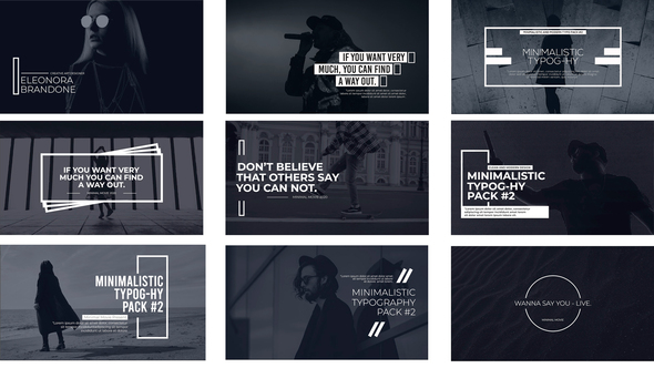
Minimalism in typography is deeply rooted in the “International Typographic Style,” also known as the Swiss Style, which emerged in the 1950s. This movement emphasized cleanliness, readability, and objectivity. Minimalist fonts are characterized by the absence of serifs (the small feet at the ends of strokes), consistent stroke weights, and generous “kerning” (the space between characters).
The primary goal of a minimalist font is to remove the “personality” of the letterforms so that the “voice” of the text is clear. This doesn’t mean the fonts are soul-less; rather, their beauty is found in their geometry. A perfect circle in the letter ‘o’ or the sharp, 90-degree angle of an ‘L’ becomes a design element in itself. In 2026, as high-resolution displays become ubiquitous, these geometric perfections are more visible—and more important—than ever before.
When designers think of minimalism, sans-serif fonts are usually the first choice. Sans-serifs like Helvetica, Futura, and more recently, Google’s Product Sans or Apple’s San Francisco, have become the standard for “clean” design. These fonts strip away the traditional “tails” of the Roman alphabet, offering a streamlined look that feels industrial and efficient.
Statistics from web design surveys in 2025 indicate that over 82% of the world’s top 100 tech companies use a minimalist sans-serif as their primary brand font. The reason is psychological: sans-serif fonts are perceived as more honest and direct. In an era of misinformation, a clean, unadorned typeface suggests transparency. Brands like Tesla and Airbnb have successfully used minimalist sans-serifs to position themselves as forward-thinking and user-centric, proving that simplicity is the ultimate sophistication.
While sans-serifs dominate the minimalist space, a new category has emerged: Minimalist Serifs. Traditionally, serifs were associated with old-world tradition and academic density. However, modern designers have reimagined the serif by thinning the strokes and increasing the “x-height” (the height of lowercase letters). The result is a font that feels elegant and high-fashion, yet remains remarkably clean.
This style is frequently seen in the luxury sector. High-end boutiques and fragrance brands use high-contrast minimalist serifs to evoke a sense of heritage without looking dated. By pairing a very thin, elegant serif with vast amounts of white space, a designer can create a “premium” feel that a sans-serif might lack. This paradox—using a “decorative” element like a serif to achieve minimalism—is one of the most exciting trends in 2026 graphic design.
In minimalist design, what you don’t see is as important as what you do. The space between letters (kerning/tracking) and the space between lines (leading) are the secret ingredients of an elegant layout. A font that looks crowded and messy when set normally can become a minimalist masterpiece simply by increasing the tracking.
Wide-tracked typography is a hallmark of “Quiet Luxury.” When letters are spaced further apart, the eye slows down, giving the word a sense of importance and “breathability.” Case studies of luxury hotel branding often show that increasing the letter-spacing of a standard font by 10-15% instantly raises the perceived value of the brand. Conversely, generous leading (the vertical space between lines) makes long-form content easier to read and less intimidating, which is crucial for digital interfaces where user fatigue is a constant risk.
Apple is perhaps the world’s most famous practitioner of minimalist design. Their journey through typography is a masterclass in clean aesthetics. In the early days, Apple used “Apple Garamond,” a condensed serif that felt literary and creative. However, as they moved toward the “iOS 7” era and beyond, they transitioned to ultra-thin sans-serifs like Helvetica Neue and eventually their own custom font, San Francisco.
This transition was driven by the need for legibility across a vast ecosystem of devices—from the tiny screen of the Apple Watch to the massive Pro Display XDR. San Francisco is a “variable font,” meaning it can subtly change its shape and weight based on the size it is being displayed at. This adaptability is the modern definition of minimalist elegance: a font that does the hard work of being legible so that the user never has to think about the font at all.
Technologically, 2026 is the year of the Variable Font. In the past, if a designer wanted five different weights of a font (Light, Regular, Medium, Bold, Black), they had to load five separate files. This increased website load times and created “clutter” in the code. Variable fonts allow a single file to contain an infinite range of weights, widths, and slants.
From a minimalist standpoint, variable fonts are a dream. They allow for “responsive typography”—where the weight of a font can automatically become thinner on a dark background to prevent it from looking “heavy,” or become wider on a small screen to improve readability. This technical efficiency mirrors the minimalist philosophy of “doing more with less.” By using one file to handle every typographic need, designers keep their projects lean and their designs cohesive.
Minimalism is often associated with a black-and-white palette, but color plays a vital role in clean design. The key is “intentionality.” In minimalist typography, color is rarely used for decoration; it is used for hierarchy and emphasis. A single word in a muted “sage green” or a “soft charcoal” can guide the reader’s eye without breaking the calm of the layout.
Contrast is the other half of the equation. High contrast (black text on a white background) is the gold standard for accessibility and cleanliness. However, 2026 has seen a rise in “low-contrast minimalism,” where dark gray text is used on a light gray background. While this can look incredibly elegant and “soft” on the eyes, designers must be careful to maintain enough contrast for users with visual impairments. The most “elegant” design is one that everyone can read.
Minimalism is deceptively difficult. Without the safety net of shadows, gradients, and decorative elements, every tiny mistake in typography becomes obvious. The most common pitfall is a lack of hierarchy. If every font is the same size and weight, the reader doesn’t know where to look first. A clean design still needs a “focal point.”
Another issue is “functional invisibility.” If a font is so thin and light that it disappears into the background, the design has failed its primary purpose: communication. Designers in 2026 are increasingly moving away from the “ultra-thin” trend of the mid-2010s in favor of “medium-weight minimalism”—fonts that have enough substance to be read easily but still maintain a clean, modern silhouette. Balance, not just reduction, is the key to successful minimalist design.
Minimalist typography in 2026 is about more than just “picking a thin font.” It is a strategic approach to communication that prioritizes the user’s experience and the clarity of the message.
Ultimately, minimalist font styles provide an elegant framework for a world that is increasingly cluttered. By choosing typefaces that are clean, legible, and balanced, designers can create experiences that feel calm, trustworthy, and timeless.