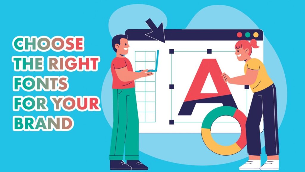
In the theater of brand building, visual identity often takes center stage. We discuss logos, color palettes, and imagery with fervor, yet one of the most hardworking elements of a brand often goes unnoticed by the casual observer: typography. Choosing the Right Font for Effective Brand Communication determines whether your typography acts as the “silent ambassador” of your brand. It is the clothes your words wear, the tone of voice they carry, and the subtle psychological cue that tells a customer whether you are a trustworthy financial institution or a playful toy company.
As we navigate 2026, the digital landscape has become more crowded than ever. A brand’s ability to communicate clearly and authentically depends heavily on its typographic choices. Typography does more than just make words legible; it evokes emotion and establishes hierarchy. In this comprehensive guide, we will explore the science and art of choosing the right font, backed by psychological insights and industry data, to ensure your brand communication resonates with your target audience.
Before a reader processes a single word of your copy, their brain has already formed an impression based on the visual style of the text. This is known as “typographic affect.” Different font families trigger specific emotional responses rooted in cultural history and visual associations.
A study conducted by researchers at Wichita State University found that participants consistently associated specific personality traits with different font categories. For instance, Serif fonts were viewed as “traditional” and “stable,” while Sans Serif fonts were seen as “modern” and “streamlined.” In a world where 70% of consumers say that a brand’s “vibe” influences their purchase decisions, understanding these subconscious triggers is essential for effective communication.
Choosing a font without first defining your brand personality is like picking an outfit without knowing where you are going. You must identify the “North Star” of your brand’s character. Is your brand an “Explorer” like Patagonia, or a “Sage” like The New York Times?
When defining your personality, use specific adjectives rather than vague terms. Instead of saying “professional,” try “authoritative” or “innovative.” A brand that describes itself as “rugged and outdoorsy” will naturally gravitate toward heavy Slab Serifs or weathered display fonts. Conversely, a “high-end minimalist” skincare brand will find its home in light-weight Sans Serifs with generous letter spacing. This alignment ensures that your typography supports, rather than contradicts, your brand message.
While these terms are often used interchangeably, in the world of typography, they mean different things. Legibility refers to how easily one individual character can be distinguished from another. Readability refers to how easily large bodies of text can be consumed.
For a brand, both are critical but serve different functions. A highly stylized “Display” font might have poor legibility but work beautifully for a three-word logo. However, if that same font is used for a 500-word blog post, the readability will suffer, leading to high bounce rates. Data from digital marketing audits suggests that 38% of users will stop engaging with a website if the layout or content is difficult to read. Therefore, your primary body font must prioritize readability above all else.
Rarely does a brand rely on a single font. Usually, a brand identity requires a “Header” font to grab attention and a “Body” font to deliver information. The goal of font pairing is to create visual contrast while maintaining tonal harmony.
The most common and effective strategy is to pair a Serif with a Sans Serif. This creates an immediate hierarchy. For example, a bold Serif header can provide a sense of history and prestige, while a clean Sans Serif body font keeps the interface feeling modern and easy to navigate. A golden rule for beginners is to avoid pairing fonts that are too similar—if they look like they might be the same font but aren’t quite, it creates “visual dissonance” that feels like a mistake rather than a choice.
One of the most famous examples of strategic font selection is Google’s move from a complex Serif logo to the geometric Sans Serif “Product Sans” in 2015. This change wasn’t just aesthetic; it was functional.
The old serif font was difficult to render clearly on low-resolution mobile devices. By switching to a geometric Sans Serif, Google ensured that its brand remained legible even on the smallest smartwatch screens. This move signaled a shift from being a “search engine” (academic/serif) to a “life assistant” (approachable/sans serif). This transition highlights a key lesson for 2026: your font choice must be as much about technical performance as it is about style.
In 2026, your brand lives on screens. This means your font must be “Web-Safe” or properly licensed for web use via services like Adobe Fonts or Google Fonts. Furthermore, the rise of Variable Fonts has revolutionized brand communication.
Variable fonts allow a single font file to contain multiple weights, widths, and styles. This is a game-changer for site performance and design flexibility. Instead of loading six different files for “Bold,” “Italic,” and “Light,” you load one file that can be adjusted dynamically. This improves page load times, which is a significant factor in SEO rankings and user retention. Brands that prioritize these technical aspects of typography often see better engagement metrics across their digital platforms.
Inclusive design is no longer an afterthought; it is a requirement. Effective brand communication means communicating with everyone, including those with visual impairments or dyslexia.
The Web Content Accessibility Guidelines (WCAG) suggest that for optimal accessibility, users should be able to resize text up to 200% without loss of content. Additionally, certain fonts are specifically designed to help readers with dyslexia by adding “weight” to the bottom of characters to prevent them from “flipping” in the reader’s mind. Brands that ignore accessibility not only alienate a significant portion of their audience but also face legal risks in many jurisdictions. Choosing a font with clear character differentiation (like a distinct ‘I’, ‘l’, and ‘1’) is a simple way to boost inclusivity.
If your brand operates internationally, your font choice becomes exponentially more complex. You must ensure that your chosen typeface supports the character sets of all the languages you serve.
Cultural context also plays a role in how fonts are perceived. In some Eastern cultures, certain stroke styles associated with traditional calligraphy carry deep religious or historical weight that might not translate to a Western audience. A global brand needs a “Superfamily”—a typeface that includes Latin, Cyrillic, Greek, Arabic, and Kanji versions that all share the same visual DNA. This consistency is what allows a brand like Coca-Cola or Airbnb to remain recognizable across the globe, regardless of the script being read.
Selecting the font is only half the battle; how you “set” the font is equally important. Tracking (letter spacing) and Leading (line spacing) can dramatically change the vibe of a typeface.
Generous tracking in all-caps text often feels luxurious and high-end (think of fashion brands like Chanel). Tight tracking, conversely, feels urgent and loud (think of tabloid headlines). Similarly, increasing the leading makes a long paragraph feel more inviting and less like a “wall of text.” For brands aimed at a younger, mobile-first demographic, slightly larger leading is often preferred to allow for easier thumb-scrolling and scanning. Fine-tuning these details is the mark of a professionally communicated brand.
Before finalizing a font for a brand, it must be put through its paces. Designers often use the “Squint Test”—looking at the layout with blurred eyes to see if the hierarchy and shapes still make sense.
In 2026, data-driven brands use A/B testing to validate their typographic choices. You might test two different header fonts on a landing page to see which leads to a higher conversion rate. You might be surprised to find that a slightly “friendlier” font leads to more sign-ups than a “sleeker” one. Typography is a hypothesis that needs to be tested in the real world against the actual behavior of your target audience.
Choosing the right font is a balancing act between psychology, technical performance, and artistic expression.
Test and Iterate: Don’t be afraid to use data to refine your typographic choices over time.
By treating typography as a strategic asset rather than a decorative choice, you empower your brand to communicate with greater clarity, authority, and emotional resonance. In the end, the right font doesn’t just tell your customers what you’re saying—it tells them who you are.